Design with AI
Generate a new design based on this screen using your own content.
# Design from Reference: ConvertKit Checkout
Create an original, high-fidelity visual design inspired by the reference. Prioritize composition, typography, colors, spacing, and component styling over technical implementation.
## Reference
- **Product:** ConvertKit
- **Category:** Checkout
- **Screenshot:** https://cdn.prod.website-files.com/5e9dc792e1210c5325f7ebbc/6acbc8696b0a1061299bac2a_6acbc60839e7f22db404a1c4_cms-2cd7c8f44d8117f9cc65c769.webp
Analyze the screenshot first. If inaccessible, request it rather than guessing.
## Content
{{content.instructions}}
{{content.data}}
Preserve essential messaging and factual accuracy. Adapt structure and copy length for visual balance; never invent product claims.
## Visual Design
### Overall aesthetic
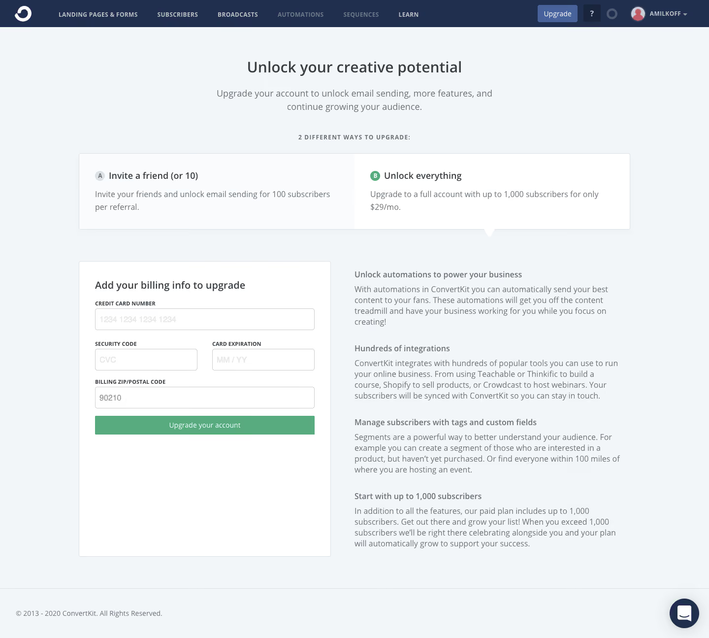
- **Style:** Restrained account-upgrade checkout with pale-gray canvas, navy global header, and green submission action.
- **Character:** Practical form layout, muted body copy, white cards, and minimal decoration.
### Page composition
- **Canvas:** 1440 × 1295 screenshot px.
- **Header:** Approximately 55px high with logo, compact navigation, upgrade action, and profile.
- **Intro:** Centered heading and two-line supporting sentence.
- **Upgrade options:** Broad two-column white panel approximately 1120 × 155px.
- **Main area:** Left billing card approximately 512 × 600px; right explanatory benefits column approximately 540px wide.
- **Footer:** Low-contrast copyright row and circular chat launcher.
### Information hierarchy
- **Primary:** Upgrade headline, then two possible upgrade paths.
- **Selection:** Right option is emphasized by a green letter marker and a small downward pointer.
- **Checkout:** Billing form provides the actionable center of the page.
- **Support:** Four short benefit descriptions explain the paid plan.
### Typography
- **Family:** Compact humanist-looking sans serif; exact family unverified.
- **Main title:** Approximately 30–32 screenshot px, medium weight.
- **Section headings:** Approximately 20px, medium or semibold.
- **Body:** Approximately 16–17px with 23–25px line-height.
- **Field labels:** Approximately 11–12px, bold uppercase.
- **Navigation:** Approximately 12px, bold uppercase with slight tracking.
- **Precision:** Screenshot-based font estimates; CSS scale unverified.
### Colors & surfaces
- **Canvas:** #F3F6F9.
- **Cards:** #FFFFFF.
- **Secondary option surface:** #F9FBFC.
- **Header:** #212F4F.
- **Primary green:** #58AB7E.
- **Borders:** #DCE1E5.
- **Secondary text:** #697177.
- **Heading text:** #373F45.
- **Shape:** Small 3–4px corner radii; subtle outlines and minimal shadows.
- **Precision:** Values sampled from screenshot pixels.
### Components
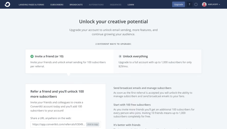
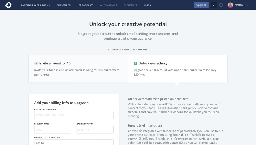
- **Option panel:** Two equal sections with letter markers, heading, and short explanation.
- **Billing form:** Card number full width; security code and expiration share a row; postal field full width.
- **Fields:** Approximately 44 screenshot px high, thin gray borders, light placeholders.
- **Submit:** Full-width green rectangular action, approximately 38px high.
- **Benefits:** Unboxed heading/paragraph groups.
- **Chat:** Dark circular launcher near lower-right edge.
### Visual rhythm
- **Vertical spacing:** Broad gap between options and main form, with regular 28–36px gaps between benefits.
- **Form rhythm:** Compact uppercase labels above fields; consistent column alignment.
- **Whitespace:** Significant empty space remains below the short form within its tall card.
### Responsive
- **Observed:** Desktop only.
- **Recommendation:** Stack upgrade options and place benefits after the billing form on smaller screens.
- **Fields:** Preserve readable labels and touch-friendly controls; stack the paired row if needed.
- **Navigation:** Collapse secondary links.
### Adaptation guidance
- **Preserve:** Quiet checkout framing, two upgrade paths, billing focus, and green confirmation action.
- **Content:** Use current supplied pricing and plan limits; do not copy historical values from the image.
- **Form:** Include only fields required by the intended payment flow.
- **Behavior:** Screenshot shows visual selection, not demonstrated payment processing.
Use this context to reproduce the reference's visual language: layout, typography, colors, spacing, borders, radii, and distinctive elements. The screenshot takes priority if descriptions conflict.
## Direction
{{preferences.fidelityInstructions}}
## Output
{{output.instructions}}
Deliver a polished, cohesive design with precise alignment, hierarchy, and spacing. Produce the requested visual artifact, not just a description. If unsupported, explain the limitation.