Design with AI
Generate a new design based on this screen using your own content.
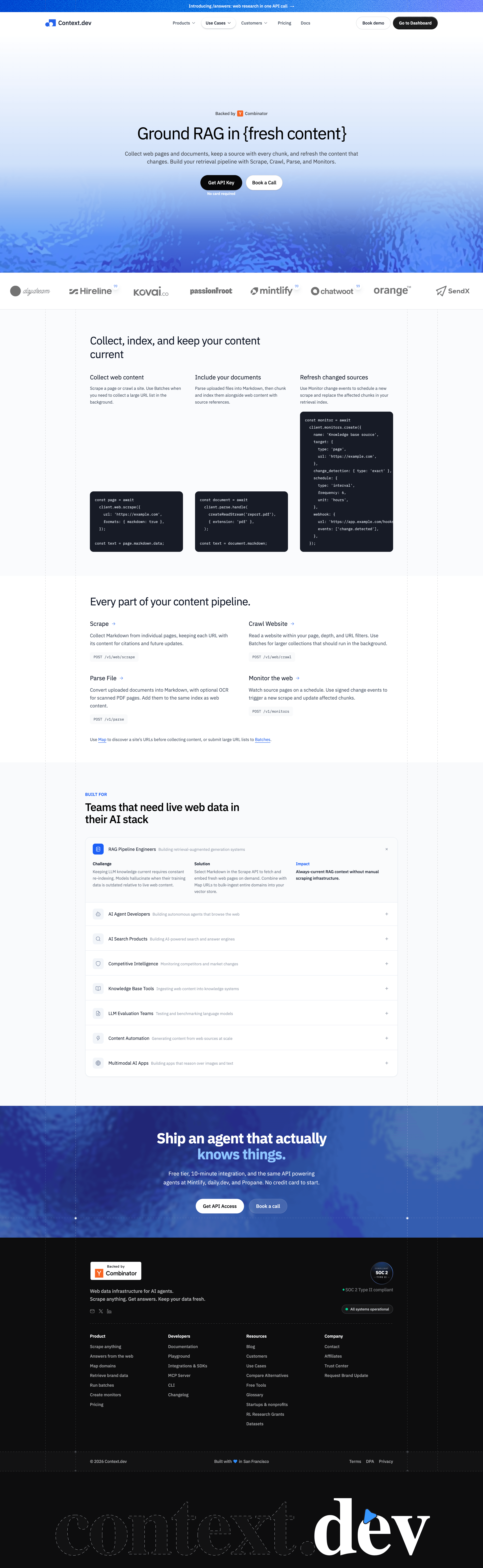
# Design from Reference: Context.dev Use Cases
Create an original, high-fidelity visual design inspired by the reference. Prioritize composition, typography, colors, spacing, and component styling over technical implementation.
## Reference
- **Product:** Context.dev
- **Category:** Use Cases
- **Screenshot:** https://cdn.prod.website-files.com/5e9dc792e1210c5325f7ebbc/6acad0017796407cec141806_6acacf8bc5142fbf89226773_cms-671285a0026f80487d01a8c2.webp
Analyze the screenshot first. If inaccessible, request it rather than guessing.
## Content
{{content.instructions}}
{{content.data}}
Preserve essential messaging and factual accuracy. Adapt structure and copy length for visual balance; never invent product claims.
## Visual Design
### Overall aesthetic
- **Character:** Technical API marketing with a blue watery hero, exposed grid guides and clear code-led explanations.
### Page composition
- **Canvas:** 2880 × 9340 screenshot pixels; CSS estimates assume approximately 2× scale.
- **Sequence:** Announcement/navigation; centered hero; logo strip; three pipeline/code columns; API capability grid; audience accordion; blue CTA; black footer.
### Information hierarchy
- **Priority:** Hero headline/actions introduce the use case, then collection/document/refresh stages explain the pipeline.
- **Detail:** Expanded audience row uses Challenge, Solution and Impact columns; other audiences remain collapsed.
### Typography
- **Families:** Neutral sans-serif headings/body, monospace code and oversized serif footer wordmark; exact fonts are unverified.
- **Scale:** Estimated CSS hero 48px, section titles 32px, body 14–16px and code 11–12px.
### Colors & surfaces
- **Sampled palette:** White #FFFFFF; pale surfaces #FAFBFD and #F9FAFC; black #0D0D0E; code navy #171B26; dark variant #121213.
- **Accents:** Bright blue actions/links and textured blue gradients; dotted vertical guides continue through sections.
### Components
- **Components:** Dark rounded code blocks, endpoint chips, thin-bordered accordion with icon tiles, paired pill actions and status/compliance badges.
- **Geometry:** Estimated 10px code radii, 16px accordion radius and 44px action height.
### Visual rhythm
- **Spacing:** Generous 80–100px CSS chapter padding; broad blank space within three-column explanations balances code density.
### Responsive
- **Guidance:** Mobile is not shown. Stack pipeline columns, scroll code horizontally and simplify accordion detail into vertical sections.
### Adaptation guidance
- **Transfer:** Retain pipeline-to-audience narrative and technical evidence. Use target endpoints, examples and verified proof.
Use this context to reproduce the reference's visual language: layout, typography, colors, spacing, borders, radii, and distinctive elements. The screenshot takes priority if descriptions conflict.
## Direction
{{preferences.fidelityInstructions}}
## Output
{{output.instructions}}
Deliver a polished, cohesive design with precise alignment, hierarchy, and spacing. Produce the requested visual artifact, not just a description. If unsupported, explain the limitation.