Design with AI
Generate a new design based on this screen using your own content.
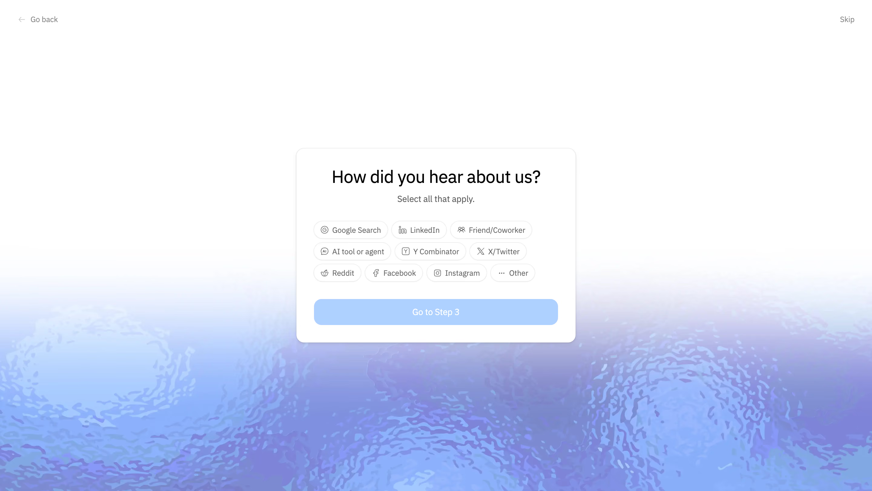
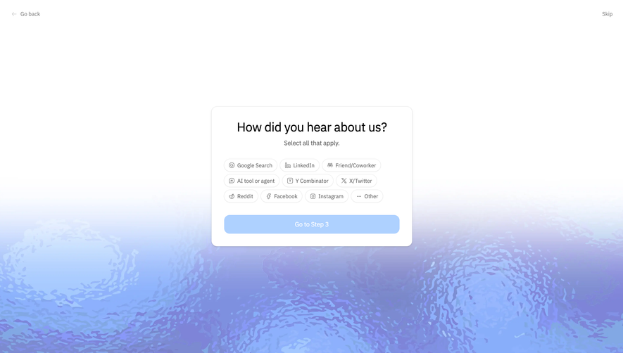
# Design from Reference: Context.dev How did you hear about us?
Create an original, high-fidelity visual design inspired by the reference. Prioritize composition, typography, colors, spacing, and component styling over technical implementation.
## Reference
- **Product:** Context.dev
- **Category:** Discovery Questions
- **Screenshot:** https://cdn.prod.website-files.com/5e9dc792e1210c5325f7ebbc/6acad04534c900e8fc1b4831_6acacfd16e99d246ad1e46b6_cms-f97f7f56dbd2e62750ff0ff9.webp
Analyze the screenshot first. If inaccessible, request it rather than guessing.
## Content
{{content.instructions}}
{{content.data}}
Preserve essential messaging and factual accuracy. Adapt structure and copy length for visual balance; never invent product claims.
## Visual Design
### Overall aesthetic
- **Character:** Minimal referral-source onboarding card above an atmospheric blue/lavender rippled background.
### Page composition
- **Canvas:** 2880 × 1624 screenshot px; CSS estimates assume 2× capture.
- **Structure:** Go back upper left, Skip upper right; centered white card positioned just above a lower-half abstract water/glass texture. Heading, helper, ten option chips and broad next-step action form a compact stack.
### Information hierarchy
- **Priority:** How did you hear about us? heading leads; Select all that apply clarifies multi-selection. Pale-blue Go to Step 3 button sits below the chip group.
### Typography
- **Family:** Neutral sans serif, exact font unverified.
- **Scale:** Estimated CSS heading 28 px, helper 14 px, chip labels 12–14 px and action 14 px.
### Colors & surfaces
- **Sampled palette:** White #FFFFFF; texture blues #AED1FF/#8DB0FD/#88AEFA; near-white #FBFCFF/#FDFCFF.
- **Treatment:** Faint gray card/chip outlines, soft card shadow and translucent lavender-blue lower texture fading into white above.
### Components
- **Card:** Estimated CSS width 460 px, 12 px corners and 28 px padding.
- **Options:** Ten compact outlined pills across three centered rows, each with a small source icon and label; Other uses an ellipsis.
- **Action:** Full-width pale-blue rounded rectangle; captured state appears visually subdued, with no selected chip visibly emphasized.
### Visual rhythm
- **Spacing:** Approximately 20–28 CSS px between title/helper/options/action; very large outer whitespace centers attention on the survey.
### Responsive
- **Observed:** Desktop only.
- **Adaptation:** Wrap chips naturally within mobile gutters, keep multi-select states explicit and ensure the background texture does not reduce label contrast.
### Adaptation guidance
- **Preserve:** Optional survey framing, concise multi-select choices and soft atmospheric backdrop.
- **Replace:** Use supplied acquisition channels and actual selection/continuation behavior; do not infer unseen validation logic.
Use this context to reproduce the reference's visual language: layout, typography, colors, spacing, borders, radii, and distinctive elements. The screenshot takes priority if descriptions conflict.
## Direction
{{preferences.fidelityInstructions}}
## Output
{{output.instructions}}
Deliver a polished, cohesive design with precise alignment, hierarchy, and spacing. Produce the requested visual artifact, not just a description. If unsupported, explain the limitation.