Design with AI
Generate a new design based on this screen using your own content.
# Design from Reference: Conduktor Create Element
Create an original, high-fidelity visual design inspired by the reference. Prioritize composition, typography, colors, spacing, and component styling over technical implementation.
## Reference
- **Product:** Conduktor
- **Category:** Add & Edit
- **Screenshot:** https://cdn.prod.website-files.com/5e9dc792e1210c5325f7ebbc/6acb6760994832179b560611_6acb6578a88b2511fbea952f_cms-382caa1b35777257b4203990.webp
Analyze the screenshot first. If inaccessible, request it rather than guessing.
## Content
{{content.instructions}}
{{content.data}}
Preserve essential messaging and factual accuracy. Adapt structure and copy length for visual balance; never invent product claims.
## Visual Design
### Overall aesthetic
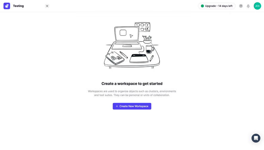
- **Style:** Minimal workspace-creation empty state with a hand-drawn monochrome desk illustration and purple primary action.
- **Character:** White canvas, thin header rule, compact status utilities, and extensive surrounding whitespace.
- **Focus:** One centered creation prompt rather than a populated dashboard.
### Page composition
- **Capture and scale:** 2880 × 1642 image px. CSS estimates assume a 2× capture, approximately 1440 × 821 CSS px; scale is unverified.
- **Header:** Purple brand tile and workspace/context label left; dropdown indicator nearby; trial/upgrade pill, help, bell, and avatar right.
- **Main group:** Centered desk illustration about 310px wide in the upper-middle, followed by heading, two-line explanation, and creation action.
- **Text measure:** Approximately 500px centered supporting-copy width.
- **Support:** Dark circular chat control anchored near the lower-right corner.
### Information hierarchy
- **Illustration:** Large line drawing establishes the empty-state context.
- **Task heading:** Create a workspace to get started is the strongest central text.
- **Explanation:** Muted copy describes the types of objects organized by workspaces and their collaboration role.
- **Primary action:** Purple Create New Workspace button with plus icon.
- **Account context:** Trial/upgrade status remains secondary in the top-right header.
### Typography
- **Family:** Neutral sans serif; exact family is unverified.
- **Heading:** Approximately 20px bold with 26px line-height.
- **Supporting copy:** Approximately 14px regular with 21px line-height.
- **Button:** Approximately 14px semibold.
- **Header:** Approximately 16px bold context label and 14px utility text.
- **Precision:** CSS sizes and weights are visual estimates under the unverified 2× assumption.
### Colors & surfaces
- **Canvas:** Sampled #FFFFFF.
- **Primary purple:** Sampled #4E3FF1.
- **Illustration ink:** Sampled #0F181C.
- **Heading:** Sampled #1B1524.
- **Muted copy:** Sampled #908E96.
- **Header rule / boundaries:** Sampled #EEEDEF.
- **Support control:** Sampled #304057.
- **Status detail:** Small green dot and teal avatar add restrained utility color.
### Components
- **Brand tile:** Rounded purple square with white geometric mark.
- **Status pill:** Fine pale outline, rounded ends, green dot, and compact trial/upgrade label.
- **Desk drawing:** Black outline laptop, calendar, plant, mug, notebook, tablet, and pens; no filled scene background.
- **Creation action:** Approximately 210 × 36px purple rectangle with 5px radius, white plus, and label.
- **Support launcher:** Approximately 48px dark circle with white chat icon and soft shadow.
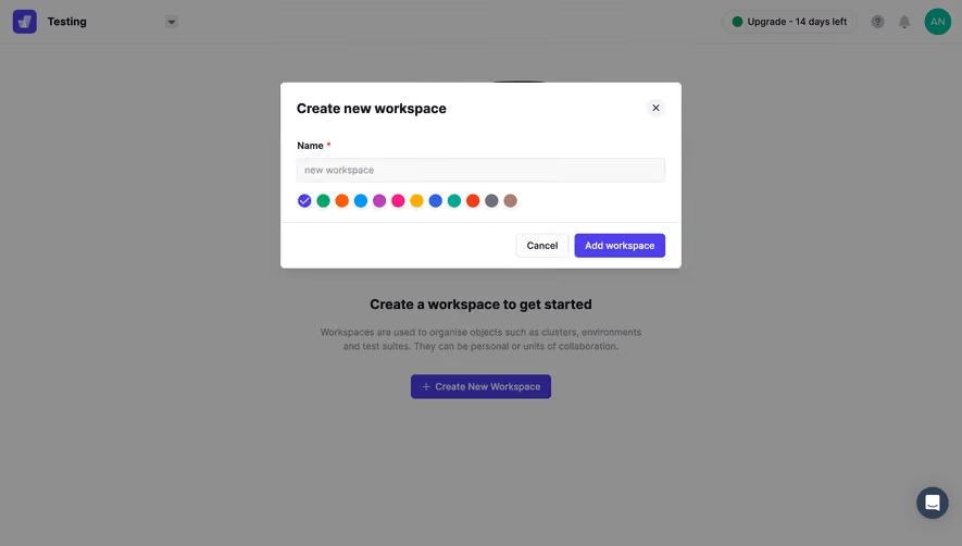
- **State limits:** No workspace form, validation, or created object is visible.
### Visual rhythm
- **Centering:** Illustration, heading, explanation, and action share the main vertical axis.
- **Spacing:** Roughly 64–72px separates illustration and heading; smaller gaps group explanation and action.
- **Header balance:** Left context and right account utilities frame an otherwise empty canvas.
- **Restraint:** No surrounding cards or secondary action competes with workspace creation.
### Responsive
- **Observed state:** Desktop only; mobile behavior is unverified.
- **Layout recommendation:** Keep the group centered within a fluid 500px maximum and 20–24px gutters.
- **Illustration recommendation:** Scale down the artwork before reducing actual text size.
- **Header recommendation:** Collapse secondary utilities when space is limited.
- **Support recommendation:** Keep the chat control clear of the creation action on short screens.
### Adaptation guidance
- **Preserve:** Single empty-state task, simple monochrome illustration, muted explanation, and purple creation action.
- **Starting geometry:** Approximately 310px illustration, 500px text measure, 20px heading, and 36px button under the unverified 2× assumption.
- **Content fidelity:** Describe real workspace behavior from supplied product requirements.
- **Interaction recommendation:** Open an accessible creation flow with explicit labels and visible focus; the screenshot does not show the next state.
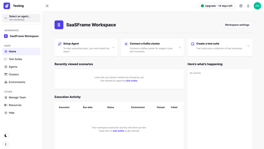
- **State fidelity:** Reconstruct the empty workspace prompt rather than inventing populated objects.
Use this context to reproduce the reference's visual language: layout, typography, colors, spacing, borders, radii, and distinctive elements. The screenshot takes priority if descriptions conflict.
## Direction
{{preferences.fidelityInstructions}}
## Output
{{output.instructions}}
Deliver a polished, cohesive design with precise alignment, hierarchy, and spacing. Produce the requested visual artifact, not just a description. If unsupported, explain the limitation.