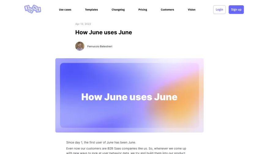
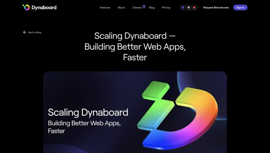
Overall Style & Aesthetic
Conduktor Gateway’s blog page channels a crisp, modern professionalism with subtle flair. The design emphasizes clean lines and abundant white space, creating a sense of openness. Cool blues dominate, reinforcing trust and technical expertise, while carefully curated accent colors draw attention without overwhelming. The minimalist approach is evident, making the content approachable and visually digestible, perfectly suited for technical SaaS audiences. Layout & Structure
The page opens with a succinct hero section—a bold title and author/date information set on a spacious, light background. Immediately below, the layout leads with a table of contents affixed as a sidebar on larger screens, streamlining navigation. The main content area employs generous margins, frequent section breaks, and an organized flow, making complex concepts skimmable. The footer is compact, but rich in quick links, further guiding and supporting the visitor’s journey. Visual Elements
Custom illustrations—diagrams and icons—serve as focal points, simplifying explanations and injecting personality. No heavy use of stock photography; instead, design elements support clarity and comprehension. Inline code snippets, info boxes highlighted in color, and annotated screenshots all improve visual interest and understanding. Color Palette & Typography
A cool spectrum—primarily blues and greys—creates a consistent, calming foundation. Typography uses a clear, geometric sans-serif font, establishing a strong hierarchy: large headings anchor sections, while comfortable line heights boost legibility. Code and special notes are thoughtfully differentiated with background shading and monospace fonts. User Experience Patterns & Unique Choices
Persistent navigation—even as users scroll—ensures quick jumps between sections. Text CTAs are tastefully integrated, prioritizing helpful resources and further learning over aggressive marketing. Scroll cues and sticky TOCs keep engagement high. The page’s overall tone is informative and trustworthy, striking a balance between technical depth and accessibility—an excellent reference for SaaS designers seeking an effective, expert-driven blog layout.