Design with AI
Generate a new design based on this screen using your own content.
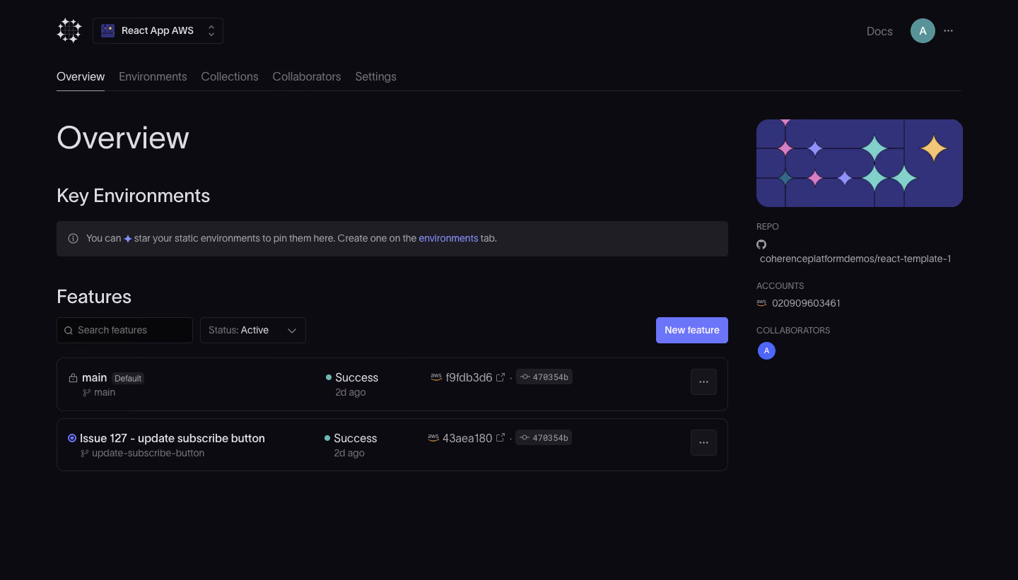
# Design from Reference: Coherence Dashboard
Create an original, high-fidelity visual design inspired by the reference. Prioritize composition, typography, colors, spacing, and component styling over technical implementation.
## Reference
- **Product:** Coherence
- **Category:** Dashboard
- **Screenshot:** https://cdn.prod.website-files.com/5e9dc792e1210c5325f7ebbc/6acb72b8018523cfee2da16e_6acb70380e8221f130848f59_cms-4cd0a0c9ff2fe76bb4dcf0e3.webp
Analyze the screenshot first. If inaccessible, request it rather than guessing.
## Content
{{content.instructions}}
{{content.data}}
Preserve essential messaging and factual accuracy. Adapt structure and copy length for visual balance; never invent product claims.
## Visual Design
### Overall aesthetic
- **Character:** Dark developer deployment dashboard with restrained violet emphasis and compact technical metadata.
### Page composition
- **Canvas:** 1440 × 821 screenshot px.
- **Structure:** App selector/header and horizontal tabs; Overview title; Key Environments notice; Features search/filter/action row; two deployment rows; narrow repository/account/collaborator column right.
### Information hierarchy
- **Priority:** Feature status rows carry the operational detail; New feature is the main action. Right column provides environment context.
### Typography
- **Family:** Neutral sans serif, exact family unverified.
- **Scale:** Estimated screenshot page title 44 px, section headings 26 px, row text 16 px and metadata 13–14 px.
### Colors & surfaces
- **Sampled palette:** Near-black #0B0B10, notice #1F1E25, violet artwork #32317B, subtle surface #24232B, action #6A75F9 and light text #DEDDE3.
### Components
- **Rows:** Fine outlined rounded rectangles with branch/name, success dot/status, age, cloud/revision badges and trailing overflow button.
- **Filters:** Outlined dark search and status controls; compact violet New feature button.
- **Context:** Rounded decorative violet tile with pastel star forms above repository/account metadata; small circular collaborator avatar.
### Visual rhythm
- **Spacing:** Estimated screenshot 24–40 px section gaps; row heights approximately 74 px; broad lower empty canvas.
### Responsive
- **Observed:** Desktop only.
- **Adaptation:** Move contextual metadata below feature rows, collapse tabs into a scrollable strip and wrap revision information without truncating key status.
### Adaptation guidance
- **Preserve:** Near-black layered surfaces, clear status indicators and compact deployment rows.
- **Replace:** Use genuine repository/cloud metadata; do not reproduce account identifiers or commit hashes.
Use this context to reproduce the reference's visual language: layout, typography, colors, spacing, borders, radii, and distinctive elements. The screenshot takes priority if descriptions conflict.
## Direction
{{preferences.fidelityInstructions}}
## Output
{{output.instructions}}
Deliver a polished, cohesive design with precise alignment, hierarchy, and spacing. Produce the requested visual artifact, not just a description. If unsupported, explain the limitation.