
Thank you! Your submission has been received!
Oops! Something went wrong while submitting the form.
Get SaaSFrame Pro
Monthly
$18
Quarterly
$48
Yearly
$180
Upgrade to access this feature
Browse all screens & flows
Filter and search screens & flows
Access Figma files
Access mobile versions
Bookmark screens & flows
Join now
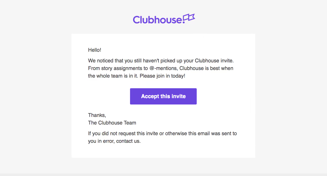
Shortcut lubhouse Invitation Emails

Shortcut
Project Management for Software Teams
Designed by
No items found.

Bookmark
Bookmark

Design with AI
Thank you! Your submission has been received!
Oops! Something went wrong while submitting the form.
# Design from Reference: Shortcut lubhouse Invitation Emails
Create an original, high-fidelity visual design inspired by the reference. Prioritize composition, typography, colors, spacing, and component styling over technical implementation.
## Reference
- **Product:** Shortcut
- **Category:** Invitation Emails
- **Screenshot:** https://cdn.prod.website-files.com/5e9dc792e1210c5325f7ebbc/6acbc9431790037d3e0591c4_6acbc6594a8f67bb0c2ff686_cms-37d66fccdbb5878736ebc7dc.webp
Analyze the screenshot first. If inaccessible, request it rather than guessing.
## Content
{{content.instructions}}
{{content.data}}
Preserve essential messaging and factual accuracy. Adapt structure and copy length for visual balance; never invent product claims.
## Visual Design
### Overall aesthetic
- **Style:** Simple branded invitation-reminder email with a light-gray surround, white message rectangle and violet identity/action.
- **Character:** A brief personal greeting and team sign-off keep the message direct and conversational.
- **Capture:** The image measures 1290 × 694 pixels. Email/browser scale is unverified; observed dimensions below refer to screenshot pixels, with CSS suggestions identified separately. The visible brand is Clubhouse.
### Page composition
- **Brand area:** A violet wordmark is centered above the message with generous top whitespace.
- **Message panel:** A white rectangle approximately 725 image pixels wide occupies the center, beginning around y133.
- **Content sequence:** Greeting, invitation reminder, centered acceptance button, team sign-off and a final assistance/error paragraph.
- **Reading inset:** Main copy begins roughly 65 image pixels inside the panel.
- **Surround:** Broad pale-gray margins frame the message; no navigation or promotional footer is visible.
### Information hierarchy
- **Brand:** The violet wordmark is the only large identity element.
- **Reminder:** A short paragraph explains the outstanding invitation and team-collaboration context.
- **Primary action:** The solid violet acceptance button is the strongest element inside the white panel.
- **Closing:** Sign-off text is followed by lower-priority assistance guidance.
- **State scope:** This is an invitation reminder, not an accepted-invitation or product onboarding screen.
### Typography
- **Family:** A conventional sans-serif is visible; exact font identity is unverified.
- **Body:** Approximately 20–21 image pixels with around 30-pixel line height; an implementation could use roughly 16-pixel CSS text at an appropriate email scale.
- **Button label:** Approximately 22 image pixels, bold, white and centered.
- **Paragraph hierarchy:** Greeting, reminder and sign-off share the same general body scale rather than using separate display headings.
- **Brand typography:** The wordmark is artwork and should not be treated as evidence for the body font.
### Colors & surfaces
- **Measured surround:** Light gray #F6F6F6 fills the exterior canvas.
- **Measured panel:** White #FFFFFF fills the message rectangle.
- **Measured accent:** Violet #6A45DE appears prominently in the brand/action family.
- **Measured text:** Dark gray #424042 carries the body copy.
- **Measured lower edge:** #EEEEEE appears in the narrow bottom boundary region.
- **Depth:** No visible shadow, gradient or heavy border frames the panel.
### Components
- **Wordmark:** A centered violet text-and-flag-style brand mark sits above the message.
- **Message container:** A plain white rectangular panel with generous padding and square-looking corners.
- **Acceptance button:** Approximately 263 × 64 image pixels, with slight corner rounding and a bold centered label.
- **Text blocks:** Short paragraphs use natural wrapping across the same left-aligned measure.
- **Closing assistance:** A final two-line paragraph provides a contact route for an unexpected invitation.
- **Interaction scope:** The screenshot shows one static action; no hover, loading or destination state is evidenced.
### Visual rhythm
- **Panel spacing:** A large gap separates the wordmark from the body panel.
- **Paragraph gaps:** Modest breaks distinguish greeting, reminder, sign-off and assistance copy.
- **Action emphasis:** The button is centered with larger white-space gaps above and below it.
- **Alignment contrast:** Branding and action are centered, while message prose stays left aligned.
- **Density:** The short message fits within a single open panel without secondary modules.
### Responsive
- **Recommendation — width:** Use a fluid email panel capped at a readable width, with comfortable side padding.
- **Recommendation — text:** Preserve body size and allow paragraphs to wrap rather than shrinking the complete email.
- **Recommendation — action:** Keep the acceptance button comfortably tappable and within the available width.
- **Recommendation — branding:** Scale the wordmark while maintaining whitespace around it. No mobile rendering is shown.
### Adaptation guidance
- **Preserve the reminder structure:** Keep outstanding-invitation context, a single acceptance route and a concise team closing.
- **Reuse limited tokens:** Maintain light-gray surround, white panel, dark copy and violet primary action.
- **Keep one dominant action:** Avoid adding competing calls to action to this compact message.
- **Maintain email robustness:** Use semantic paragraphs and a button treatment that works across email clients.
- **Respect visible branding:** Describe or recreate the captured Clubhouse identity independently from the record's later product naming.
- **Define acceptance separately:** The destination, authentication and successful-join states are not shown.
Use this context to reproduce the reference's visual language: layout, typography, colors, spacing, borders, radii, and distinctive elements. The screenshot takes priority if descriptions conflict.
## Direction
{{preferences.fidelityInstructions}}
## Output
{{output.instructions}}
Deliver a polished, cohesive design with precise alignment, hierarchy, and spacing. Produce the requested visual artifact, not just a description. If unsupported, explain the limitation.


Category
Patterns
No items found.
Tech Stack

Added on
February 4, 2023
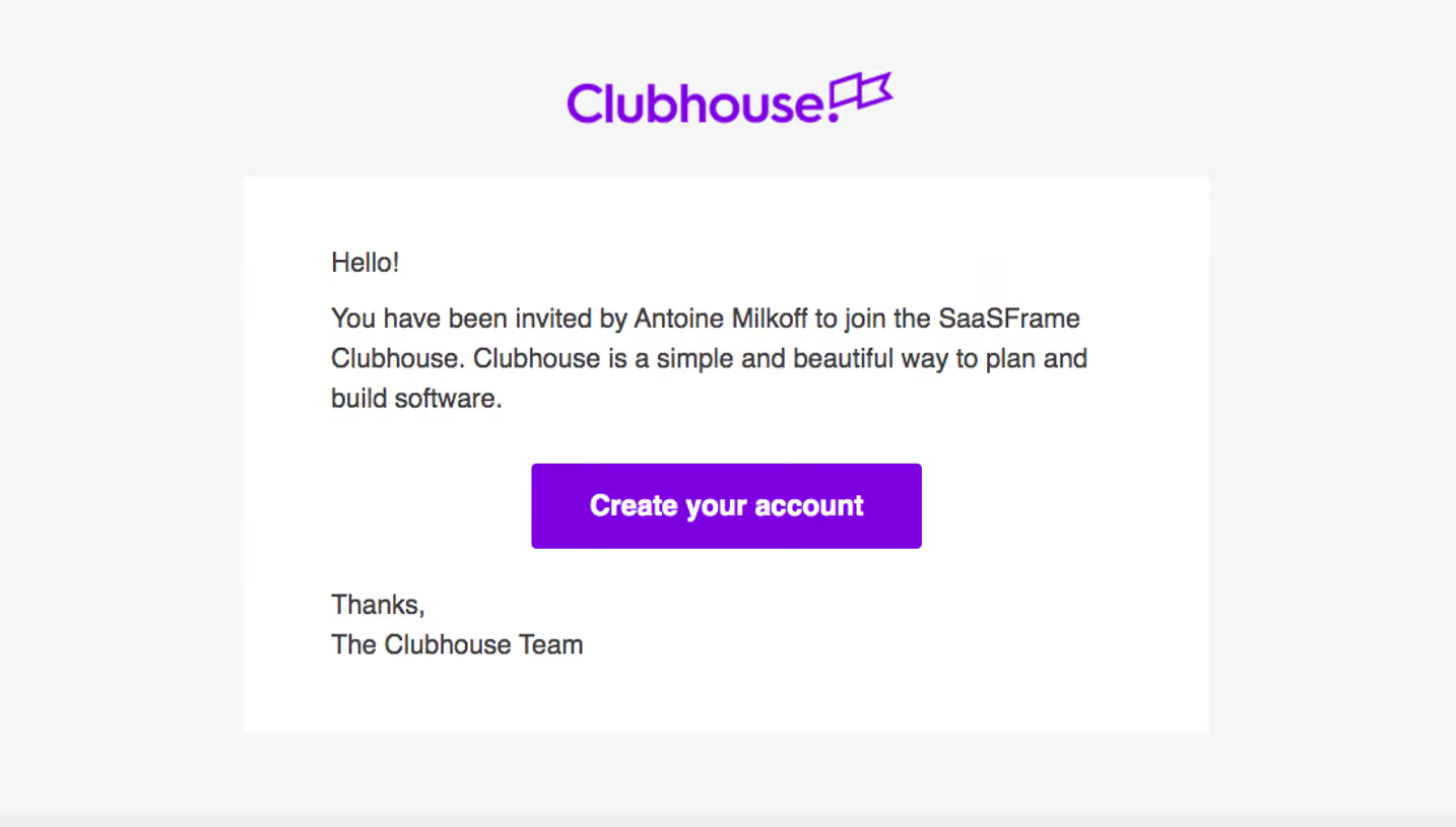

Similar screens







Upgrade to SaaSFrame Pro now to see similar examples.
Monthly
$18 /month
Billed $18 monthly
Browse all screens & flows
Filter and search screens & flows
Search text in screenshots
Access Figma files
Access mobile versions
Join now
Quarterly
$16 /month
Billed $48 quarterly
Browse all screens & flows
Filter and search screens & flows
Search text in screenshots
Access Figma files
Access mobile versions
Join now
Yearly
$15 /month
Billed $180 yearly
Browse all screens & flows
Filter and search screens & flows
Search text in screenshots
Access Figma files
Access mobile versions
Join now