Design with AI
Generate a new design based on this screen using your own content.
# Design from Reference: Shortcut lubhouse Affiliate Page
Create an original, high-fidelity visual design inspired by the reference. Prioritize composition, typography, colors, spacing, and component styling over technical implementation.
## Reference
- **Product:** Shortcut
- **Category:** Affiliate Page
- **Screenshot:** https://cdn.prod.website-files.com/5e9dc792e1210c5325f7ebbc/62ec9c6508e2d8619c29718c_1659620717407-screenshot-device-c0d62c7dd514661109c9ebb0a96a2e64-1659599243999.webp
Analyze the screenshot first. If inaccessible, request it rather than guessing.
## Content
{{content.instructions}}
{{content.data}}
Preserve essential messaging and factual accuracy. Adapt structure and copy length for visual balance; never invent product claims.
## Visual Design
### Overall aesthetic
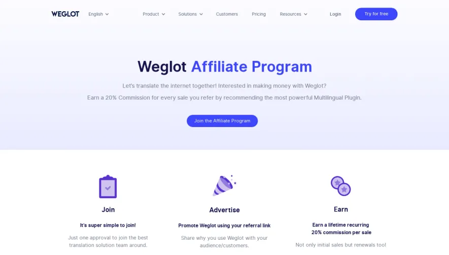
- **Character:** A spacious referral-program page with soft gray type, blue pill actions, a three-column reward comparison and playful outlined geometry.
- **Evidence scale:** Original 1456 × 2852 pixels, inspected through both readable crops. Dimensions are image-pixel estimates; CSS scale is unverified.
### Page composition
- **Header:** Purple announcement strip, then brand/navigation row with account and signup actions.
- **Hero:** Centered large referral heading, two-line supporting message and blue referral-link button.
- **Rewards:** A roughly 1150 px wide bordered table has three equal columns for the referred organization, individual rewards and referring organization.
- **Repeat CTA:** Broad pale-gray band contains a centered multi-line statement and repeated blue action, with colorful outline shapes along the edges.
- **Footer:** Brand symbol left, product/company/developer/resource groups and blog snippets, then copyright/legal links.
### Information hierarchy
- **Hero promise:** Large light-weight headline leads, followed by a single clear action.
- **Reward comparison:** Small colored header labels precede large reward names/amounts; supporting terms are smaller and muted.
- **Individual tiering:** Three centered prize blocks use bold labels with smaller referral counts.
- **Closing emphasis:** A repeated centered action gives a second opportunity after the reward details.
### Typography
- **Hero:** Unverified rounded sans-serif, approximately 64 px regular, 76 px line height and tight tracking.
- **Reward values:** Around 44–48 px semibold, 52 px line height.
- **Secondary display:** Approximately 44 px regular with 60 px line height.
- **Body:** Around 16–20 px regular, 26–32 px line height.
- **Column/feature labels:** Approximately 20 px semibold; footer around 14–16 px.
### Colors & surfaces
- **Base:** Measured white #FFFFFF.
- **Pale sections:** #F8F8F8 supports reward headers and the repeat CTA.
- **Text:** Dark gray #404042, muted gray copy and purple #452B5A accents.
- **Action:** Blue #3A96C9 fills pill buttons and selected text accents.
- **Decoration:** Small green #90D68F shapes plus pink, yellow, cyan and purple line art.
### Components
- **Top strip:** Approximately 50 px purple bar with centered message/link and right close icon.
- **Referral buttons:** Approximately 232 × 50 px blue pills, white medium-weight text.
- **Reward table:** Thin pale border and vertical rules, square corners, roughly 60 px header band and generous interior spacing.
- **Tier blocks:** Unboxed centered text with subtle short separators and referral counts below bold prize names.
- **Background motifs:** Sparse dot grid behind the table; outlined cylinders, triangles and rectangles flank the lower CTA.
- **Footer:** Four navigation groups arranged in two vertical tiers, blog snippets in blue and four social icons.
### Visual rhythm
- **Hero spacing:** Broad gaps between header, heading, copy and action.
- **Table alignment:** Equal columns share reward-title baselines while the center column contains a denser tier list.
- **CTA break:** Large pale block resets the page after detailed terms.
- **Footer:** Open columns and regular link pitch retain the page's airy character.
### Responsive
- **Observed limit:** Desktop only; smaller layouts are unverified.
- **Recommendation:** Stack reward columns as labeled cards and preserve which beneficiary each reward belongs to.
- **Decoration/footer:** Crop edge geometry and wrap footer groups without shrinking text excessively.
### Adaptation guidance
- **Retain:** Explain beneficiary-specific rewards in parallel columns, then repeat one referral action.
- **Implement:** Use thin rules, generous spacing and restrained blue pills with playful peripheral geometry.
- **Verify:** Confirm fonts, actual scale and current referral terms separately; no referral link was generated or sent.
Use this context to reproduce the reference's visual language: layout, typography, colors, spacing, borders, radii, and distinctive elements. The screenshot takes priority if descriptions conflict.
## Direction
{{preferences.fidelityInstructions}}
## Output
{{output.instructions}}
Deliver a polished, cohesive design with precise alignment, hierarchy, and spacing. Produce the requested visual artifact, not just a description. If unsupported, explain the limitation.