
Thank you! Your submission has been received!
Oops! Something went wrong while submitting the form.
Get SaaSFrame Pro
Monthly
$18
Quarterly
$48
Yearly
$180
Upgrade to access this feature
Browse all screens & flows
Filter and search screens & flows
Access Figma files
Access mobile versions
Bookmark screens & flows
Join now
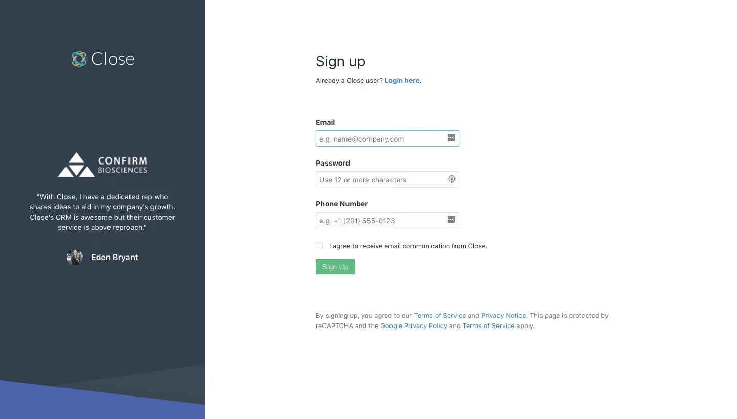
Close Signup Page

Close
Inside Sales Software
Designed by
No items found.

Bookmark
Bookmark

Design with AI
Thank you! Your submission has been received!
Oops! Something went wrong while submitting the form.
# Design from Reference: Close Signup Page
Create an original, high-fidelity visual design inspired by the reference. Prioritize composition, typography, colors, spacing, and component styling over technical implementation.
## Reference
- **Product:** Close
- **Category:** Signup
- **Screenshot:** https://cdn.prod.website-files.com/5e9dc792e1210c5325f7ebbc/6acbd0408f05a14579f046fb_6acbcd206d0a156378f79a3a_cms-6b6ad1918375b4a80d5c7df1.webp
Analyze the screenshot first. If inaccessible, request it rather than guessing.
## Content
{{content.instructions}}
{{content.data}}
Preserve essential messaging and factual accuracy. Adapt structure and copy length for visual balance; never invent product claims.
## Visual Design
### Overall aesthetic
- **Style:** Simple desktop signup page with a full-height dark testimonial panel at left and a sparse white registration area at right.
- **Character:** Conventional compact form controls, small supporting text and restrained green/blue actions. The page relies on whitespace and customer proof rather than decorative cards.
- **Brand treatment:** A multicolored line emblem accompanies the light Close wordmark. Angled slate and blue shapes decorate the bottom edge of the dark panel.
### Page composition
- **Capture scale:** 1440 × 820 image px. Dimensions below are image-space measurements with approximate CSS reconstruction assuming an unverified 1× capture.
- **Left panel:** Approximately 400 px wide, or 28% of the page. The logo is horizontally centered near y=115 px; customer proof is centered in the middle portion.
- **Testimonial arrangement:** A white customer logo sits above a compact four-line quote. A circular author portrait and bold name form a centered row below.
- **Right region:** A white area occupies the remaining approximately 1040 px. The form begins around x=617, y=109 px, leaving substantial space between it and the left panel.
- **Heading block:** Sign up appears above a small existing-user sentence with a blue login link.
- **Form stack:** Three labeled fields—Email, Password and Phone Number—are arranged vertically. Below are an unchecked email-communication checkbox and a small green Sign Up button.
- **Legal block:** A two-line legal/privacy paragraph begins roughly 75 px beneath the action button and spans approximately 580 px, wider than the inputs.
- **Unused space:** The rightmost area and the lower white region remain empty; there is no enclosing form card or main navigation.
### Information hierarchy
- **Task focus:** The signup heading and aligned field labels define the primary task, while the customer quote provides reassurance in a separate visual zone.
- **Form order:** Email, password and phone number establish a clear top-to-bottom sequence. The password placeholder specifies a minimum character count.
- **Secondary route:** Login here is the only prominent alternate access path and sits immediately beneath the title.
- **Consent and legal hierarchy:** The optional communication statement is next to a small checkbox; contractual and reCAPTCHA information are grouped farther below in muted text.
- **Captured state:** Email has a visible blue focus outline. Inputs are otherwise empty and the consent checkbox is unchecked. No error, success or submission state is shown.
### Typography
- **Family:** Neutral sans serif for form, testimonial and supporting content. Exact font identity is unverified; the brand wordmark uses a lighter custom-looking treatment.
- **Heading:** Approximately 28 px, regular or medium weight, with about 34 px line-height and dark slate coloring.
- **Field labels:** Approximately 14 px, bold around 600–700, with compact 18–20 px leading.
- **Input and action text:** Approximately 14 px, regular weight. Placeholder text uses medium gray; the green action uses white text.
- **Support and legal text:** Approximately 13–14 px with 19–20 px leading. Links use blue color while remaining close to the surrounding text size.
- **Testimonial:** Approximately 14 px with 20 px leading and centered alignment. The author name is bold and slightly more prominent.
- **Measurement limit:** Sizes, weights and line-height values are visual reconstruction estimates under the assumed 1× scale.
### Colors & surfaces
- **Main canvas:** Sampled sRGB #FFFFFF fills the registration region and input interiors.
- **Testimonial surface:** Sampled dark slate #323F4D fills most of the left panel. A related sampled #3C4855 forms a secondary angled shape near its base.
- **Decorative blue:** Sampled #4A64AA supplies the large bottom diagonal wedge.
- **Primary action:** Sampled #5EBC80 is the green signup-button fill.
- **Borders:** Sampled #E5E5E5 supplies a light neutral reference for the input and checkbox outlines.
- **Text and links:** The white region uses dark slate labels and muted gray secondary text. The focused field border and inline links are blue; their precise hex is not established by the dominant-color sample.
- **Contrast treatment:** Testimonial text and logos are light against slate. Keep this strong separation while maintaining clear legal-text contrast on white.
### Components
- **Inputs:** Approximately 280 px wide and 32 px tall, with 1 px light-gray borders, small 3–4 px radii and about 7–9 px horizontal padding.
- **Field spacing:** Labels sit roughly 7–9 px above their controls; field groups are separated by about 24–28 px.
- **Focused email field:** A thin blue edge and subtle pale outer highlight indicate focus without changing the white fill.
- **Trailing icons:** Small utility-style glyphs appear at the right edge of the fields. Their precise function is not established from the screenshot.
- **Checkbox row:** A roughly 14 px unchecked square aligns with a single-line communication statement, with a modest horizontal gap.
- **Signup button:** A compact approximately 78 × 30 px green rectangle, small radius and white centered label. It aligns with the form's left edge rather than filling the input width.
- **Customer proof:** Centered white logo, quotation, small circular grayscale portrait and bold author name. No enclosing border or shadow is present.
- **Bottom decoration:** Two broad diagonal polygons meet the left panel's lower edge, adding brand color without overlapping the form.
### Visual rhythm
- **Split contrast:** A visually dense dark reassurance panel balances a much lighter and wider form region.
- **Vertical pacing:** Logo, customer logo, quote and attribution form a loose centered stack on the left. The form uses a tighter repeatable label/input rhythm.
- **Alignment:** Title, helper sentence, labels, inputs, checkbox, action and legal block share the same left edge.
- **Whitespace:** Large gaps around the compact form make the page feel quiet. The legal block is intentionally separated from the immediate submission controls.
### Responsive
- **Evidence limit:** Only desktop is shown; the following are recommendations.
- **Layout recommendation:** Prioritize the registration form on narrow screens and move the testimonial below it or reduce it to a short proof strip.
- **Form recommendation:** Expand fields to available width with 20–24 px outer margins and increase control height toward 44 px for touch use.
- **Copy recommendation:** Let consent and legal text wrap naturally without shrinking font size.
- **Decoration recommendation:** Keep the diagonal artwork within the testimonial region so it cannot obstruct inputs or legal links.
### Adaptation guidance
- **Preserve focus:** Pair one concise registration task with relevant customer reassurance, while keeping alternate login and legal information easy to find.
- **Use real evidence:** Replace customer logo, quote, portrait and author details with authorized material; omit the block when no genuine proof exists.
- **Match necessary fields:** Request only information required by the target flow. Do not retain a phone-number field solely because it appears in the reference.
- **Retain the visual language:** Use a dark branded side panel, a white form canvas, compact typography, restrained colored links and a distinct submit accent.
- **Accessibility recommendation:** Provide visible labels, keyboard focus, clear consent semantics and helpful validation. Error handling and submission behavior are not verified by this capture.
Use this context to reproduce the reference's visual language: layout, typography, colors, spacing, borders, radii, and distinctive elements. The screenshot takes priority if descriptions conflict.
## Direction
{{preferences.fidelityInstructions}}
## Output
{{output.instructions}}
Deliver a polished, cohesive design with precise alignment, hierarchy, and spacing. Produce the requested visual artifact, not just a description. If unsupported, explain the limitation.


Category
Patterns
No items found.
Tech Stack




Added on
May 1, 2020
Found in 1 flow
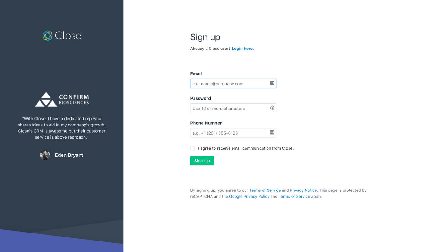
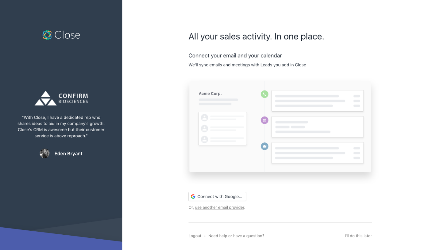

Similar screens
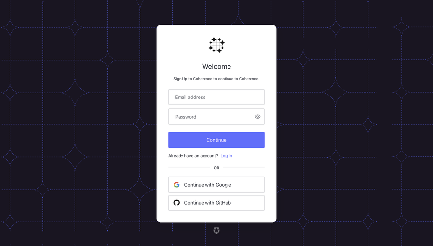




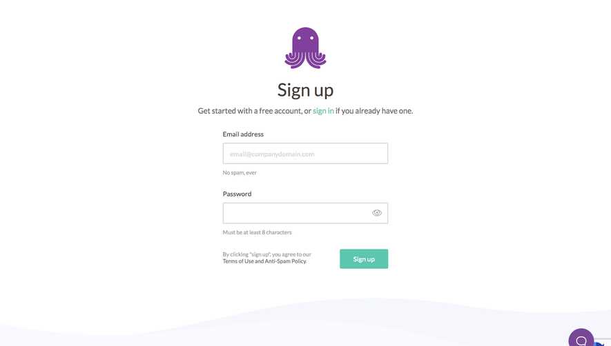

Upgrade to SaaSFrame Pro now to see similar examples.
Monthly
$18 /month
Billed $18 monthly
Browse all screens & flows
Filter and search screens & flows
Search text in screenshots
Access Figma files
Access mobile versions
Join now
Quarterly
$16 /month
Billed $48 quarterly
Browse all screens & flows
Filter and search screens & flows
Search text in screenshots
Access Figma files
Access mobile versions
Join now
Yearly
$15 /month
Billed $180 yearly
Browse all screens & flows
Filter and search screens & flows
Search text in screenshots
Access Figma files
Access mobile versions
Join now