
Thank you! Your submission has been received!
Oops! Something went wrong while submitting the form.
Get SaaSFrame Pro
Monthly
$18
Quarterly
$48
Yearly
$180
Upgrade to access this feature
Browse all screens & flows
Filter and search screens & flows
Access Figma files
Access mobile versions
Bookmark screens & flows
Join now
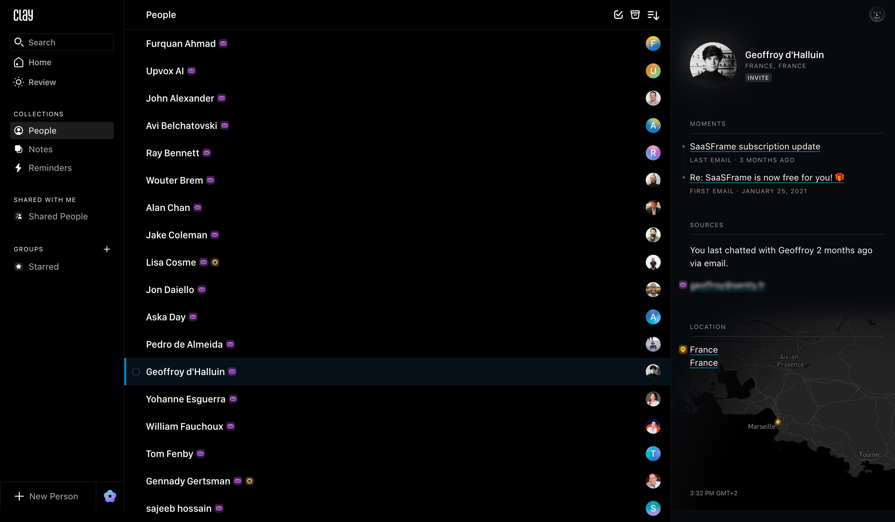
Clay Contacts Dashboard

Clay
Be more thoughtful with the people in your network.
Designed by
No items found.

Bookmark
Bookmark

Design with AI
Thank you! Your submission has been received!
Oops! Something went wrong while submitting the form.
# Design from Reference: Clay Contacts Dashboard
Create an original, high-fidelity visual design inspired by the reference. Prioritize composition, typography, colors, spacing, and component styling over technical implementation.
## Reference
- **Product:** Clay
- **Category:** Table
- **Screenshot:** https://cdn.prod.website-files.com/5e9dc792e1210c5325f7ebbc/6acb69955e515b69c7964e34_6acb67dac8e486b21178848e_cms-8eb859727635e3fc1fcb8ac3.webp
Analyze the screenshot first. If inaccessible, request it rather than guessing.
## Content
{{content.instructions}}
{{content.data}}
Preserve essential messaging and factual accuracy. Adapt structure and copy length for visual balance; never invent product claims.
## Visual Design
### Overall aesthetic
- **Character:** Dense, dark contact-management workspace with a nearly black canvas, restrained dividers, compact white text and small colored identity markers.
- **Evidence and scale:** Screenshot is 2880 × 1680 image pixels. Dimensions estimate a 1440 × 840 CSS viewport at 2× capture scale; actual DPR and typeface remain unverified.
### Page composition
- **Navigation rail:** Approximately 200px CSS wide, full height, with a small wordmark, outlined search box, primary links, grouped collection navigation and a bottom create-person control.
- **People list:** The central region spans approximately 880px CSS. A slim header contains the list title and right-aligned utility icons; repeated contact rows occupy the rest.
- **Detail pane:** Approximately 360px CSS wide at right, with a portrait/name header, small invite badge, activity links, source information and a dark map/location region.
- **Pane boundaries:** Fine vertical rules separate all three regions. The selected row runs across the center list and aligns with its detail content.
### Information hierarchy
- **Workspace levels:** Small uppercase, letter-spaced group labels organize the rail; brighter regular-sized labels identify destinations and contacts.
- **Selection:** The active person uses a full-width blue-black row fill and a thin cyan left edge, establishing which detail pane is open.
- **Detail structure:** Profile identity leads, followed by uppercase section labels, underlined activity titles, muted metadata and map information. Actual personal identifiers are incidental to this design pattern.
### Typography
- **Navigation and rows:** Neutral sans-serif around 14–15px CSS, regular-to-medium weight. Contact names remain one line.
- **Section metadata:** Approximately 10–11px uppercase text with tracking around 1px gives rail groups, activity dates and detail categories a quieter level.
- **Identity header:** Profile name is approximately 15px medium weight; location and badge text are smaller and more widely tracked. The narrow brand wordmark has a distinct condensed appearance, with exact family unverified.
### Colors & surfaces
- **Measured backgrounds:** #000000 dominates the list and rail; #090A0B appears in the detail area. #242424 and #1D1D1D support selected navigation and subtle controls.
- **Measured selection:** Deep blue-black #06111A creates the active row, with saturated cyan-blue #0088C3 appearing in small accents.
- **Foreground:** White #FFFFFF handles primary labels, muted gray handles secondary copy and fine rules. Tiny purple communication badges and multicolor circular avatars add local accents.
### Components
- **Search and rail items:** A thin outlined search field is approximately 166 × 28px CSS with a small radius. Active collection navigation uses a rounded charcoal rectangle and white icon.
- **Contact rows:** Approximately 44px CSS high, with left-aligned names, tiny purple envelope badges and right-aligned circular avatars around 24px. The active row also exposes a small checkbox.
- **Profile header:** A circular portrait near 72px CSS sits beside compact identity text and a small rectangular invite badge.
- **Detail modules:** Activity and source groups are divided by thin horizontal rules. A dark map uses subdued roads and a small warm location marker; no bright map base competes with the text.
### Visual rhythm
- **List repetition:** Even row heights and a shared avatar edge make a long contact list easy to scan.
- **Rail grouping:** Approximately 28–40px vertical breaks separate navigation categories; short gaps connect individual links within each category.
- **Density contrast:** The central list is repetitive and compact, while larger gaps between right-pane modules separate identity, history, sources and location.
### Responsive
- **Observed limit:** Only the desktop three-pane state is visible. Collapsed rails, narrow screens and hover interactions are not shown.
- **Recommended navigation:** Collapse the rail to icons or a drawer at narrower widths; show the detail pane as a separate route or overlay on phones.
- **Recommended selection:** Preserve a clear selected-person cue and a visible return path from details. Avoid shrinking all three panes until names and controls become unreadable.
### Adaptation guidance
- **Preserve the system:** Use near-black surfaces, subtle divider lines, consistent compact rows and one cool selection accent.
- **Separate concerns:** Keep navigation, collection list and person detail as distinct regions with independent scrolling where needed.
- **Implementation:** Provide keyboard navigation, accessible selected-row state and visible focus. Verify contrast for gray metadata and tiny badges; treat the screenshot's invite, email and map content as display evidence only.
Use this context to reproduce the reference's visual language: layout, typography, colors, spacing, borders, radii, and distinctive elements. The screenshot takes priority if descriptions conflict.
## Direction
{{preferences.fidelityInstructions}}
## Output
{{output.instructions}}
Deliver a polished, cohesive design with precise alignment, hierarchy, and spacing. Produce the requested visual artifact, not just a description. If unsupported, explain the limitation.


Category
Patterns
Tech Stack
No items found.
Added on
May 25, 2023
Similar screens
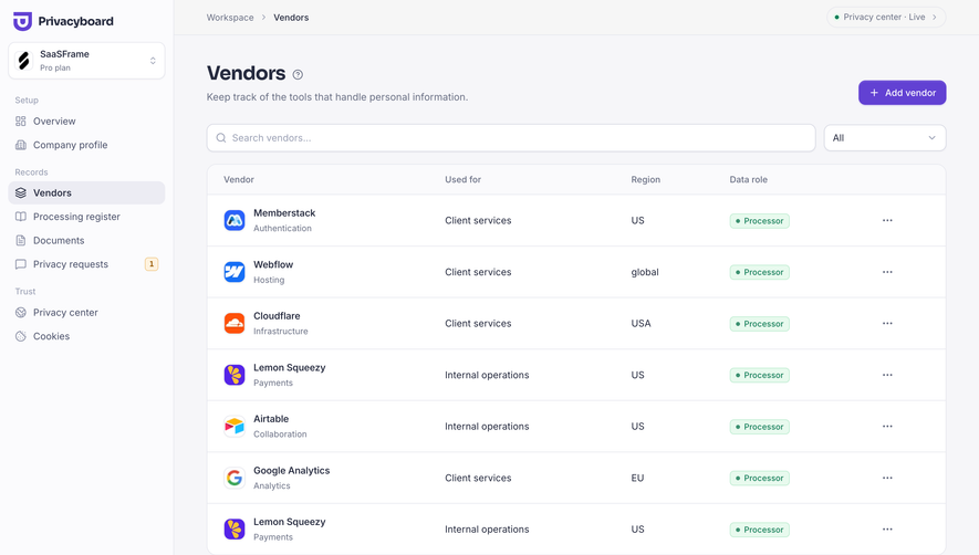


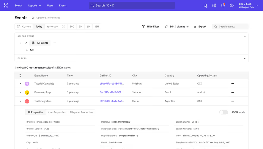

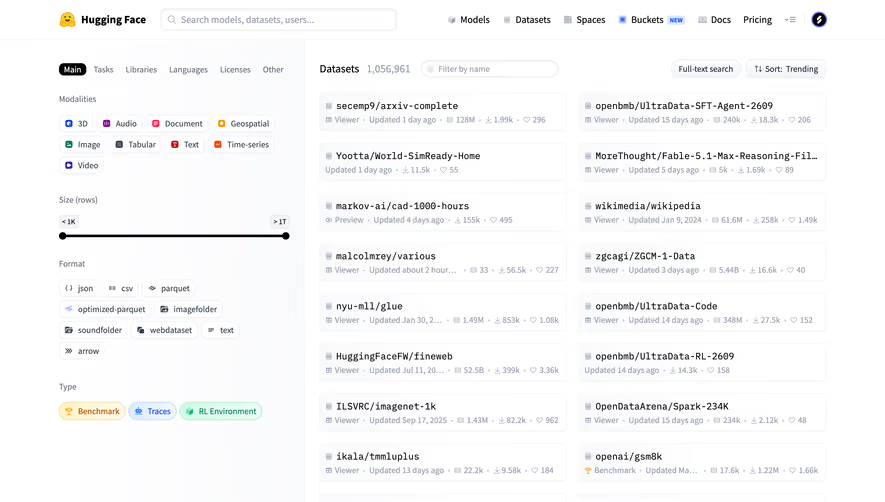

Upgrade to SaaSFrame Pro now to see similar examples.
Monthly
$18 /month
Billed $18 monthly
Browse all screens & flows
Filter and search screens & flows
Search text in screenshots
Access Figma files
Access mobile versions
Join now
Quarterly
$16 /month
Billed $48 quarterly
Browse all screens & flows
Filter and search screens & flows
Search text in screenshots
Access Figma files
Access mobile versions
Join now
Yearly
$15 /month
Billed $180 yearly
Browse all screens & flows
Filter and search screens & flows
Search text in screenshots
Access Figma files
Access mobile versions
Join now