
Thank you! Your submission has been received!
Oops! Something went wrong while submitting the form.
Get SaaSFrame Pro
Monthly
$18
Quarterly
$48
Yearly
$180
Upgrade to access this feature
Browse all screens & flows
Filter and search screens & flows
Access Figma files
Access mobile versions
Bookmark screens & flows
Join now
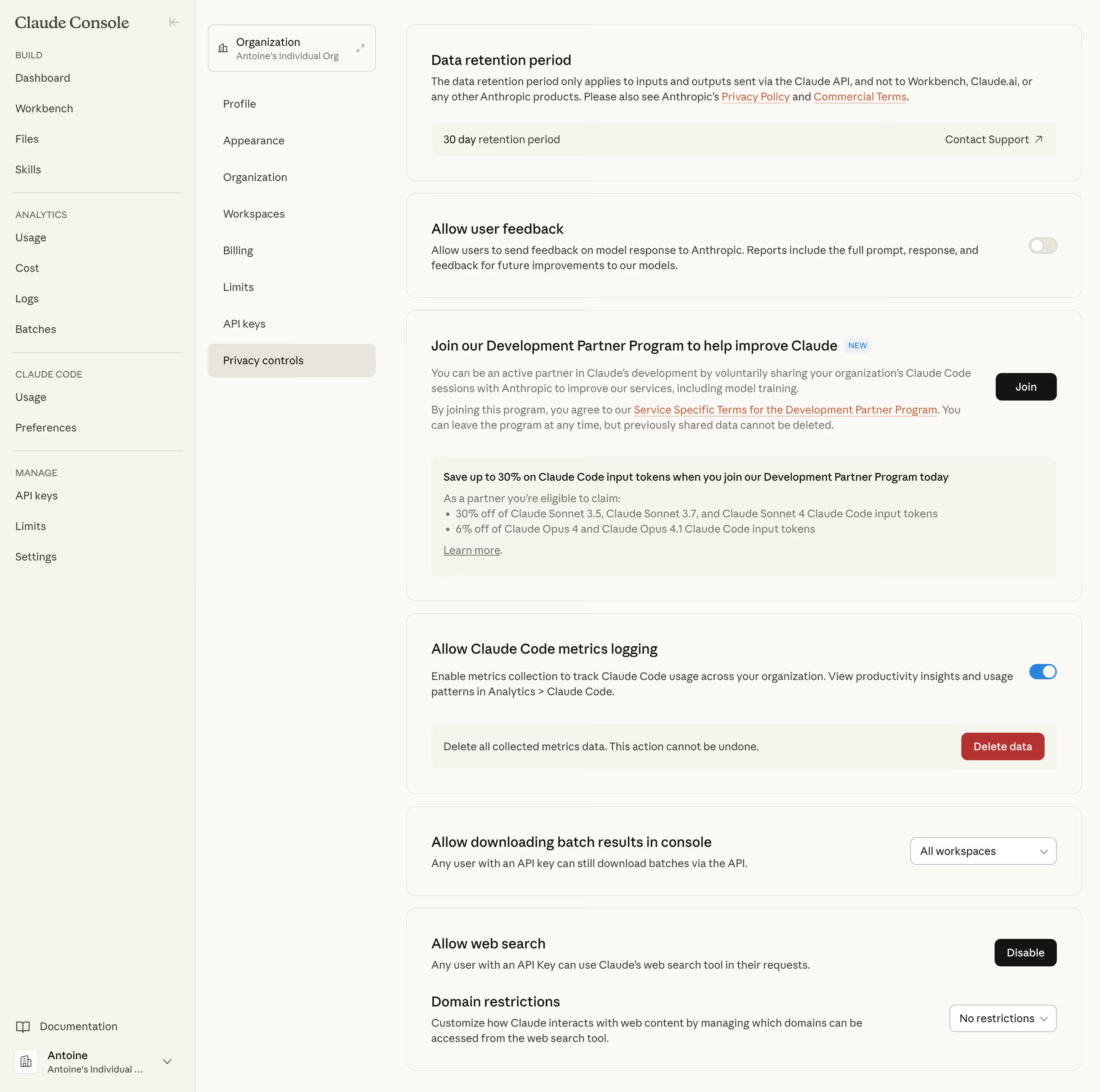

Claude Privacy Controls

Claude
Next generation AI assistant
Designed by
No items found.

Bookmark
Bookmark

Design with AI
Thank you! Your submission has been received!
Oops! Something went wrong while submitting the form.
# Design from Reference: Claude Privacy Controls
Create an original, high-fidelity visual design inspired by the reference. Prioritize composition, typography, colors, spacing, and component styling over technical implementation.
## Reference
- **Product:** Claude
- **Category:** Settings
- **Screenshot:** https://cdn.prod.website-files.com/5e9dc792e1210c5325f7ebbc/69971c4a057f7e118866d7c8_1IkPyYd7XcPwrTvLrflNztAF-jy2K2NPXM-NLqd11IA.avif
Analyze the screenshot first. If inaccessible, request it rather than guessing.
## Content
{{content.instructions}}
{{content.data}}
Preserve essential messaging and factual accuracy. Adapt structure and copy length for visual balance; never invent product claims.
## Visual Design
### Overall aesthetic
- **Character:** A warm-neutral console settings page with two navigation columns and stacked outlined privacy-control panels.
- **Evidence scale:** Original 2880 × 2860 pixels, inspected across the full visible screen. CSS estimates assume an unverified 2× capture scale.
### Page composition
- **Primary rail:** Approximately 256 px wide, with serif Claude Console branding, grouped build/analytics/manage links, documentation and a bottom account control.
- **Settings rail:** Approximately 260 px wide, starting with an organization selector and a vertical settings list. Privacy controls is the active rounded row.
- **Main area:** A roughly 884 px column begins around x532 and contains six vertically stacked panels.
- **Panels:** Data retention, user feedback, development-partner participation, metrics logging, batch-result downloads and web-search/domain settings appear in that order.
### Information hierarchy
- **Panel titles:** Medium-weight dark headings introduce each setting, with smaller explanatory text underneath.
- **State controls:** A gray off-looking feedback switch and blue on-looking metrics switch align at the far right of their panels.
- **Nested information:** Retention and metrics deletion use inset neutral strips; the partner panel contains a larger inset benefit box with bullets.
- **Actions:** Black Join and Disable buttons, a red Delete data button and white dropdowns distinguish action types visually. These are observed controls only.
### Typography
- **Brand:** Unverified serif, approximately 22 px regular.
- **Panel headings:** Unverified sans-serif around 20 px medium, 26 px line height and slightly tight tracking.
- **Body and navigation:** Approximately 14 px regular, 20 px line height; muted text supports longer descriptions.
- **Rail group labels:** Around 12 px uppercase with neutral-to-slightly expanded spacing.
- **Badges/actions:** Small NEW badge around 11 px; button and dropdown text approximately 14 px medium.
### Colors & surfaces
- **Main surface:** Measured warm white #FAF9F5.
- **Rails/insets:** Pale warm #F5F4ED and neighboring cream surfaces differentiate groups without strong contrast.
- **Text:** Near-black #141413 and dark #3D3D3A, with muted #73726C secondary copy.
- **Borders:** Warm light #E8E6DC and #D9D8D4 define cards and controls.
- **Accents:** Blue enabled switch and NEW badge, coral-orange underlined policy links, a black action family and a dark red destructive-action fill.
### Components
- **Main panels:** Approximately 12 px radii, fine warm-gray borders and roughly 32 px padding; heights vary with content.
- **Retention strip:** Broad rounded inset row with value left and Contact Support plus diagonal arrow at right.
- **Switches:** Small approximately 36 × 20 px pill tracks with white circular knobs; feedback knob is left and metrics knob is right.
- **Partner panel:** Title with NEW badge, multiple paragraphs and underlined terms links, a right-aligned black Join button and a pale inset benefit block.
- **Metrics panel:** Explanatory text and blue switch above a neutral deletion strip with a red action button.
- **Dropdowns:** White outlined rounded controls for workspace scope and domain restrictions, with trailing chevrons.
- **Navigation selection:** Broad cream-gray rounded Privacy controls row, darker text and no icon; primary rail groups are separated by fine horizontal rules.
### Visual rhythm
- **Panel cadence:** Approximately 16 px gaps separate cards, while nested title/body/inset groups use 12–24 px spacing.
- **Alignment:** Panel headings and body copy share one left edge; controls anchor near a consistent right inset.
- **Column rhythm:** Primary links use regular vertical spacing, while organization settings form a separate equally spaced list.
- **Density:** Long policy descriptions remain readable through wide panels, restrained line height and clear nested backgrounds.
### Responsive
- **Observed limit:** Desktop settings layout only; collapsed rails and mobile controls are unverified.
- **Recommendation:** Collapse navigation columns progressively and use a single content column with 16–24 px gutters.
- **Panel handling:** Move right-aligned actions below explanatory copy at narrow widths; preserve explicit labels and selected values.
- **Accessibility recommendation:** Pair switch position/color with accessible state text and keep destructive actions distinctly labeled.
### Adaptation guidance
- **Retain:** Group related privacy controls into independent cards and use inset surfaces for secondary values or consequences.
- **Implement:** Keep warm neutrals consistent, reserve blue for enabled state and red for destructive actions, and align controls predictably.
- **Verify:** Confirm fonts, actual scale and control semantics independently. The screenshot's policy copy is not verified current policy; no setting, program enrollment or deletion was changed.
Use this context to reproduce the reference's visual language: layout, typography, colors, spacing, borders, radii, and distinctive elements. The screenshot takes priority if descriptions conflict.
## Direction
{{preferences.fidelityInstructions}}
## Output
{{output.instructions}}
Deliver a polished, cohesive design with precise alignment, hierarchy, and spacing. Produce the requested visual artifact, not just a description. If unsupported, explain the limitation.


Category
Tech Stack

Added on
February 19, 2026
Similar screens



Upgrade to SaaSFrame Pro now to see similar examples.
Monthly
$18 /month
Billed $18 monthly
Browse all screens & flows
Filter and search screens & flows
Search text in screenshots
Access Figma files
Access mobile versions
Join now
Quarterly
$16 /month
Billed $48 quarterly
Browse all screens & flows
Filter and search screens & flows
Search text in screenshots
Access Figma files
Access mobile versions
Join now
Yearly
$15 /month
Billed $180 yearly
Browse all screens & flows
Filter and search screens & flows
Search text in screenshots
Access Figma files
Access mobile versions
Join now