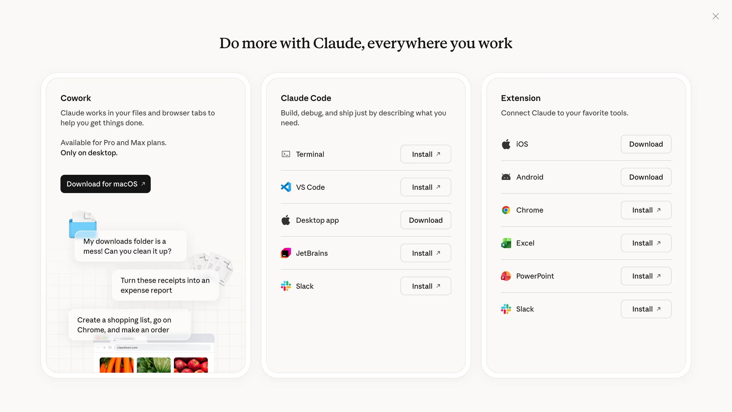
Generate a new design based on this screen using your own content.
Thank you! Your submission has been received!
Oops! Something went wrong while submitting the form.
# Design from Reference: Claude Download Page
Create an original, high-fidelity visual design inspired by the reference. Prioritize composition, typography, colors, spacing, and component styling over technical implementation.
## Reference
- **Product:** Claude
- **Category:** Download Page
- **Screenshot:** https://cdn.prod.website-files.com/5e9dc792e1210c5325f7ebbc/69971c1575ea45240ee3834c_2D1TFv0HAGOMpg4VDA1Yn3Vf_u2wkDUEOxSd2tll3Wg.avif
Analyze the screenshot first. If inaccessible, request it rather than guessing.
## Content
{{content.instructions}}
{{content.data}}
Preserve essential messaging and factual accuracy. Adapt structure and copy length for visual balance; never invent product claims.
## Visual Design
Use this context to reproduce the reference's visual language: layout, typography, colors, spacing, borders, radii, and distinctive elements. The screenshot takes priority if descriptions conflict.
## Direction
{{preferences.fidelityInstructions}}
## Output
{{output.instructions}}
Deliver a polished, cohesive design with precise alignment, hierarchy, and spacing. Produce the requested visual artifact, not just a description. If unsupported, explain the limitation.
First thing you notice is how clean this modal feels. Anthropic's "Do more with Claude" page splits into three distinct product cards: Cowork, Claude Code, and Extension. Each one has a clear purpose and doesn't bleed into the others. The soft beige background on the cards against the white modal creates just enough contrast without being heavy.
Smart Visual Hierarchy
The left card does the most work. It's got an illustrated conversation flow showing real use cases like "My downloads folder is a mess! Can you clean it up?" That grounds the abstract concept of "Cowork" in something tangible. The middle and right columns go minimal with simple icon + label + button rows. Consistent install buttons with subtle arrow icons. No extra decoration needed.
What Makes It Stand Out
Typography is sharp. Bold serif headings paired with clean sans-serif body text. The CTA hierarchy is deliberate: "Download for macOS" gets a filled black button while everything else stays outlined. Small detail but it tells you exactly where to start. Restrained color palette too. Basically monochrome with brand icons providing the only color pops.