Design with AI
Generate a new design based on this screen using your own content.
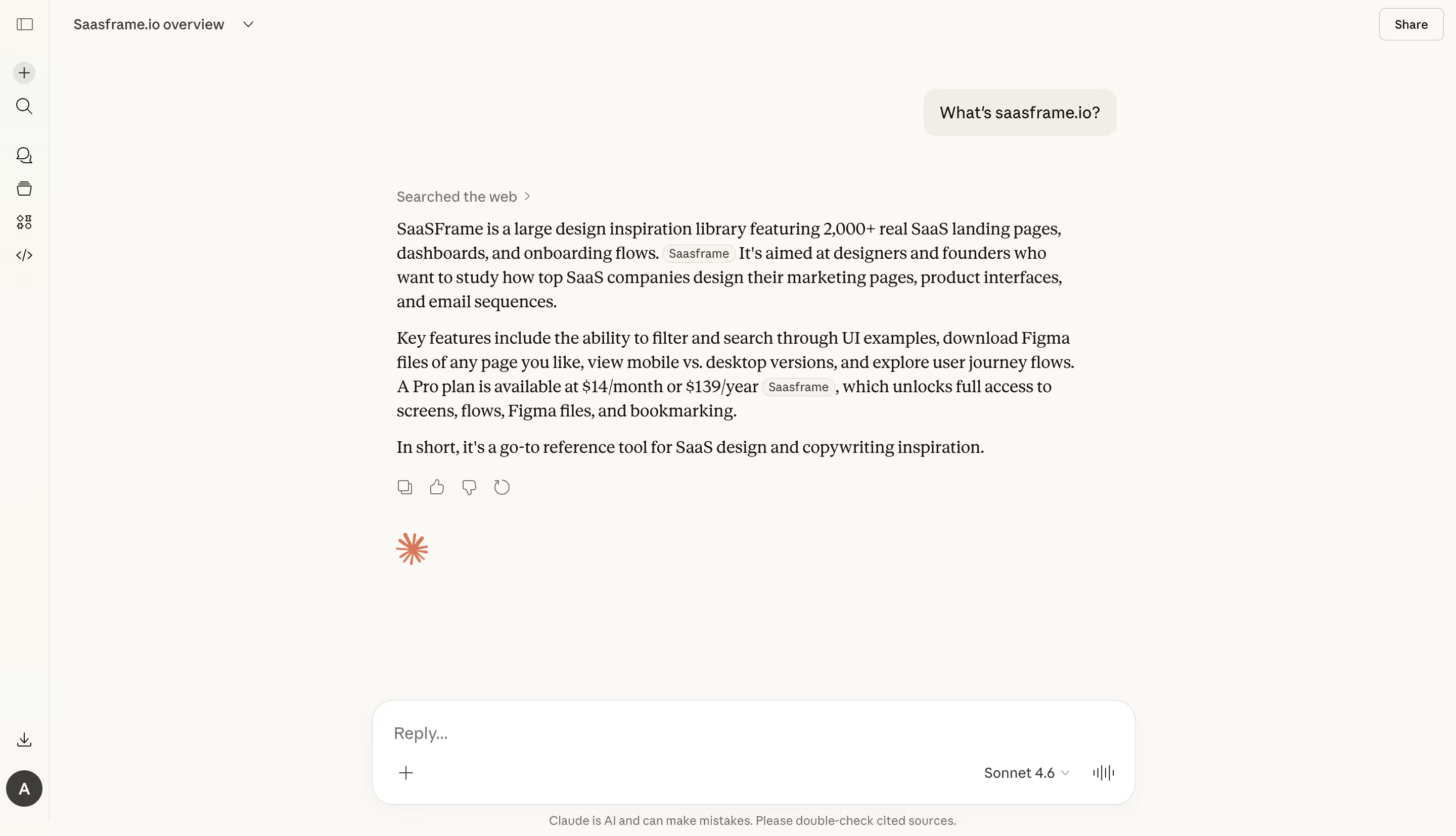
# Design from Reference: Claude Chat Feed
Create an original, high-fidelity visual design inspired by the reference. Prioritize composition, typography, colors, spacing, and component styling over technical implementation.
## Reference
- **Product:** Claude
- **Category:** Chat
- **Screenshot:** https://cdn.prod.website-files.com/5e9dc792e1210c5325f7ebbc/69971bf7a6bbf7e2bcf63f99_dc4VI1u1EwhPk6QC1M61qQccr6AJyNBQdJ9IDBVigcg.avif
Analyze the screenshot first. If inaccessible, request it rather than guessing.
## Content
{{content.instructions}}
{{content.data}}
Preserve essential messaging and factual accuracy. Adapt structure and copy length for visual balance; never invent product claims.
## Visual Design
### Overall aesthetic
- **Style:** Warm, restrained conversational interface with an ivory canvas, serif assistant prose and a white rounded composer.
- **Scale:** Source 2880 × 1654px; dimensions estimate a 1440px-wide CSS viewport at 2× capture scale.
### Page composition
- **Shell:** A narrow approximately 48px icon rail spans the left edge. Conversation title and dropdown sit top left; Share is top right.
- **Conversation:** A roughly 720px central reading column begins around x392. A small right-aligned user bubble sits above a left-aligned assistant answer.
- **Composer:** A broad approximately 756 × 104px white input panel is anchored near the bottom, with a short disclaimer beneath it.
### Information hierarchy
- **Prompt and response:** The user asks a short question in a pale rounded bubble. A Searched the web disclosure precedes three paragraphs of assistant prose.
- **Sources and feedback:** Small inline citation pills appear within paragraphs. Copy, positive/negative feedback and retry icons follow the answer.
- **Input options:** The composer shows Reply, an add control, a model selector and a voice-style waveform control.
### Typography
- **Families:** Serif response text contrasts with sans-serif navigation, prompt and composer labels; exact fonts are unverified.
- **Roles:** Estimated response 18px/24px, UI labels 14px, source pills and disclaimer 11–12px. Paragraphs have distinct vertical spacing.
- **Emphasis:** The response stays mostly regular weight; controls remain small and visually subordinate.
### Colors & surfaces
- **Sampled palette:** ICC-aware sRGB samples include ivory #FAF9F5, white #FFFFFF, ink #141413, pale #F0EEE6 and near-ivory #F9F8F4.
- **Accents:** A small orange starburst appears beneath the answer. Otherwise, neutral grays and warm surfaces dominate.
- **Depth:** The composer has a faint border and soft shadow; the rail boundary is a thin pale vertical rule.
### Components
- **Prompt bubble:** Small warm-gray rounded rectangle with generous horizontal padding and around 16px corners.
- **Composer:** Approximately 20px corners, a text entry area above a bottom utility row, plus icon left and model/voice controls right.
- **Rail:** Stacked thin outline icons, with a circular plus near the top and an initial avatar near the bottom.
- **Sources:** Compact rounded inline chips use a pale outline/fill without interrupting the prose flow.
### Visual rhythm
- **Reading cadence:** A narrow text measure and paragraph gaps make the answer feel editorial. Large empty space separates the response from the composer.
- **Alignment:** Response disclosure, paragraphs, feedback icons and orange mark share one left edge; the prompt is offset right.
### Responsive
- **Recommended adaptation:** Only desktop is observed. Collapse the rail, use viewport-width reading margins and keep the composer above the mobile keyboard.
- **Text:** Retain readable serif body text and allow source pills and long passages to wrap.
### Adaptation guidance
- **Preserve:** Keep warm surfaces, a clear prompt/response distinction, readable prose and a quiet persistent composer.
- **Adapt:** Use actual response and source data. Treat the visible product claims as conversation content rather than facts to reuse in another design.
Use this context to reproduce the reference's visual language: layout, typography, colors, spacing, borders, radii, and distinctive elements. The screenshot takes priority if descriptions conflict.
## Direction
{{preferences.fidelityInstructions}}
## Output
{{output.instructions}}
Deliver a polished, cohesive design with precise alignment, hierarchy, and spacing. Produce the requested visual artifact, not just a description. If unsupported, explain the limitation.