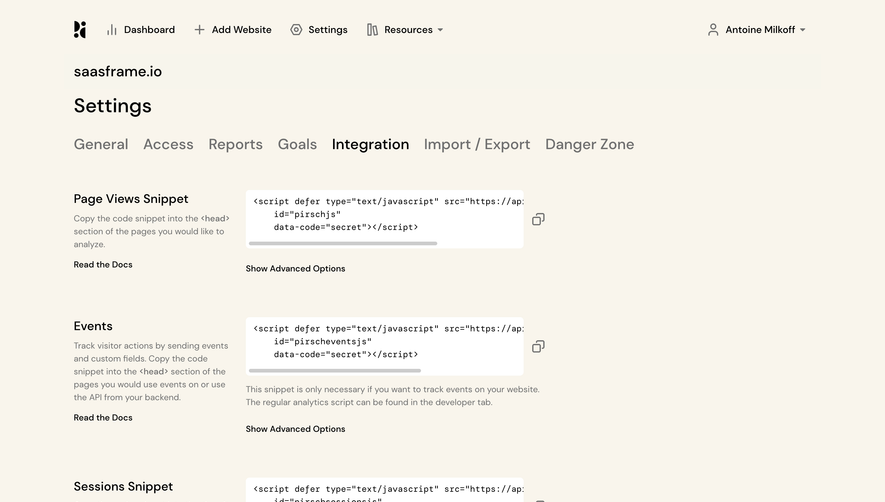
Generate a new design based on this screen using your own content.
Thank you! Your submission has been received!
Oops! Something went wrong while submitting the form.
# Design from Reference: Claude Account Settings
Create an original, high-fidelity visual design inspired by the reference. Prioritize composition, typography, colors, spacing, and component styling over technical implementation.
## Reference
- **Product:** Claude
- **Category:** Settings
- **Screenshot:** https://cdn.prod.website-files.com/5e9dc792e1210c5325f7ebbc/69971c1ef325d56cf155bfd6_JOcZbV_PtEZDsv9AF0tCU-3soaCDV_BKpLJbe92V8JQ.avif
Analyze the screenshot first. If inaccessible, request it rather than guessing.
## Content
{{content.instructions}}
{{content.data}}
Preserve essential messaging and factual accuracy. Adapt structure and copy length for visual balance; never invent product claims.
## Visual Design
Use this context to reproduce the reference's visual language: layout, typography, colors, spacing, borders, radii, and distinctive elements. The screenshot takes priority if descriptions conflict.
## Direction
{{preferences.fidelityInstructions}}
## Output
{{output.instructions}}
Deliver a polished, cohesive design with precise alignment, hierarchy, and spacing. Produce the requested visual artifact, not just a description. If unsupported, explain the limitation.
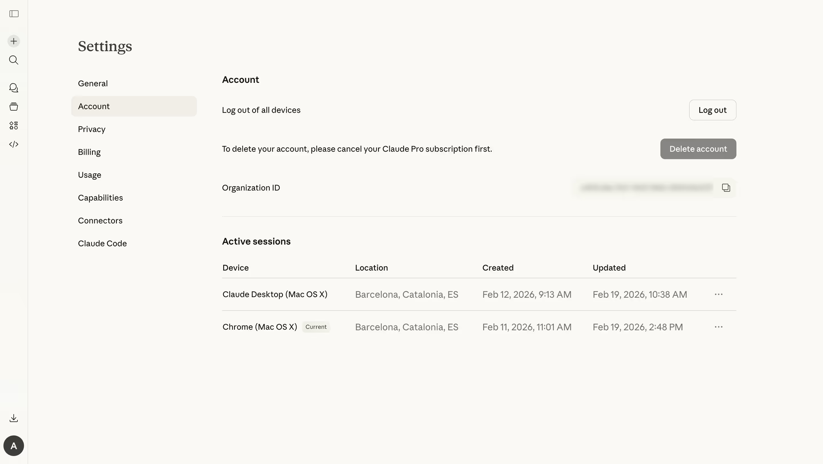
This is Claude's account settings page and it's a masterclass in restraint. The warm off-white background paired with that left sidebar nav feels almost paper-like. Nothing screams at you. Everything just sits where it should.
Layout That Breathes
The two-column structure does the heavy lifting here. Navigation stacked vertically on the left, content flowing on the right with generous whitespace between sections. The "Active sessions" table is clean, with four columns that don't feel cramped at all. Device, Location, Created, Updated. Simple. The "Current" badge on Chrome session is a subtle olive-gray pill that doesn't fight for attention but gives you exactly what you need.
Typography and Color Worth Noting
The type hierarchy is tight. Bold section headers, regular weight body text, all in what looks like a serif or transitional typeface for headings. The red "Delete account" button is the only real color punch on the entire page, and that's intentional. It signals danger without decoration. The "Log out" button stays outlined and minimal by contrast. Smart prioritization through color alone.