
Thank you! Your submission has been received!
Oops! Something went wrong while submitting the form.
Get SaaSFrame Pro
Monthly
$18
Quarterly
$48
Yearly
$180
Upgrade to access this feature
Browse all screens & flows
Filter and search screens & flows
Access Figma files
Access mobile versions
Bookmark screens & flows
Join now
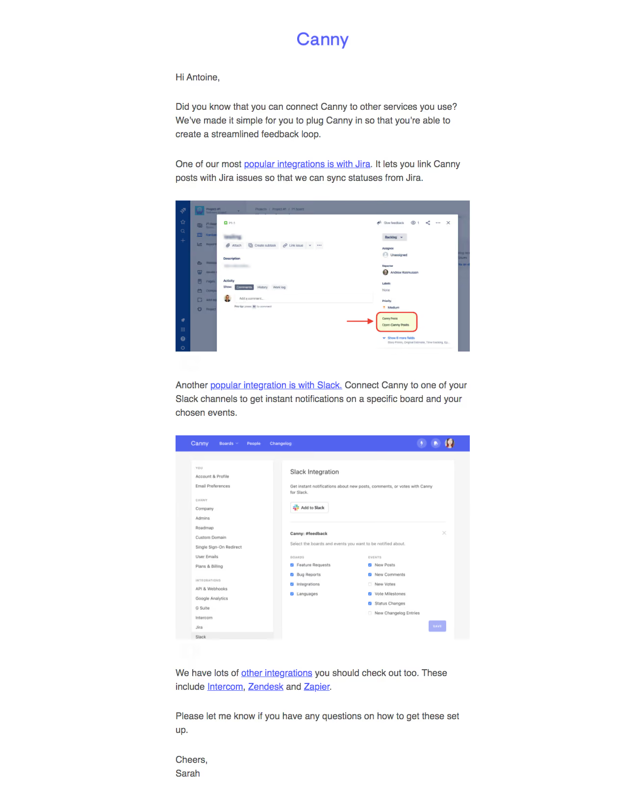
Canny Onboarding Emails

Canny
Keep Track of User Feedback
Designed by
No items found.

Bookmark
Bookmark

Design with AI
Thank you! Your submission has been received!
Oops! Something went wrong while submitting the form.
# Design from Reference: Canny Onboarding Emails
Create an original, high-fidelity visual design inspired by the reference. Prioritize composition, typography, colors, spacing, and component styling over technical implementation.
## Reference
- **Product:** Canny
- **Category:** Onboarding Email
- **Screenshot:** https://cdn.prod.website-files.com/5e9dc792e1210c5325f7ebbc/6acbceb475891049b18401b0_6acbcd23862bf04f5625730e_cms-59b5602c83659792cf2cc05b.webp
Analyze the screenshot first. If inaccessible, request it rather than guessing.
## Content
{{content.instructions}}
{{content.data}}
Preserve essential messaging and factual accuracy. Adapt structure and copy length for visual balance; never invent product claims.
## Visual Design
### Overall aesthetic
- **Style:** Plain educational email with white canvas, gray body text, violet links and two embedded product screenshots.
- **Character:** A small centered wordmark and personal greeting/sign-off keep the tone conversational despite technical guidance.
- **Capture:** The image measures 1299 × 1644 pixels. Email scale is unverified; observed dimensions refer to screenshot pixels, while CSS sizes are estimates.
### Page composition
- **Brand:** A small violet Canny wordmark is centered above the message.
- **Reading column:** A roughly 600-image-pixel-wide column uses left-aligned copy with broad white margins.
- **Introduction:** Greeting and two paragraphs explain connecting the product to other services.
- **First example:** A Jira-related paragraph precedes a wide screenshot with a red pointer annotation.
- **Second example:** A Slack-related paragraph precedes a taller integration-settings screenshot.
- **Closing:** Additional integration links, a support invitation and an individual sign-off finish the message.
### Information hierarchy
- **Learning purpose:** The opening explains the integration benefit without a large display headline.
- **Primary examples:** Jira and Slack links introduce distinct illustrated sections.
- **Screenshot guidance:** The first image highlights a specific linked-post control; the second shows integration configuration.
- **Further exploration:** A final paragraph links to other integrations and named services.
- **Personal support:** The closing invites questions before the sign-off.
- **State scope:** Only one instructional email is shown, not the entire onboarding sequence.
### Typography
- **Family:** A conventional sans-serif is visible; exact identity is unverified.
- **Body:** Approximately 19 image pixels with around 28-pixel line height; an email implementation could use roughly 16-pixel CSS text at an appropriate capture scale.
- **Links:** Violet-blue underlined phrases retain the body size.
- **Brand:** The wordmark is approximately 34 image pixels high.
- **Sign-off:** Normal body text continues into a short two-line closing.
- **Embedded UI:** Small screenshot labels belong to the illustrated products and should not define the email's type scale.
### Colors & surfaces
- **Measured base:** White #FFFFFF fills the canvas.
- **Measured body:** Gray #525252 carries the principal prose.
- **Measured accent:** Violet-blue #515DF9 appears among link/brand pixels; #5163EF occurs prominently in embedded interface artwork.
- **Measured media tones:** #747F95, #798499 and deep blue #073170 appear in screenshot regions.
- **Supporting surfaces:** #F5F6F5 and related pale grays occur inside embedded settings UI.
- **Depth:** The email itself has no enclosing shadow/card; depth is contained within screenshots.
### Components
- **Wordmark:** A centered violet text mark sits above the greeting.
- **Inline links:** Integration names and broader resource references are underlined within prose.
- **Jira screenshot:** A wide landscape image shows an issue panel with a red arrow and outlined highlight around a specific integration control.
- **Slack screenshot:** A taller settings image shows navigation, connection information and checkbox groups.
- **Text blocks:** Short paragraphs are separated by generous whitespace around each image.
- **Closing links:** Several named integration destinations share a final resource paragraph.
- **State scope:** Screenshot controls are illustrative media, not live email inputs.
### Visual rhythm
- **Centered measure:** Brand and body share a narrow central axis.
- **Paragraph spacing:** Larger breaks distinguish introduction, example sections and closing.
- **Image alternation:** Text-image-text-image structure creates a clear instructional cadence.
- **Media widths:** Both screenshots align to the same reading-column edges.
- **Minimal shell:** No footer navigation or promotional card interrupts the learning flow.
### Responsive
- **Recommendation — width:** Use a fluid reading column with a readable maximum.
- **Recommendation — screenshots:** Scale images within the email width and provide useful alternative text or enlarged destinations.
- **Recommendation — links:** Allow long linked phrases to wrap naturally.
- **Recommendation — type:** Preserve body readability rather than shrinking the whole message.
- **Recommendation — structure:** Keep each explanation immediately before its corresponding image. No mobile rendering is evidenced.
### Adaptation guidance
- **Preserve example-led education:** Explain one integration, show it, then move to the next.
- **Keep annotations focused:** Use a clear pointer/highlight only where it clarifies the relevant control.
- **Reuse a light template:** Maintain white background, gray prose and underlined violet links.
- **Separate embedded UI from email:** Treat screenshots as media with their own scale and colors.
- **Keep a personal support close:** Retain a concise invitation to ask questions.
- **Avoid inferring setup results:** The email does not establish whether any integration is connected for the recipient.
Use this context to reproduce the reference's visual language: layout, typography, colors, spacing, borders, radii, and distinctive elements. The screenshot takes priority if descriptions conflict.
## Direction
{{preferences.fidelityInstructions}}
## Output
{{output.instructions}}
Deliver a polished, cohesive design with precise alignment, hierarchy, and spacing. Produce the requested visual artifact, not just a description. If unsupported, explain the limitation.


Category
Patterns
No items found.
Tech Stack

Added on
May 19, 2020
Found in 1 flow
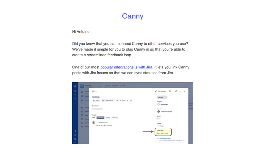


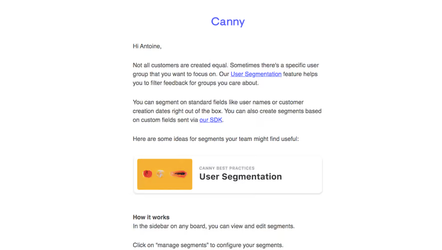

Similar screens






Upgrade to SaaSFrame Pro now to see similar examples.
Monthly
$18 /month
Billed $18 monthly
Browse all screens & flows
Filter and search screens & flows
Search text in screenshots
Access Figma files
Access mobile versions
Join now
Quarterly
$16 /month
Billed $48 quarterly
Browse all screens & flows
Filter and search screens & flows
Search text in screenshots
Access Figma files
Access mobile versions
Join now
Yearly
$15 /month
Billed $180 yearly
Browse all screens & flows
Filter and search screens & flows
Search text in screenshots
Access Figma files
Access mobile versions
Join now