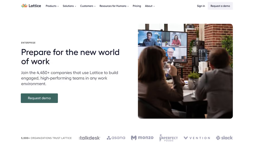
Generate a new design based on this screen using your own content.
Thank you! Your submission has been received!
Oops! Something went wrong while submitting the form.
# Design from Reference: Cal.com Enterprise Page
Create an original, high-fidelity visual design inspired by the reference. Prioritize composition, typography, colors, spacing, and component styling over technical implementation.
## Reference
- **Product:** Cal.com
- **Category:** Enterprise Page
- **Screenshot:** https://cdn.prod.website-files.com/5e9dc792e1210c5325f7ebbc/6acad91881d0b61fedf68e35_6acad88a3a2a243ca5f51188_cms-8cdb1dd29169bbd660ddf2a5.webp
Analyze the screenshot first. If inaccessible, request it rather than guessing.
## Content
{{content.instructions}}
{{content.data}}
Preserve essential messaging and factual accuracy. Adapt structure and copy length for visual balance; never invent product claims.
## Visual Design
Use this context to reproduce the reference's visual language: layout, typography, colors, spacing, borders, radii, and distinctive elements. The screenshot takes priority if descriptions conflict.
## Direction
{{preferences.fidelityInstructions}}
## Output
{{output.instructions}}
Deliver a polished, cohesive design with precise alignment, hierarchy, and spacing. Produce the requested visual artifact, not just a description. If unsupported, explain the limitation.
Cal.com’s Enterprise page exudes a sleek, minimalist professionalism, combining ample white space with sharp lines and discrete shadowing. The design feels modern yet approachable, balancing enterprise authority with the friendly accessibility expected from SaaS solutions.
Layout and Structure
The page opens with a commanding hero section—bold headlines and a focused CTA instantly set the tone. Scrolling transitions users through benefit-driven features, clear grid layouts, and visually balanced content blocks. Notable are the granular, scannable highlights with iconography, followed by customer-focused sections and a compact FAQ before the footer.
Visual Elements
Custom vector illustrations and animated SVGs bring personality, breaking monotony without overwhelming the user. Subtle iconography supports key points, while minimal photographic elements keep the page light and emphasize clarity over distraction.
Color Palette and Typography
Cal.com leverages a restrained palette—crisp whites, charcoal, and a signature accent (a punchy blue) guide attention, signifying actions and key details. Typography is clean and contemporary: a geometric sans-serif for headings commands hierarchy, while friendly body text maximizes readability and supports quick scanning.
User Experience Patterns
Sticky navigation, high-contrast call-to-actions, and intuitive section spacing foster effortless browsing. Forms are simplified, reducing friction on conversion points. Micro-interactions—for example, button hovers—provide tactile feedback.
Unique or Notable Design Choices
A standout feature is the integrated, interactive product demo within the flow—not walled behind a modal or form—giving users a transparent preview. The tone, consistently calm yet authoritative, instills trust, making even complex enterprise solutions feel accessible and innovative.