
Thank you! Your submission has been received!
Oops! Something went wrong while submitting the form.
Get SaaSFrame Pro
Monthly
$18
Quarterly
$48
Yearly
$180
Upgrade to access this feature
Browse all screens & flows
Filter and search screens & flows
Access Figma files
Access mobile versions
Bookmark screens & flows
Join now
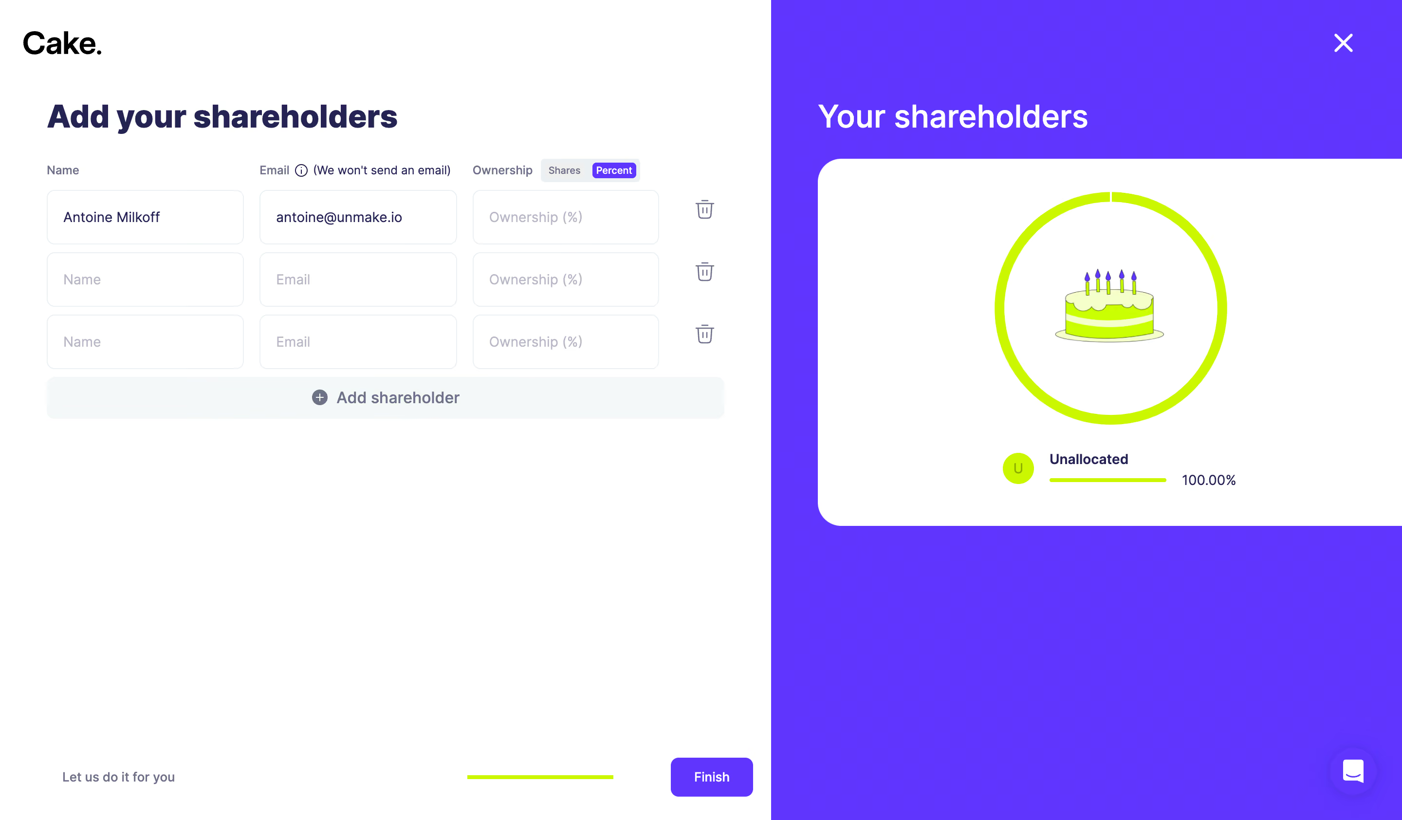
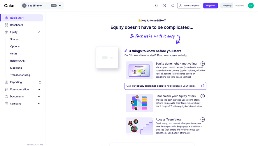
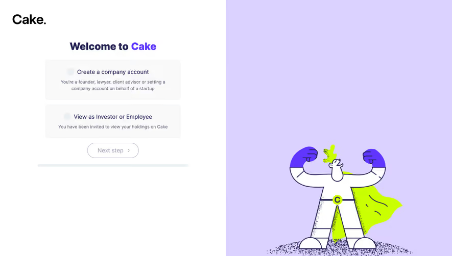
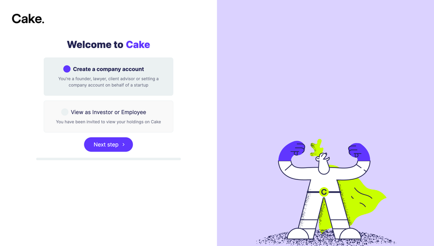
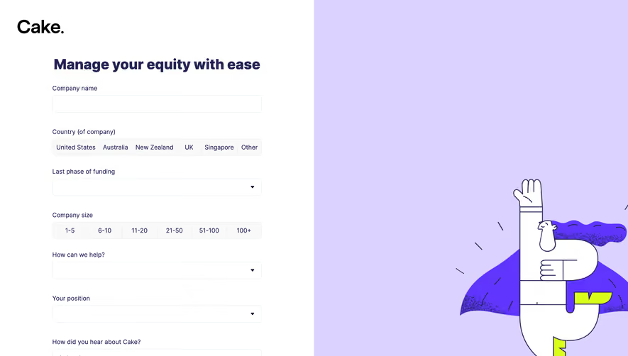
Cake Equity Account Setup

Cake Equity
Equity Management Software
Designed by
No items found.

Bookmark
Bookmark

Design with AI
Thank you! Your submission has been received!
Oops! Something went wrong while submitting the form.
# Design from Reference: Cake Equity Account Setup
Create an original, high-fidelity visual design inspired by the reference. Prioritize composition, typography, colors, spacing, and component styling over technical implementation.
## Reference
- **Product:** Cake Equity
- **Category:** Account Setup
- **Screenshot:** https://cdn.prod.website-files.com/5e9dc792e1210c5325f7ebbc/6acb6344adcf005a3c5c3171_6acb6290c08cd859ff85741d_cms-db80c0c332941ea06ff6d639.webp
Analyze the screenshot first. If inaccessible, request it rather than guessing.
## Content
{{content.instructions}}
{{content.data}}
Preserve essential messaging and factual accuracy. Adapt structure and copy length for visual balance; never invent product claims.
## Visual Design
### Overall aesthetic
- **Character:** A bright equity-onboarding screen pairs a practical white spreadsheet-like form with a vivid purple ownership visualization.
- **Capture scale:** The screenshot is 2880 × 1684 pixels. Approximate CSS dimensions below assume a 1440 × 842 viewport at 2× density; that scale is unverified.
- **Tone:** Bold navy typography, rounded controls, a lime chart and playful cake illustration make financial setup feel approachable.
### Page composition
- **Split layout:** A white left region occupies approximately 55% of the width and the purple right region approximately 45%, both extending the full screen height.
- **Left header and form:** The black wordmark sits at the upper left; a bold shareholder-entry heading begins below it. Three input rows align under Name, Email and Ownership labels.
- **Right summary:** A white shareholder heading sits above a large white panel containing a lime donut, cake illustration and unallocated-share legend.
- **Bottom controls:** Assistance text, a thin lime progress line and Finish button align along the bottom of the left region. A close icon is top right and a circular chat control is bottom right.
### Information hierarchy
- **Primary task:** The large shareholder-entry heading precedes compact column labels and repeated editable rows.
- **Ownership feedback:** The donut is the dominant visual in the summary, with an unallocated label, lime marker, short line and percentage beneath.
- **Form state:** The first row contains entered values, while two rows retain placeholders; no error messages are visible.
- **Action hierarchy:** Finish has a saturated purple fill; Add shareholder is a broad pale secondary control and row removal uses small trash icons.
### Typography
- **Family:** A neutral sans-serif is visible; exact identity is unverified.
- **Main heading:** Approximately 34px CSS, bold, with around 40px line-height and slightly tight tracking.
- **Summary heading:** Approximately 32px CSS, medium weight, white, with a more open appearance than the left title.
- **Fields:** Approximately 14px regular input text; labels and ownership-mode controls are around 12px.
- **Actions and legend:** Approximately 14–16px, medium or semibold; muted helper text is smaller.
### Colors & surfaces
- **Main surfaces:** Sampled #FFFFFF forms the left canvas and chart panel; purple pixels cluster at #6035FF and #6036FF.
- **Text:** Sampled #242452 provides the deep navy heading and form-text character.
- **Chart:** Sampled #CBF800 is the vivid lime accent used for ownership visualization and progress.
- **Secondary surfaces:** Sampled #F4F8F9 supports the pale add-row area; #EBF1F2 appears in light control boundaries and related surfaces.
- **Illustration accent:** Sampled #F4FFCA supplies the pale lime tint visible in the cake artwork.
### Components
- **Input grid:** Three columns use approximately 200px-wide fields, about 55px high, with thin light borders, 8px radii and around 16px horizontal inset.
- **Ownership switch:** Small Shares and Percent tabs sit beside the column label; Percent is visibly selected in purple with white text.
- **Row controls:** Three evenly spaced trash icons align outside the ownership fields. Add shareholder spans the form width at around 42px high with a centered plus-circle icon.
- **Chart panel:** The large white surface has approximately 24px rounded left corners and generous internal space. A roughly 240px donut surrounds the cake illustration.
- **Finish action:** A compact approximately 84 × 40px purple button has an 8px radius and white semibold label.
- **Utility controls:** The top-right white close mark and bottom-right circular purple chat button remain separate from the form.
### Visual rhythm
- **Form margins:** Roughly 48px left inset and 48px top spacing below the logo establish the content column.
- **Row rhythm:** Approximately 8px gaps separate input rows; the add-row button follows closely below.
- **Open lower area:** Large white and purple blank regions separate setup content from the bottom actions.
- **Color repetition:** Purple links form submission to the summary background, while lime links the chart and bottom progress indicator.
### Responsive
- **Evidence limit:** Only this desktop state is observed; mobile behavior and validation states are unverified.
- **Layout recommendation:** Stack the visualization after the form on narrow screens and reduce its height to keep the entry task prominent.
- **Form recommendation:** Turn each shareholder row into a labeled vertical group when three columns no longer fit.
- **Action recommendation:** Keep Finish easy to reach without obscuring fields, and maintain large touch targets for removal and close controls.
### Adaptation guidance
- **Reusable structure:** Build repeatable shareholder field groups, a clearly selected ownership-mode control and a summary that updates from the same data.
- **Chart treatment:** Preserve the slim lime ring, centered illustrative asset and separated legend rather than adding unnecessary chart decoration.
- **State design:** Define empty, populated, invalid and disabled states consistently; only the populated and placeholder states are visible here.
- **Privacy and access:** Use representative sample data in demonstrations, explicit field labels and accessible names for icon-only controls.
Use this context to reproduce the reference's visual language: layout, typography, colors, spacing, borders, radii, and distinctive elements. The screenshot takes priority if descriptions conflict.
## Direction
{{preferences.fidelityInstructions}}
## Output
{{output.instructions}}
Deliver a polished, cohesive design with precise alignment, hierarchy, and spacing. Produce the requested visual artifact, not just a description. If unsupported, explain the limitation.


Category
Tech Stack

Added on
July 26, 2023



Similar screens






Upgrade to SaaSFrame Pro now to see similar examples.
Monthly
$18 /month
Billed $18 monthly
Browse all screens & flows
Filter and search screens & flows
Search text in screenshots
Access Figma files
Access mobile versions
Join now
Quarterly
$16 /month
Billed $48 quarterly
Browse all screens & flows
Filter and search screens & flows
Search text in screenshots
Access Figma files
Access mobile versions
Join now
Yearly
$15 /month
Billed $180 yearly
Browse all screens & flows
Filter and search screens & flows
Search text in screenshots
Access Figma files
Access mobile versions
Join now