Design with AI
Generate a new design based on this screen using your own content.
# Design from Reference: Café Create An Event
Create an original, high-fidelity visual design inspired by the reference. Prioritize composition, typography, colors, spacing, and component styling over technical implementation.
## Reference
- **Product:** Café
- **Category:** Add & Edit
- **Screenshot:** https://cdn.prod.website-files.com/5e9dc792e1210c5325f7ebbc/6acb72ad018523cfee2d9fc3_6acb6f23f56587432a4733ee_cms-869dccd582026b1469548fcf.webp
Analyze the screenshot first. If inaccessible, request it rather than guessing.
## Content
{{content.instructions}}
{{content.data}}
Preserve essential messaging and factual accuracy. Adapt structure and copy length for visual balance; never invent product claims.
## Visual Design
### Overall aesthetic
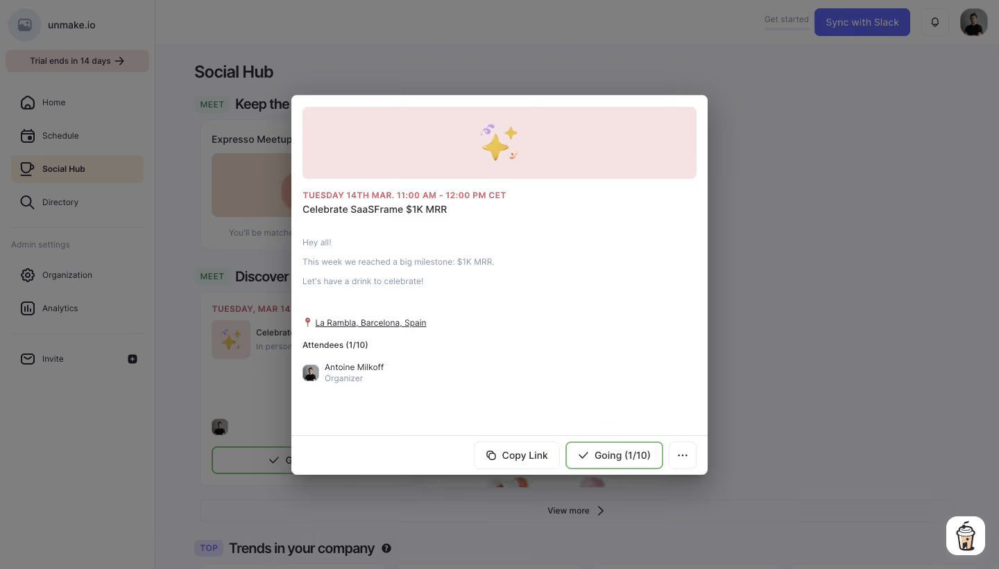
- **Style:** A compact event-detail modal over a dimmed social-workspace dashboard, with a soft pink illustrated banner and restrained utility controls.
- **Character:** Friendly and lightweight: a celebration emoji supplies personality while the event information remains a simple text stack.
### Page composition
- **Capture and scale:** The screenshot measures 1440 × 821 pixels. Dimensions below are approximate screenshot pixels; CSS scale is unverified.
- **Background shell:** The obscured application has a left navigation rail, top account controls, a Social Hub heading, and event cards. A gray translucent overlay de-emphasizes the entire background.
- **Modal:** A centered white rectangle is approximately 600 px wide and 545 px tall, with small rounded corners and a substantial soft shadow. The content area has about 16 px side padding.
- **Content order:** A wide pink emoji banner leads into an uppercase date/time line, event title, several short description lines, an underlined location, attendee count, and organizer avatar/name. A bottom action bar is divided by a thin rule.
### Information hierarchy
- **Focus:** The modal is the sole active visual focus; underlying navigation and cards remain recognizable but subdued.
- **Event information:** The coral date label precedes the title. Description and location follow at lower emphasis, with attendee information grouped separately.
- **Actions:** The footer right-aligns Copy Link, an outlined Going status with count, and a compact ellipsis control.
### Typography
- **Family:** A compact neutral sans serif is visible; the exact font is unverified.
- **Role sizes:** Date/time is approximately 12 px bold uppercase with slight tracking. The title and action labels are around 14 px; description, location, and attendee metadata approximately 12–13 px.
- **Hierarchy:** Use darker ink for title and attendee heading, muted lavender-gray for descriptive copy and organizer role, and a brighter coral date accent.
### Colors & surfaces
- **Surfaces:** Sampled sRGB white #FFFFFF defines the modal, and pale pink #F5E3E3 defines the banner.
- **Overlay:** Sampled visible dimmed-background grays include #7C7C7F, #7F7F7F, #7B7B7E, and #7C7C7E. These are composited screenshot colors, not verified underlying surface tokens.
- **Accents:** Coral marks the date; green outlines the Going state. Lavender-gray supporting text and pale borders keep utilities quiet. Exact accent hex values are unverified.
### Components
- **Banner:** A roughly 568 × 104 px pink rounded rectangle centers a small celebration emoji cluster.
- **Information stack:** The description uses short separated lines. A pin symbol accompanies the underlined location; a small rounded avatar precedes the organizer name and role.
- **Footer controls:** Buttons are approximately 40 px tall with 7–8 px radii. Copy Link has a pale border and link icon; Going has a green border and checkmark; the ellipsis is nearly square.
- **Modal boundary:** A thin divider and compact footer distinguish actions from the spacious body. No close icon is visibly present in the captured modal.
### Visual rhythm
- **Spacing:** Use compact 8–12 px date/title spacing, roughly 28–36 px before the description, and clear 24–32 px separation before location and attendees.
- **Breathing room:** A broad empty region below the organizer keeps the footer anchored at the bottom rather than immediately attached to the text.
### Responsive
- **Observed state:** Only a desktop modal is shown.
- **Recommended reflow:** Use a viewport-constrained dialog with 16–20 px outer margins, scrollable body, and wrapping or stacked footer actions on narrow screens.
- **Usability:** Preserve readable event details and a clearly reachable dismissal mechanism; its exact behavior is not evidenced here.
### Adaptation guidance
- **Preserve:** Keep the dimmed workspace, compact centered modal, illustrated banner, date-first event hierarchy, and separated action footer.
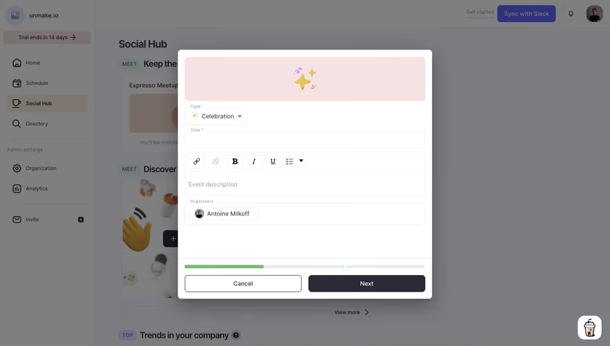
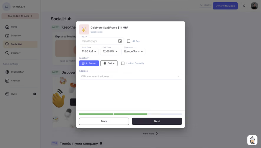
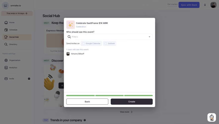
- **Adapt:** Use actual event date, description, location, attendance, and organizer information. The visible screen is an event detail/attendance state despite the record title referring to creation.
- **Avoid:** Do not infer unseen event-creation fields or interactions from the record name. Model the visible information and controls.
Use this context to reproduce the reference's visual language: layout, typography, colors, spacing, borders, radii, and distinctive elements. The screenshot takes priority if descriptions conflict.
## Direction
{{preferences.fidelityInstructions}}
## Output
{{output.instructions}}
Deliver a polished, cohesive design with precise alignment, hierarchy, and spacing. Produce the requested visual artifact, not just a description. If unsupported, explain the limitation.