Generate a new design based on this screen using your own content.
Thank you! Your submission has been received!
Oops! Something went wrong while submitting the form.
# Design from Reference: Café About Page
Create an original, high-fidelity visual design inspired by the reference. Prioritize composition, typography, colors, spacing, and component styling over technical implementation.
## Reference
- **Product:** Café
- **Category:** About Page
- **Screenshot:** https://cdn.prod.website-files.com/5e9dc792e1210c5325f7ebbc/6acb72b5018523cfee2da104_6acb7032b679c88211a4631c_cms-780547afb29eb65a9418a6d4.webp
Analyze the screenshot first. If inaccessible, request it rather than guessing.
## Content
{{content.instructions}}
{{content.data}}
Preserve essential messaging and factual accuracy. Adapt structure and copy length for visual balance; never invent product claims.
## Visual Design
Use this context to reproduce the reference's visual language: layout, typography, colors, spacing, borders, radii, and distinctive elements. The screenshot takes priority if descriptions conflict.
## Direction
{{preferences.fidelityInstructions}}
## Output
{{output.instructions}}
Deliver a polished, cohesive design with precise alignment, hierarchy, and spacing. Produce the requested visual artifact, not just a description. If unsupported, explain the limitation.
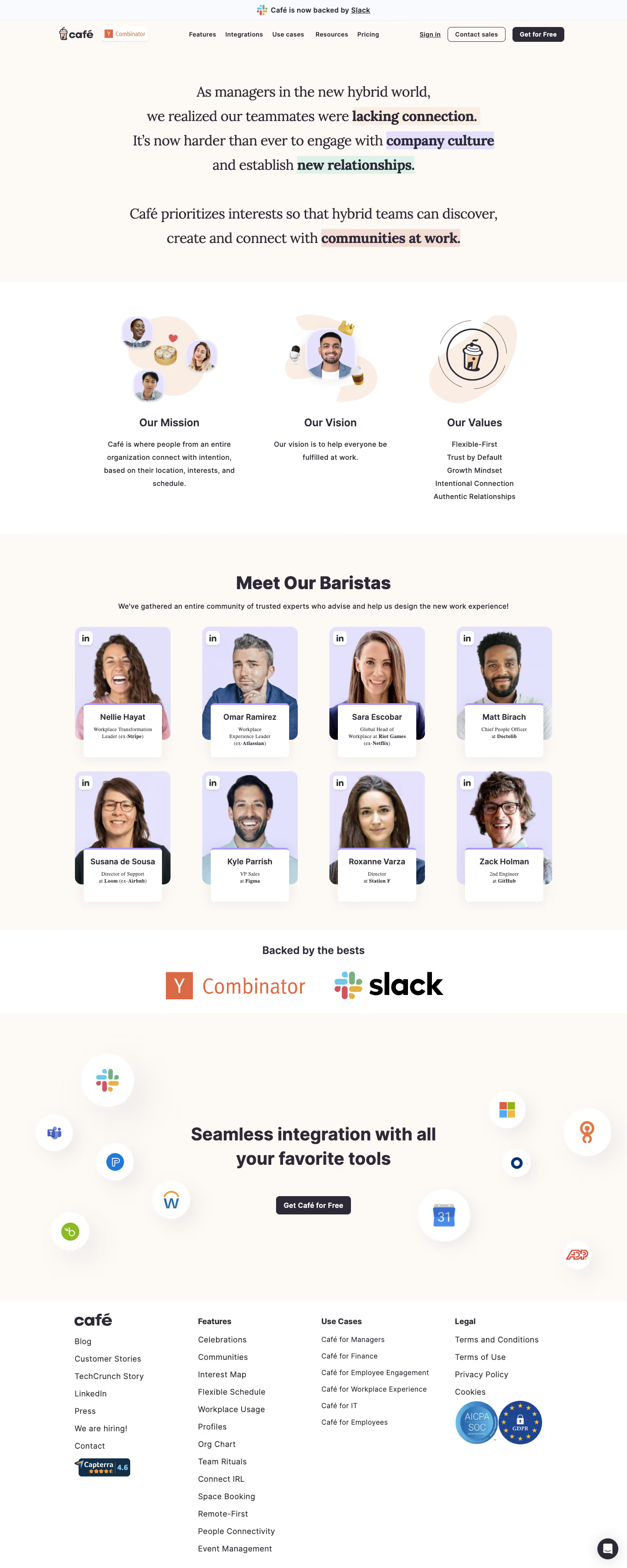
AT Café’s About page radiates a modern and minimalist sensibility, using ample white space to create a breathable, distraction-free atmosphere. The design balances professionalism with a touch of playful innovation, making the SaaS brand feel both credible and approachable.
Layout and Structure
The page begins with a bold hero section featuring a concise mission statement and simple navigation, quickly orienting visitors. Content is elegantly grouped—team introductions, company values, and a clear story arc are presented in digestible blocks. There’s no clutter: each section flows naturally, encouraging effortless reading without endless scrolling.
Visual Elements
Custom vector illustrations stand out, replacing conventional stock photos and lending a unique personality to the page. These illustrations are subtle, softly animated, and harmonize with the copy. Abstract shapes and purpose-driven icons guide the eye and reinforce key ideas, while the lack of photography keeps things consistent with the SaaS identity.
Color Palette and Typography
A calm, pastel color palette—blues, lavenders, and soft accents—creates a soothing yet sophisticated look. Large headers in a friendly sans-serif typeface establish hierarchy, paired with high-contrast body text for maximum readability. Section titles “pop” without overpowering subtler content.
User Experience Patterns
Navigational elements are sticky and straightforward, with persistent CTAs for sign-up and product navigation. Smooth scroll interactions and gentle fade-in animations maintain momentum without distracting from the content.
Unique or Notable Design Choices
The playful, café-inspired metaphors—subtly woven into illustrations and microcopy—make the SaaS brand feel welcoming and memorable. The About page communicates the team’s ethos visually and verbally, cultivating a trustworthy yet energetic tone perfect for design inspiration.