
Thank you! Your submission has been received!
Oops! Something went wrong while submitting the form.
Get SaaSFrame Pro
Monthly
$18
Quarterly
$48
Yearly
$180
Upgrade to access this feature
Browse all screens & flows
Filter and search screens & flows
Access Figma files
Access mobile versions
Bookmark screens & flows
Join now
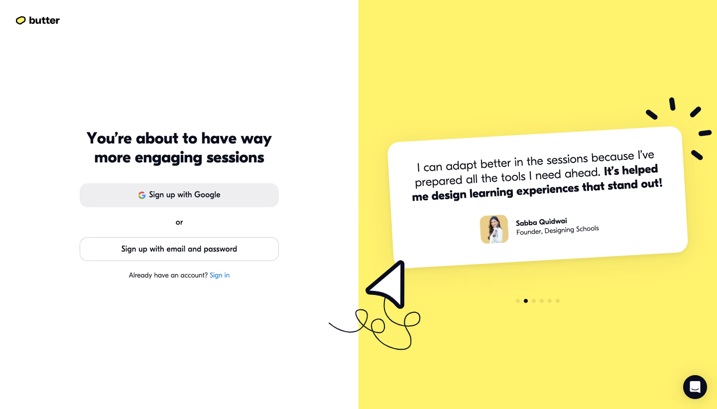
Butter Signup Page

Butter
Virtual collaboration platform
Designed by
No items found.

Bookmark
Bookmark

Design with AI
Thank you! Your submission has been received!
Oops! Something went wrong while submitting the form.
# Design from Reference: Butter Signup Page
Create an original, high-fidelity visual design inspired by the reference. Prioritize composition, typography, colors, spacing, and component styling over technical implementation.
## Reference
- **Product:** Butter
- **Category:** Signup
- **Screenshot:** https://cdn.prod.website-files.com/5e9dc792e1210c5325f7ebbc/6acbbd093b6b24eada548871_6acbbc340f0c77113b57ab41_cms-80b362ed60c618e60d8eeb6c.webp
Analyze the screenshot first. If inaccessible, request it rather than guessing.
## Content
{{content.instructions}}
{{content.data}}
Preserve essential messaging and factual accuracy. Adapt structure and copy length for visual balance; never invent product claims.
## Visual Design
### Overall aesthetic
- **Character:** A playful signup screen pairs a white authentication area with a vivid yellow testimonial half.
- **Personality:** Rounded heavy typography, a slightly rotated testimonial card and hand-drawn arrow/spark marks give the page an informal, energetic tone.
### Page composition
- **Capture:** The source measures 1440 × 821 image pixels. Observed dimensions below approximate CSS only under an unverified 1× capture assumption.
- **Equal split:** The canvas divides into two 720 px halves, white on the left and yellow on the right.
- **Authentication column:** A roughly 400 px wide centered block begins around y=260, containing a two-line headline, Google signup button, an or separator, email/password alternative and sign-in link.
- **Brand:** A small Butter symbol and wordmark sit in the upper-left corner with roughly 32 px inset.
- **Testimonial region:** A large tilted white card occupies the middle of the yellow half. Pagination dots sit below it; a decorative paper-plane arrow crosses the central divide.
- **Support:** A dark circular chat launcher sits at the lower-right edge.
### Information hierarchy
- **Signup promise:** The bold two-line headline is the strongest text in the left half.
- **Authentication choices:** The Google action has a filled gray surface, while the email/password action is outlined. Both span the same width.
- **Social proof:** A large quote dominates the right card, with its final phrase in heavier weight. A portrait, name and role form a smaller attribution below.
- **Secondary actions:** Sign in and chat remain separate from the main signup choices. One dark pagination dot marks the visible testimonial position.
### Typography
- **Family:** A rounded-looking sans serif is used throughout; exact font identity is unverified.
- **Heading:** The signup headline appears approximately 32 px, heavy, with around 38 px line height and centered alignment.
- **Testimonial:** Quote text is approximately 24 px with 29–32 px leading, switching from regular to bold emphasis.
- **Controls and details:** Button labels are around 16 px and semibold. Sign-in copy and attribution details are approximately 14 px.
### Colors & surfaces
- **Measured foundation:** ICC-aware sRGB sampling yields white #FFFFFF and yellow #FFF26D as the dominant split surfaces.
- **Measured text:** Near-black navy #090D1E appears in headings, quote text, decorative strokes and the chat launcher.
- **Measured neutral control:** The Google button uses light gray #EEEEEF.
- **Accents:** The sign-in link is blue; the Google mark retains its multicolor identity. Muted yellow pagination dots contrast with one dark active dot.
- **Depth:** A soft warm-gray shadow lifts the testimonial card above the yellow background.
### Components
- **Google action:** A broad roughly 400 × 48 px button has rounded corners around 16 px, a centered provider icon and label.
- **Email action:** A matching white control uses a fine gray border, the same broad width and rounded silhouette.
- **Testimonial card:** A roughly 590 × 255 px white rectangle has large corners around 24 px, generous internal padding and a slight counterclockwise rotation.
- **Attribution:** A small rounded portrait sits beside two stacked text lines, below the quote.
- **Decorative artwork:** A thick navy outlined paper-plane arrow with a looping thin trail overlaps the split boundary; short navy rays sit near the card's upper-right corner.
- **Carousel and chat:** A row of seven small dots indicates testimonial position. The bottom-right circular support control contains a white conversation icon.
### Visual rhythm
- **Form cadence:** A large gap separates the heading from the first action; smaller consistent pauses distinguish the separator, second action and sign-in line.
- **Central balance:** Both primary content groups sit around the vertical middle, leaving generous blank space above and below.
- **Controlled irregularity:** The tilted card and hand-drawn marks contrast with the perfectly centered authentication controls.
- **Shared widths:** Equal-width signup choices establish a stable left-column rhythm despite the asymmetrical illustration treatment.
### Responsive
- **Evidence boundary:** Only the desktop state is captured; responsive behaviors are recommendations.
- **Stacked layout:** Prioritize the signup controls and place the testimonial beneath them on narrow screens.
- **Decorative scaling:** Reduce or reposition the crossing arrow and rays so they do not overlap form controls or testimonial text.
- **Fluid controls:** Keep authentication actions full-width within safe gutters and allow the headline/quote to wrap naturally.
### Adaptation guidance
- **Signup pattern:** Pair a concise benefit promise with two clear authentication methods and a quiet existing-account route.
- **Social-proof system:** Reuse the quote, emphasized phrase and compact attribution format with authentic application-specific content.
- **Interaction states:** Define provider loading, email-form transition, focus and error treatments; the screenshot shows only the initial choice state.
- **Accessibility:** Give provider controls explicit labels and make carousel position understandable beyond dot color. Keep decorative marks out of the accessibility reading order.
- **Scale validation:** Confirm the assumed 1× scale before assigning CSS sizes, retaining the white/yellow balance and rounded visual language.
Use this context to reproduce the reference's visual language: layout, typography, colors, spacing, borders, radii, and distinctive elements. The screenshot takes priority if descriptions conflict.
## Direction
{{preferences.fidelityInstructions}}
## Output
{{output.instructions}}
Deliver a polished, cohesive design with precise alignment, hierarchy, and spacing. Produce the requested visual artifact, not just a description. If unsupported, explain the limitation.


Category
Patterns


Added on
February 21, 2023




Similar screens





Upgrade to SaaSFrame Pro now to see similar examples.
Monthly
$18 /month
Billed $18 monthly
Browse all screens & flows
Filter and search screens & flows
Search text in screenshots
Access Figma files
Access mobile versions
Join now
Quarterly
$16 /month
Billed $48 quarterly
Browse all screens & flows
Filter and search screens & flows
Search text in screenshots
Access Figma files
Access mobile versions
Join now
Yearly
$15 /month
Billed $180 yearly
Browse all screens & flows
Filter and search screens & flows
Search text in screenshots
Access Figma files
Access mobile versions
Join now