
Thank you! Your submission has been received!
Oops! Something went wrong while submitting the form.
Get SaaSFrame Pro
Monthly
$18
Quarterly
$48
Yearly
$180
Upgrade to access this feature
Browse all screens & flows
Filter and search screens & flows
Access Figma files
Access mobile versions
Bookmark screens & flows
Join now


Boords Affiliate Page
Boords
Storyboarding and animatics for modern video teams
Designed by
No items found.

Bookmark
Bookmark

Design with AI
Thank you! Your submission has been received!
Oops! Something went wrong while submitting the form.
# Design from Reference: Boords Affiliate Page
Create an original, high-fidelity visual design inspired by the reference. Prioritize composition, typography, colors, spacing, and component styling over technical implementation.
## Reference
- **Product:** Boords
- **Category:** Affiliate Page
- **Screenshot:** https://cdn.prod.website-files.com/5e9dc792e1210c5325f7ebbc/62f3cce3d36866223b5536d7_1660143366895-partner-1660143020702.webp
Analyze the screenshot first. If inaccessible, request it rather than guessing.
## Content
{{content.instructions}}
{{content.data}}
Preserve essential messaging and factual accuracy. Adapt structure and copy length for visual balance; never invent product claims.
## Visual Design
### Overall aesthetic
- **Character:** Bold, graphic partner-program page with black typography, pastel-to-blue gradients and thick outlined geometric illustrations.
- **Visual identity:** Large rounded sans-serif headings, strong black borders and simple flat shapes evoke a storyboard/creative-tool brand.
- **Capture:** The image measures 1440 × 5693 px and was inspected in four portions. Dimensions below are image estimates; CSS scale is unverified.
### Page composition
- **Hero:** A full-width warm-cream-to-blue gradient includes a horizontal header. A narrow left text column presents the partner proposition and black action; a large abstract-shape composition fills the right.
- **Benefits:** A centered heading introduces four benefits in a two-column, two-row grid with check-circle headings and short descriptions.
- **Testimonials:** Three equal tall outlined cards pair circular portraits, quotes and bottom-aligned attribution beneath a centered heading.
- **FAQ:** Six visible question/answer blocks stack on white, separated by strong black horizontal rules. Answers are shown directly rather than hidden behind a demonstrated accordion.
- **Closing conversion:** A pastel-gradient band surrounds a large white black-outlined card containing a bold partner headline, action, small social-proof line and geometric artwork.
- **Footer:** A near-black block holds four white-text link groups, followed by cookie copy and a white acceptance button.
### Information hierarchy
- **Hero proposition:** A four-line bold headline highlights recurring commission, introduced by a small program eyebrow. A short paragraph explains the offer.
- **Action:** The black Join Partner Program button is primary in the hero, followed by a small outlined numerical proof chip.
- **Benefits:** Four large labeled benefits use identical check icons, giving commercial terms a scannable structure.
- **Proof:** Portraits lead each testimonial card; quote text is regular weight and attribution smaller with a bold name.
- **FAQ and closing:** Large question headings organize detailed answers. The closing card repeats the offer at display scale before the dark footer.
- **Evidence caution:** Commercial numbers and conditions are captured page content, not verified current program terms.
### Typography
- **Family:** Rounded geometric sans-serif throughout; exact family is unverified.
- **Hero:** Approximately 40–42 image px, bold, with 46 px leading and compact tracking.
- **Section headings:** Around 40–42 px bold and centered. Benefit/FAQ headings are roughly 32–35 px, with tight multiline leading.
- **Body:** Approximately 19–20 px with 30 px line-height in paragraphs and testimonials.
- **Small roles:** Navigation, buttons, proof line and attribution are around 15–16 px. Footer links are similarly compact.
- **Closing headline:** Approximately 48–50 px bold across two broad lines.
### Colors & surfaces
- **Measured base:** ICC-aware sRGB sampling yields #FFFFFF for most content, #111111 for dark regions and #000000 in strong foreground outlines.
- **Measured pastel accents:** #F8E0E6 appears in pink illustration/gradient areas; #DCEDF7 is a pale blue.
- **Measured blue tones:** #6FBDE4, #72BDE4 and #6CBCE5 occur across the blue gradient/illustration treatment.
- **Warm contrast:** Cream and yellow shapes balance cool blue areas in the hero and final artwork.
- **Depth:** Most components are flat. Thick outlines, rather than shadows, define testimonials and the final conversion card.
### Components
- **Header controls:** A black rounded trial button sits beside a black-outlined sign-in action; product/learn menus include small chevrons.
- **Hero action:** A compact black rectangle with white bold text, approximately 206 × 50 image px and small rounded corners.
- **Illustration kit:** Outlined diamonds, tilted squares, circles with wavy fills and split rectangles use pastel grounds and heavy dark strokes.
- **Benefit markers:** Black circular checks precede each large heading; no enclosing cards are visible.
- **Testimonial cards:** Approximately 394 px-wide tall white rectangles have 2–3 px black borders, small corners, large circular portraits and generous padding.
- **FAQ blocks:** Full-width black rules introduce large questions; answer paragraphs occupy a narrower measure beneath, with underlined bold contact links where present.
- **Final card:** A broad white bordered panel has large text at top left and modular geometric artwork across its lower/right areas.
- **Cookie action:** A white rounded Accept & Close button contrasts with black footer copy; no acceptance is performed.
### Visual rhythm
- **Container:** Most content sits inside a broad centered width with roughly 80 px side margins.
- **Macro spacing:** Large blank intervals separate hero, benefits, proof, FAQ and final conversion.
- **Grid consistency:** Benefits share column axes; testimonial cards have equal widths and aligned bottoms despite different quote lengths.
- **FAQ cadence:** Strong rules and consistent question/answer spacing produce an editorial rhythm without extra icons.
- **Color milestones:** Gradient hero and closing band bracket a predominantly white middle.
### Responsive
- **Evidence limit:** Only desktop is shown; these are recommendations.
- **Hero:** Collapse navigation, stack text above artwork and scale shapes as a unified decorative asset.
- **Grids:** Reduce benefits and testimonials to one column while retaining portrait/attribution hierarchy.
- **FAQ:** Keep full-width readable text with fluid heading sizes and comfortable margins.
- **Footer:** Wrap four link groups and cookie controls without reducing touch targets.
### Adaptation guidance
- **Reusable structure:** Present a clear partner offer, four concise benefits, customer proof, explicit FAQ and repeated final action.
- **Identity:** Reuse heavy black outlines and a limited pastel geometric kit for a cohesive creative brand.
- **Content discipline:** Keep financial/program claims distinct from design instructions and validate them separately before reuse.
- **Accessibility:** Use semantic FAQ headings, meaningful link labels, decorative image alternatives and clear keyboard focus on actions.
Use this context to reproduce the reference's visual language: layout, typography, colors, spacing, borders, radii, and distinctive elements. The screenshot takes priority if descriptions conflict.
## Direction
{{preferences.fidelityInstructions}}
## Output
{{output.instructions}}
Deliver a polished, cohesive design with precise alignment, hierarchy, and spacing. Produce the requested visual artifact, not just a description. If unsupported, explain the limitation.


Category
Patterns
No items found.
Tech Stack

Added on
August 10, 2022
Similar screens
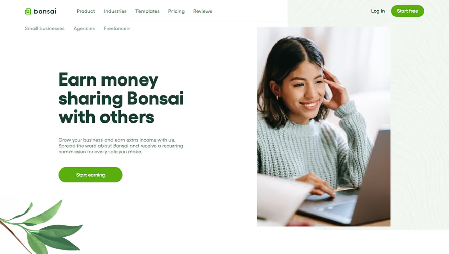


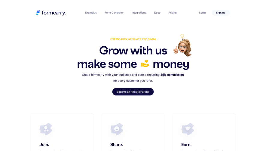

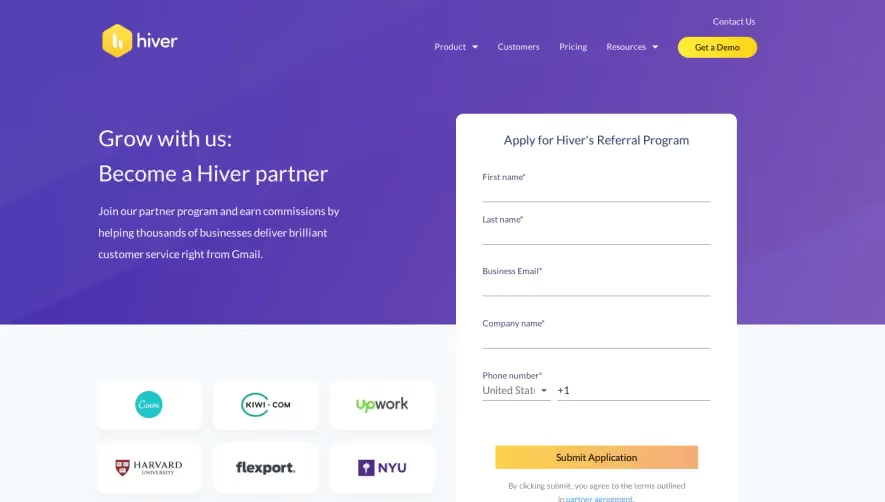

Upgrade to SaaSFrame Pro now to see similar examples.
Monthly
$18 /month
Billed $18 monthly
Browse all screens & flows
Filter and search screens & flows
Search text in screenshots
Access Figma files
Access mobile versions
Join now
Quarterly
$16 /month
Billed $48 quarterly
Browse all screens & flows
Filter and search screens & flows
Search text in screenshots
Access Figma files
Access mobile versions
Join now
Yearly
$15 /month
Billed $180 yearly
Browse all screens & flows
Filter and search screens & flows
Search text in screenshots
Access Figma files
Access mobile versions
Join now