Design with AI
Generate a new design based on this screen using your own content.
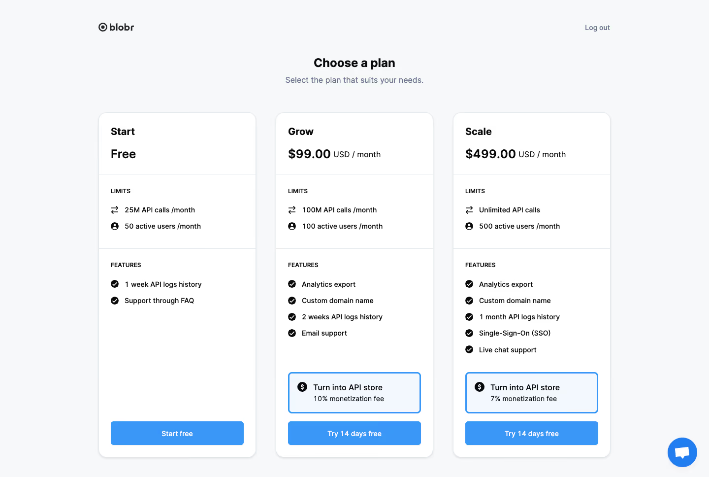
# Design from Reference: Blobr Choose A Plan
Create an original, high-fidelity visual design inspired by the reference. Prioritize composition, typography, colors, spacing, and component styling over technical implementation.
## Reference
- **Product:** Blobr
- **Category:** Account Setup
- **Screenshot:** https://cdn.prod.website-files.com/5e9dc792e1210c5325f7ebbc/6acb6c1d5391d62536b672f0_6acb6ab3b5df5d2dd4cf1bba_cms-b9d920c26e50314dc344d1ed.webp
Analyze the screenshot first. If inaccessible, request it rather than guessing.
## Content
{{content.instructions}}
{{content.data}}
Preserve essential messaging and factual accuracy. Adapt structure and copy length for visual balance; never invent product claims.
## Visual Design
### Overall aesthetic
- **Style:** Bright, restrained plan-selection screen with three equal white cards on a cool gray canvas.
- **Emphasis:** Black plan names and prices establish comparison; blue conversion buttons and outlined monetization options supply the accent.
### Page composition
- **Canvas:** Source 1440 × 968 image pixels. Geometry here uses the 1400px inspection rendering; CSS scale is unverified.
- **Header:** Small logo at x194, y46, with Log out aligned near the right edge of a roughly 1010px centered wrapper.
- **Introduction:** Centered heading and one-line subtitle above the card row.
- **Cards:** Three approximately 311 × 680px columns begin near y222, separated by about 39px. Each has pricing, limits, features and a bottom action.
- **Floating control:** A blue circular chat launcher sits in the lower-right corner.
### Information hierarchy
- **Selection:** Choose a plan is followed by a short supporting instruction.
- **Comparison:** Start, Grow and Scale use matching title and price positions. The free tier is contrasted with two monthly prices and smaller currency/period text.
- **Details:** Uppercase Limits and Features labels organize icon-led lists. Paid tiers include a separate monetization-fee option above their trial action.
- **Actions:** The free and paid buttons align at the same bottom baseline despite different feature counts.
### Typography
- **Heading and prices:** Approximately 24px bold sans serif; plan names around 21px bold. Exact family is unverified.
- **Body roles:** Feature and limit rows are around 14px medium with roughly 20px line height; subtitle around 16px in muted slate.
- **Small labels:** Section labels approximately 12px semibold uppercase; button labels about 14px semibold.
- **Price qualifiers:** Currency and monthly period remain about 16px regular, sharing the price baseline.
### Colors & surfaces
- **Measured canvas and cards:** #F7F8FA background, #FFFFFF cards, #E4E7EB divider/border tone.
- **Measured accent:** #3A97F7 appears in blue controls; pale blue #F2F8FE fills the paid monetization boxes.
- **Text:** Solid dark pixels include #0A0A0A; secondary text appears slate gray. Nearby #F6F7F9 and #F4F5F7 occur in subtle neutral surfaces and edge transitions.
- **Depth:** Cards have faint outlines and small soft shadows, without strong elevation.
### Components
- **Plan shells:** Roughly 16px radius, thin pale border and about 24px horizontal padding.
- **Section separators:** Full-width hairlines divide the approximately 121px price header, limits area and remaining feature/action area.
- **Feature rows:** Small black check circles precede each feature; limits use exchange and user icons. Rows follow a roughly 32px pitch.
- **Monetization option:** Approximately 262 × 81px, blue 2–3px outline, 6px radius, money icon and two text lines. No selected-state behavior is established.
- **Primary buttons:** Approximately 262 × 47px, blue fill, white label and 5px radius. Chat launcher is about 59px across.
- **States:** No hover, loading, checkout or confirmation state is shown.
### Visual rhythm
- **Outer layout:** The title block leaves about 55px before cards; card bottoms sit roughly 40px above the image edge.
- **Internal rhythm:** Pricing receives generous space, followed by tightly aligned lists; empty space in shorter plans preserves equal card height.
- **Action spacing:** Paid monetization boxes sit about 16px above buttons. All card buttons share matching side and bottom insets.
### Responsive
- **Observed scope:** Desktop only; mobile behavior is unverified.
- **Recommended grid:** Stack cards or use a clear swipe comparison at narrow widths, keeping each plan’s price and primary action together.
- **Recommended sizing:** Use fluid card widths, 20–24px gutters and comfortable touch targets; allow long limit labels and price qualifiers to wrap.
- **Floating control:** Keep chat clear of the final plan action on small screens.
### Adaptation guidance
- **Preserve:** Equal card geometry, consistent section separators, icon-led lists and a common action baseline.
- **Content:** Replace prices, usage allowances, features and fees with supplied values; keep pricing qualifiers visually secondary.
- **Implementation:** Use a grid and flexible vertical card bodies to align actions without hard-coded empty spacers.
- **Interaction:** Explicitly define any monetization selection state and show its effect before checkout; behavior cannot be inferred from this capture.
Use this context to reproduce the reference's visual language: layout, typography, colors, spacing, borders, radii, and distinctive elements. The screenshot takes priority if descriptions conflict.
## Direction
{{preferences.fidelityInstructions}}
## Output
{{output.instructions}}
Deliver a polished, cohesive design with precise alignment, hierarchy, and spacing. Produce the requested visual artifact, not just a description. If unsupported, explain the limitation.