Design with AI
Generate a new design based on this screen using your own content.
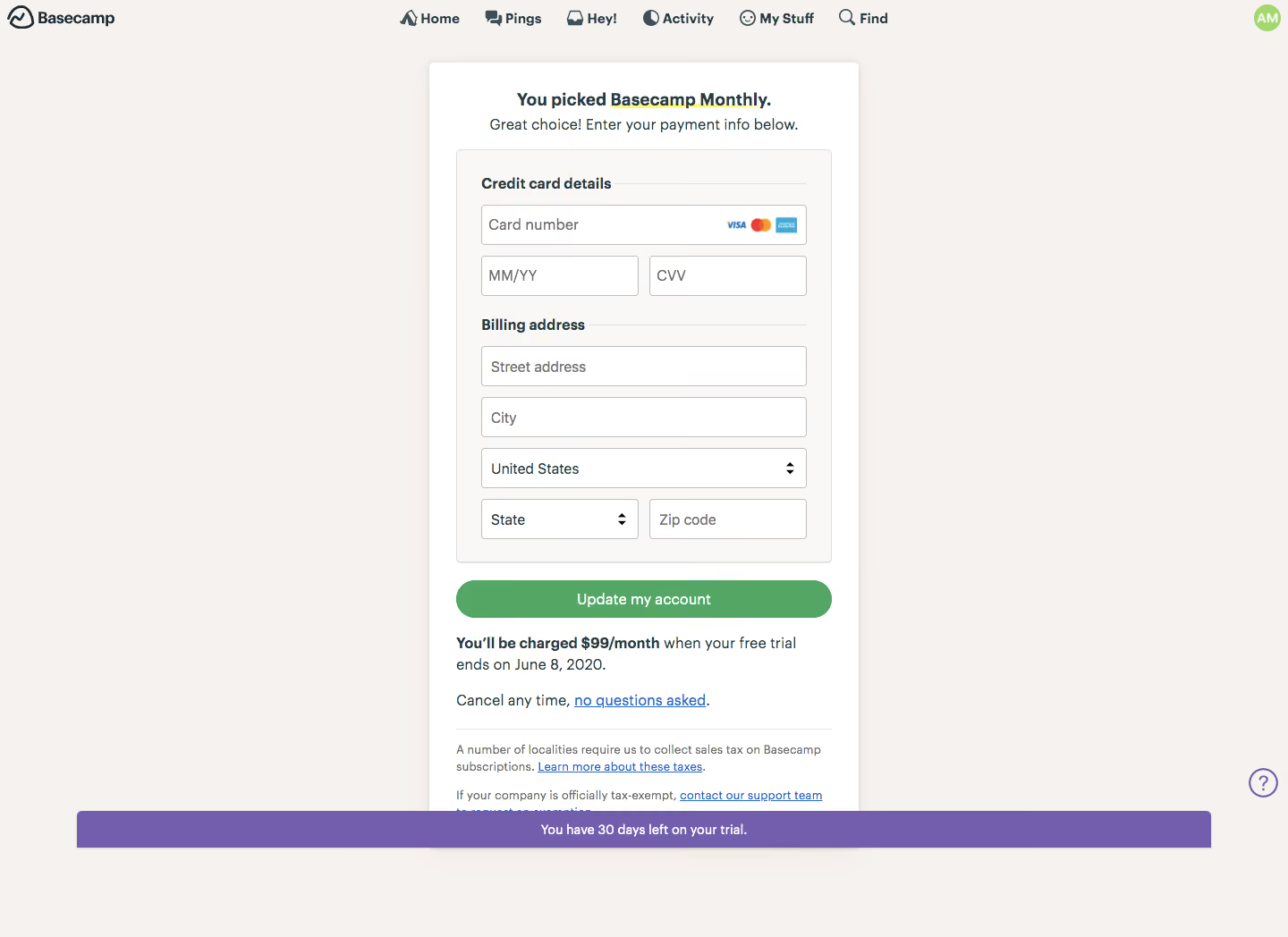
# Design from Reference: Basecamp Checkout
Create an original, high-fidelity visual design inspired by the reference. Prioritize composition, typography, colors, spacing, and component styling over technical implementation.
## Reference
- **Product:** Basecamp
- **Category:** Checkout
- **Screenshot:** https://cdn.prod.website-files.com/5e9dc792e1210c5325f7ebbc/6acbc54b2488d2f8f7d367c6_6acbbf348fac5a61406fb5a4_cms-71de03fc3591ccad8209620a.webp
Analyze the screenshot first. If inaccessible, request it rather than guessing.
## Content
{{content.instructions}}
{{content.data}}
Preserve essential messaging and factual accuracy. Adapt structure and copy length for visual balance; never invent product claims.
## Visual Design
### Overall aesthetic
- **Character:** Warm, traditional subscription checkout with a centered paper-like form and reassuring billing copy.
### Page composition
- **Canvas:** 1440 × 1048 screenshot px.
- **Structure:** Compact top navigation, narrow centered white checkout panel, grouped credit-card/address fields, green update action, billing terms and bottom violet trial-status strip.
### Information hierarchy
- **Priority:** Selected-plan heading precedes payment details. Green action contrasts with subdued fields; charge terms immediately below clarify the commitment.
### Typography
- **Family:** Humanist sans serif, exact font unverified.
- **Scale:** Estimated screenshot heading 20 px bold, field/body 16 px, group labels 16 px bold and fine print 13–14 px.
### Colors & surfaces
- **Sampled palette:** Warm surround #F6F2EF, panel #FFFFFF, inner form #FAF8F7, trial strip #725EAD and primary green #53A663.
### Components
- **Fields:** Card number with payment-network marks, paired expiry/security code, address/city/country and paired region/postcode.
- **Surfaces:** Fine gray outlines, subtle panel shadow, approximately 6 px card corners; green action is fully rounded.
- **Status:** Wide violet strip near bottom overlays part of lower content in the capture; small outlined help circle sits right.
### Visual rhythm
- **Spacing:** Estimated screenshot panel width 480 px; approximately 24–30 px padding and 12 px field gaps. Dense form contrasts with broad outer margins.
### Responsive
- **Observed:** Desktop only.
- **Adaptation:** Use full mobile width with 16 px gutters; ensure trial status does not obscure terms or fields and keep paired inputs readable.
### Adaptation guidance
- **Preserve:** Clear payment grouping, warm neutral surface and adjacent subscription terms.
- **Replace:** Use accurate plan price, timing and regional billing fields; never reuse reference payment details.
Use this context to reproduce the reference's visual language: layout, typography, colors, spacing, borders, radii, and distinctive elements. The screenshot takes priority if descriptions conflict.
## Direction
{{preferences.fidelityInstructions}}
## Output
{{output.instructions}}
Deliver a polished, cohesive design with precise alignment, hierarchy, and spacing. Produce the requested visual artifact, not just a description. If unsupported, explain the limitation.