Design with AI
Generate a new design based on this screen using your own content.
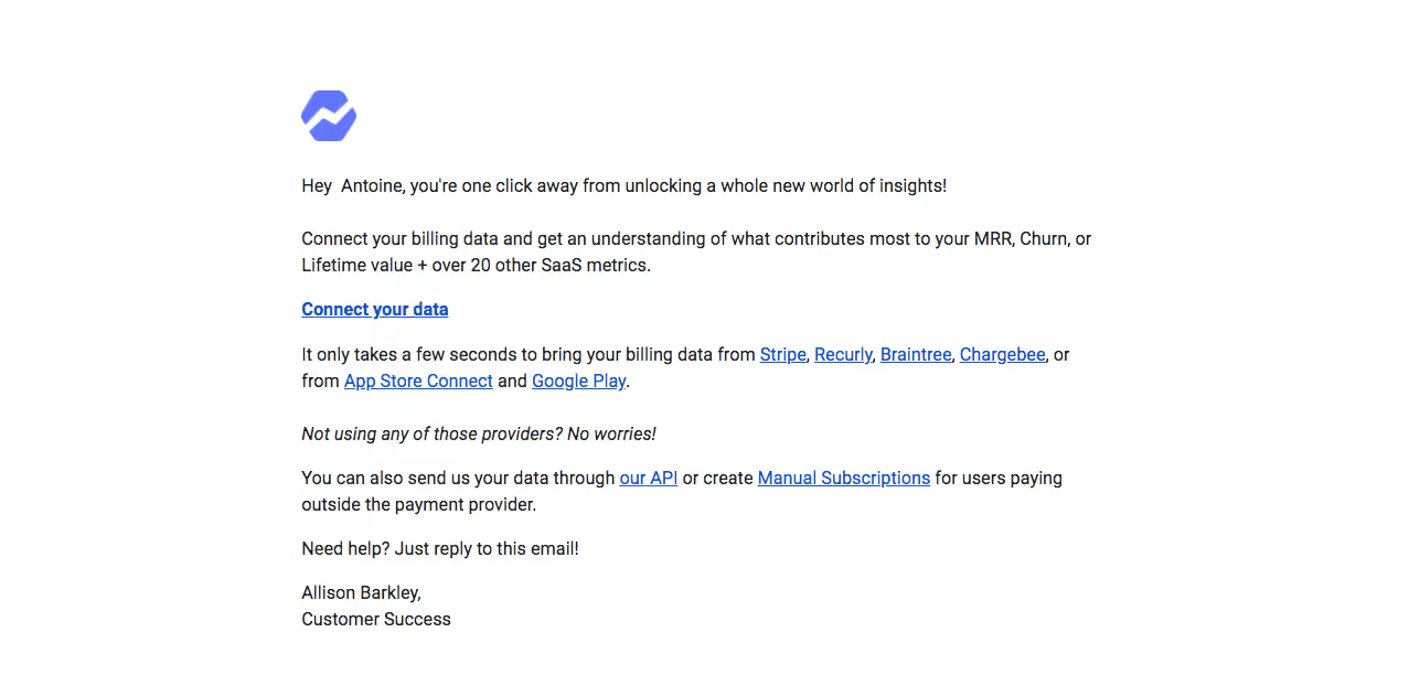
# Design from Reference: Baremetrics Onboarding Emails
Create an original, high-fidelity visual design inspired by the reference. Prioritize composition, typography, colors, spacing, and component styling over technical implementation.
## Reference
- **Product:** Baremetrics
- **Category:** Onboarding Email
- **Screenshot:** https://cdn.prod.website-files.com/5e9dc792e1210c5325f7ebbc/6acbd2134f59d5c9438bb67b_6acbcffb7d306093e25689ee_cms-e6723d41349f862fbc5c5264.webp
Analyze the screenshot first. If inaccessible, request it rather than guessing.
## Content
{{content.instructions}}
{{content.data}}
Preserve essential messaging and factual accuracy. Adapt structure and copy length for visual balance; never invent product claims.
## Visual Design
### Overall aesthetic
- **Style:** Plain white onboarding email with a small blue-violet mark, black prose and conventional blue underlined links.
- **Character:** A personal customer-success message emphasizes connecting billing data without promotional panels or illustration.
### Page composition
- **Canvas:** Source 1277 × 612 pixels, inspected at native size. Email-client zoom and CSS scale are unverified.
- **Column:** Approximately 720px-wide message begins near x273, with brand mark near y82.
- **Flow:** Greeting, value paragraph, standalone connection link, provider paragraph, italic fallback prompt, API/manual alternative, help line and two-line sign-off.
- **Extent:** No additional navigation, legal footer or enclosing card appears in the supplied image.
### Information hierarchy
- **Opening:** Short personalized greeting introduces the onboarding purpose.
- **Primary action:** Bold underlined Connect your data link occupies its own line.
- **Alternatives:** Several provider names are linked within prose; API and manual-subscription links form an alternate route.
- **Support:** A simple reply-for-help line and customer-success sign-off close the message.
### Typography
- **Body:** Approximately 16px regular sans serif with about 24px line height.
- **Primary link:** Same size, bold and underlined.
- **Fallback prompt:** One italic line separates provider guidance from alternative options.
- **Sign-off:** Same body size and line height. Exact font family is unverified.
### Colors & surfaces
- **Measured base/text:** #FFFFFF white and #222222 dark text.
- **Measured links:** #1155CC blue.
- **Measured brand:** #6077FC blue-violet with #1D2B68 among darker colored pixels.
- **Near-white tones:** #F9FFFF, #FFFFF8 and #FFFADC are minor rendering/image tones, not distinct content surfaces.
- **Depth:** No visible borders, cards or shadows.
### Components
- **Brand mark:** Approximately 50 × 47px, compact abstract blue-violet symbol at the message’s left edge.
- **Primary action:** Text link rather than a filled button.
- **Provider links:** Blue underlined inline anchors within a two-line paragraph.
- **Alternative links:** Two underlined anchors remain embedded in the explanatory sentence.
- **Captured state:** Static email only; connection flows and linked destinations are not visible.
### Visual rhythm
- **Opening gap:** Around 34px separates brand mark and greeting.
- **Paragraph cadence:** Roughly 22–28px separates prose blocks and standalone action.
- **Reading width:** Short paragraphs generally occupy one or two lines, maintaining a light message.
- **Alignment:** Logo, prose, action and sign-off share a single left edge.
### Responsive
- **Observed scope:** One email rendering only; mobile behavior is unverified.
- **Recommended column:** Use fluid width with a conservative maximum and 20px mobile side gutters.
- **Recommended links:** Allow provider names and long alternatives to wrap naturally.
- **Recommended type:** Preserve readable body size and adequate line spacing.
### Adaptation guidance
- **Preserve:** Personal plain-text tone, one clear connection action and visible alternative routes.
- **Content:** Replace greeting, providers and support signature with supplied details; avoid carrying personal values into templates.
- **Implementation:** Use email-compatible layout, meaningful link labels and a useful logo alternative.
- **Restraint:** Keep the email concise and avoid adding decorative components absent from the reference.
Use this context to reproduce the reference's visual language: layout, typography, colors, spacing, borders, radii, and distinctive elements. The screenshot takes priority if descriptions conflict.
## Direction
{{preferences.fidelityInstructions}}
## Output
{{output.instructions}}
Deliver a polished, cohesive design with precise alignment, hierarchy, and spacing. Produce the requested visual artifact, not just a description. If unsupported, explain the limitation.