
Thank you! Your submission has been received!
Oops! Something went wrong while submitting the form.
Get SaaSFrame Pro
Monthly
$18
Quarterly
$48
Yearly
$180
Upgrade to access this feature
Browse all screens & flows
Filter and search screens & flows
Access Figma files
Access mobile versions
Bookmark screens & flows
Join now

Baremetrics New Features Emails

Baremetrics
Subscription Analytics and Insights
Designed by
No items found.

Bookmark
Bookmark

Design with AI
Thank you! Your submission has been received!
Oops! Something went wrong while submitting the form.
# Design from Reference: Baremetrics New Features Emails
Create an original, high-fidelity visual design inspired by the reference. Prioritize composition, typography, colors, spacing, and component styling over technical implementation.
## Reference
- **Product:** Baremetrics
- **Category:** Product Update Emails
- **Screenshot:** https://cdn.prod.website-files.com/5e9dc792e1210c5325f7ebbc/62ecad7917fa6372dd8183bb_1659676424250-5ec54d6d7fc3707b8f03cad5_screencapture-mail-google-mail-u-0-2020-05-20-17_30_56.webp
Analyze the screenshot first. If inaccessible, request it rather than guessing.
## Content
{{content.instructions}}
{{content.data}}
Preserve essential messaging and factual accuracy. Adapt structure and copy length for visual balance; never invent product claims.
## Visual Design
### Overall aesthetic
- **Style:** Announcement email combining plain correspondence with a large pale-lavender product graphic.
- **Character:** White background, dark text, blue underlined links, selective bold/italic emphasis, and emoji checkmarks.
- **Decoration:** Messaging illustration uses layered white message cards, soft lavender shapes, and a small green paper-plane badge.
### Page composition
- **Capture:** 1440 × 1489 image px. Dimensions below describe screenshot pixels; email CSS scale and zoom are unverified.
- **Content:** Left-aligned column beginning near x=122 image px and extending broadly across the capture.
- **Brand:** Large blue/dark wordmark at top.
- **Introduction:** Bold two-line launch statement with inline blue product link.
- **Hero graphic:** Approximately 1000 × 600 image px, left aligned, with product statement left and layered message examples right.
- **Body:** Several short paragraphs, four green-check feature lines, prominent blue action link, secondary launch-platform link, and founder portrait/signature.
- **Bottom:** Capture ends after the signature with a small white tail.
### Information hierarchy
- **Launch:** Bold opening sentence announces the new messaging product.
- **Product illustration:** Large graphic is the principal visual evidence.
- **Benefits:** Short paragraphs lead into four concise checked capabilities.
- **Primary link:** Larger bold blue underlined messaging action stands alone.
- **Secondary proof:** Bold platform-launch sentence and link precede the signature.
- **Identity:** Small portrait and name/role links close the email.
### Typography
- **Family:** Arial-like proportional sans serif; exact identity is unverified.
- **Body:** Approximately 18–20 image px with 28px line-height.
- **Opening:** Similar size in bold.
- **Hero artwork:** Large bold multiline statement, smaller example-message text; these are embedded image typography.
- **Primary action link:** Approximately 22px bold.
- **Signature:** Body-size regular text with blue underlined references.
- **Precision:** Image-scale measurements are not verified email CSS dimensions.
### Colors & surfaces
- **Canvas:** Sampled #FFFFFF.
- **Lavender artwork:** Sampled #F8F7FC, #F1EFFD, and #F0EEFC.
- **Additional pale tone:** Sampled #EFECFB.
- **Blue accent:** Sampled #5484FD among brand/link-like pixels.
- **Text:** Dark navy/charcoal throughout main copy.
- **Feature symbols:** Green emoji checks provide a small semantic accent.
- **Depth:** Soft white-card shadows are confined to the illustration.
### Components
- **Brand lockup:** Blue geometric mark and dark lowercase wordmark.
- **Announcement graphic:** Broad lavender rectangle, branded top label, green messaging icon, large statement, and overlapping white message cards with small timing labels.
- **Body paragraphs:** Unboxed, left aligned, with short line groups.
- **Checklist:** Four emoji-check lines without separate card boundaries.
- **Primary CTA:** Bold underlined blue text with right arrow, not a filled button.
- **Secondary link:** Long underlined blue launch-platform URL within bold text.
- **Signature:** Small rounded portrait above name/role lines.
- **State limits:** Static email only; no messaging campaign or link action is demonstrated.
### Visual rhythm
- **Alignment:** Brand, intro, graphic, body, links, and signature share one left edge.
- **Scale contrast:** Large image and wordmark contrast with letter-like body text.
- **Paragraph spacing:** Clear white gaps separate explanation, checklist, CTA, and signature.
- **List rhythm:** Four tight repeated checks create a compact benefits block.
### Responsive
- **Observed state:** One email capture; mobile/client variants are unverified.
- **Width recommendation:** Use a fluid email-safe container with mobile gutters.
- **Artwork recommendation:** Scale the graphic proportionally and repeat essential claims in accessible real text.
- **Link recommendation:** Allow long links to wrap without overflow.
- **Typography recommendation:** Preserve readable body size instead of shrinking the entire email.
### Adaptation guidance
- **Preserve:** Clear launch statement, illustrative product graphic, concise checklist, direct text CTA, and personal signature.
- **Content fidelity:** Use approved actual messaging capabilities and pricing claims; screenshot statements are historical copy.
- **Asset fidelity:** Use supplied product artwork and portrait with meaningful alternatives.
- **Email implementation:** Use robust supported markup and real destination links.
- **Privacy:** Replace example message identities and signature data with approved content.
Use this context to reproduce the reference's visual language: layout, typography, colors, spacing, borders, radii, and distinctive elements. The screenshot takes priority if descriptions conflict.
## Direction
{{preferences.fidelityInstructions}}
## Output
{{output.instructions}}
Deliver a polished, cohesive design with precise alignment, hierarchy, and spacing. Produce the requested visual artifact, not just a description. If unsupported, explain the limitation.


Category
Patterns
No items found.
Tech Stack



Added on
May 20, 2020
Similar screens
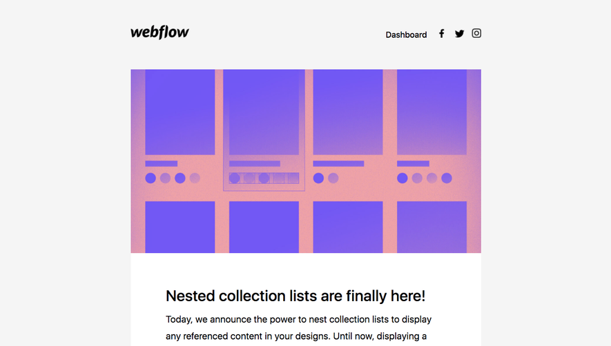


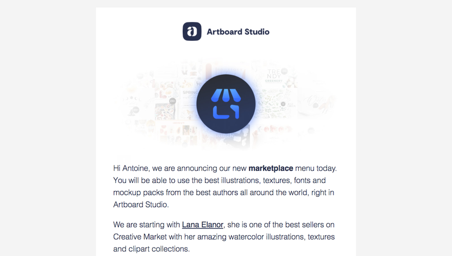

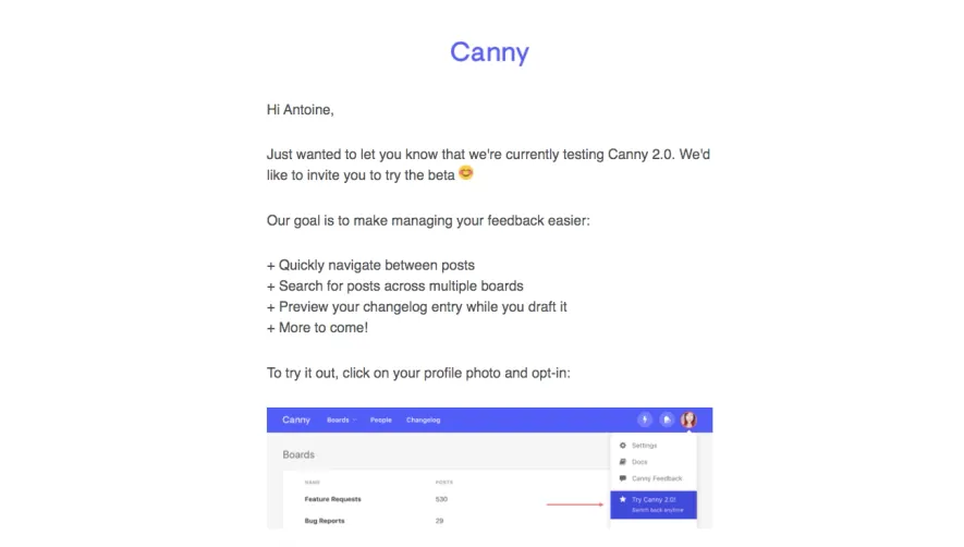

Upgrade to SaaSFrame Pro now to see similar examples.
Monthly
$18 /month
Billed $18 monthly
Browse all screens & flows
Filter and search screens & flows
Search text in screenshots
Access Figma files
Access mobile versions
Join now
Quarterly
$16 /month
Billed $48 quarterly
Browse all screens & flows
Filter and search screens & flows
Search text in screenshots
Access Figma files
Access mobile versions
Join now
Yearly
$15 /month
Billed $180 yearly
Browse all screens & flows
Filter and search screens & flows
Search text in screenshots
Access Figma files
Access mobile versions
Join now