Design with AI
Generate a new design based on this screen using your own content.
# Design from Reference: Baremetrics Activation Emails
Create an original, high-fidelity visual design inspired by the reference. Prioritize composition, typography, colors, spacing, and component styling over technical implementation.
## Reference
- **Product:** Baremetrics
- **Category:** Activation Emails
- **Screenshot:** https://cdn.prod.website-files.com/5e9dc792e1210c5325f7ebbc/6acbc9341790037d3e058f0c_6acbc6446b6ddc4c143ef03e_cms-6c67342b38fa182e9ca103b6.webp
Analyze the screenshot first. If inaccessible, request it rather than guessing.
## Content
{{content.instructions}}
{{content.data}}
Preserve essential messaging and factual accuracy. Adapt structure and copy length for visual balance; never invent product claims.
## Visual Design
### Overall aesthetic
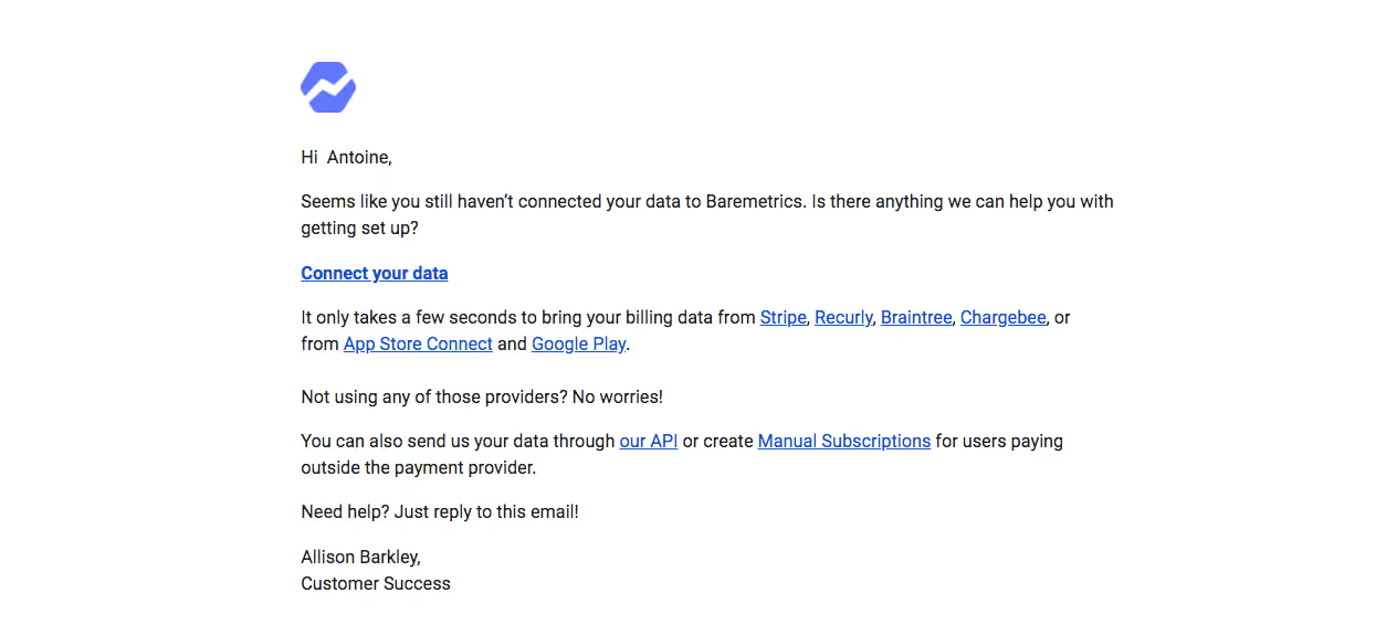
- **Character:** A plain activation email uses a white canvas, small violet brand mark and straightforward black text.
- **Focus:** Blue underlined links carry all actions; there is no large button, promotional image or enclosing card.
### Page composition
- **Capture:** The source measures 1254 × 575 image pixels. Email CSS scale and device-pixel ratio are unverified; measurements below describe source pixels.
- **Reading column:** A left-aligned message block approximately 740 px wide begins around x=270.
- **Sequence:** Logo, personalized greeting, setup reminder, emphasized connection link, provider explanation, alternative-data paragraph, help invitation and two-line signature form a compact vertical flow.
- **Frame:** Broad white margins surround the message; no footer/legal strip is visible in the capture.
### Information hierarchy
- **Brand cue:** A small violet geometric mark opens the message.
- **Activation prompt:** A short reminder explains the missing data connection, followed by a bold Connect your data link.
- **Alternatives:** Several provider links appear inline; a separate paragraph introduces API/manual-subscription routes.
- **Support:** A concise reply invitation and customer-success signature close the message.
### Typography
- **Family:** A conventional sans serif is visible; exact identity is unverified.
- **Body:** Approximately 16 px in the source, with around 24 px line height.
- **Primary link:** The connection link uses bold weight and underlining at the same approximate size as body text.
- **Signature:** Two plain lines retain the body style, avoiding a graphic or oversized sign-off.
### Colors & surfaces
- **Measured foundation:** ICC-aware sRGB sampling yields #FFFFFF.
- **Measured text:** Dark #222222 anchors the message.
- **Measured links:** Blue #1155CC distinguishes underlined actions and provider references.
- **Measured brand:** Violet-blue #6077FC appears in the small geometric symbol.
### Components
- **Logo:** A compact angular/segmented mark sits above the greeting with clear white space.
- **Text action:** The bold underlined connection link stands alone between paragraphs.
- **Inline links:** Provider, API and manual-entry references remain embedded in explanatory sentences.
- **Signature:** A name line and customer-success role form a simple two-line closure.
### Visual rhythm
- **Paragraph spacing:** Consistent blank intervals distinguish reminder, connection route, alternatives and support.
- **Alignment:** Logo, greeting, paragraphs, action and signature share the same left edge.
- **Reading measure:** Short two-line paragraphs keep the message compact and easy to scan.
- **Restraint:** The absence of containers and decorative elements reinforces a personal support-email feel.
### Responsive
- **Evidence boundary:** Only one email capture is shown; responsive behaviors are recommendations.
- **Fluid column:** Use a readable maximum width with mobile side gutters.
- **Link wrapping:** Allow provider lists and alternative routes to wrap naturally without fixed line breaks.
- **Text accessibility:** Keep all copy selectable and provide meaningful alternative text for the logo.
### Adaptation guidance
- **Activation pattern:** Reuse a concise reminder, one emphasized setup link, clear alternative routes and a reply-based help invitation.
- **Email resilience:** Use simple email-compatible typography and spacing, testing common clients at narrow widths.
- **Personalization:** Treat greeting, signature and supported providers as maintained dynamic content.
- **State boundaries:** The capture shows an activation reminder only; connection status and link destinations are not independently verified.
- **Measurement boundary:** Validate image scale before mapping source pixels to email CSS.
Use this context to reproduce the reference's visual language: layout, typography, colors, spacing, borders, radii, and distinctive elements. The screenshot takes priority if descriptions conflict.
## Direction
{{preferences.fidelityInstructions}}
## Output
{{output.instructions}}
Deliver a polished, cohesive design with precise alignment, hierarchy, and spacing. Produce the requested visual artifact, not just a description. If unsupported, explain the limitation.