Design with AI
Generate a new design based on this screen using your own content.
# Design from Reference: Attio Customize Workspace
Create an original, high-fidelity visual design inspired by the reference. Prioritize composition, typography, colors, spacing, and component styling over technical implementation.
## Reference
- **Product:** Attio
- **Category:** Discovery Questions
- **Screenshot:** https://cdn.prod.website-files.com/5e9dc792e1210c5325f7ebbc/6acbb9f9d37e66e942ffbb54_6acb70aa5391d62536b76230_cms-1133b27d76d7056ed51c85cf.webp
Analyze the screenshot first. If inaccessible, request it rather than guessing.
## Content
{{content.instructions}}
{{content.data}}
Preserve essential messaging and factual accuracy. Adapt structure and copy length for visual balance; never invent product claims.
## Visual Design
### Overall aesthetic
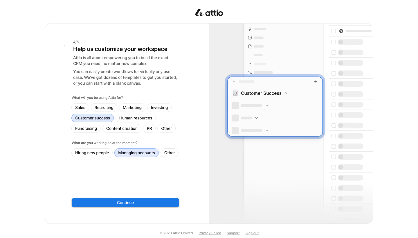
- **Character:** Calm workspace-customization onboarding with white form, pale product illustration and blue selected/continuation states.
- **Evidence and scale:** Screenshot measures 1440 × 821 image pixels. Sizes describe captured pixels with plausible 1× CSS scale; DPR and font identity are unverified.
### Page composition
- **Outer frame:** Centered brand sits above a large rounded split panel approximately 1130 × 690px.
- **Form half:** White left pane contains back chevron, 4/5 progress, heading, two explanatory paragraphs and two chip-choice groups.
- **Illustration half:** Pale-gray CRM interface mockup fills the right, with a blue-outlined Customer Success panel floating over faint table/sidebar shapes.
- **Action/footer:** Wide blue Continue button anchors the form bottom; small copyright/privacy/support/sign-out links sit below the outer panel.
### Information hierarchy
- **Task:** Bold customization heading leads into smaller explanatory copy.
- **Choice groups:** Use-case question has ten wrapping chips; current-work question has three.
- **Selection:** Customer success and Managing accounts use pale blue fills/blue outlines; other chips remain white.
- **Progression:** Continue is the strongest action; the mockup reinforces selected context without competing with the form.
### Typography
- **Heading:** Approximately 21px captured size semibold.
- **Body:** Around 14px with 20px leading.
- **Questions/chips:** Questions around 12px gray; chips around 14px dark.
- **Utilities:** Progress/footer around 12px; button around 14px medium. Exact family and computed weights remain unverified.
### Colors & surfaces
- **Measured foundation:** White #FFFFFF, near-white #FBFBFB and pale gray #EFEFEF dominate.
- **Measured borders:** #E7E7E7 and #F0F0F0 support subtle outlines.
- **Measured action:** Blue #1977E6 fills Continue; lighter #87B1F9/#7CA6ED appear around selected/illustrative highlights.
- **Foreground:** Dark headings and gray explanatory text; muted skeleton-like illustration content stays low contrast.
### Components
- **Panel shell:** Thin pale border, radius near 20px, clean vertical split.
- **Choice chips:** Content-width pills around 30px high, fine gray outline and compact 12px horizontal padding.
- **Selected chips:** Pale-blue fill and stronger blue border without an additional check icon.
- **Continue:** Approximately 365 × 34px, blue fill, white label, 7px radius and soft lower shadow.
- **Mockup highlight:** Floating rounded white panel around 330 × 210px with blue outline/halo, title/dropdown/plus and faint list rows.
### Visual rhythm
- **Form inset:** Roughly 90–96px from the pane edge; copy and choices align consistently.
- **Group spacing:** About 32–40px separates explanation and choice groups.
- **Wrapping rhythm:** Chips use small 6–8px gaps across multiple lines.
- **Bottom anchoring:** Large gap before Continue keeps progression stable independent of selected choices.
### Responsive
- **Observed limit:** Desktop selected-choice state only; chip changes, continuation and mobile layout are unobserved.
- **Recommended layout:** Reduce or omit decorative mockup on phones, retaining fluid form width.
- **Recommended chips:** Allow natural wrapping with comfortable tap areas and clear selected semantics.
- **Recommended action:** Preserve readable progress and reachable Continue without excessive vertical compression.
### Adaptation guidance
- **Preserve focus:** Ask a small number of contextual questions with compact choices rather than a long form.
- **Reinforce context:** A quiet product illustration can echo selections without becoming a second task.
- **Implementation:** Provide accessible multi/single-selection semantics appropriate to real logic, focus and clear state. Screenshot choices do not establish actual customization behavior.
Use this context to reproduce the reference's visual language: layout, typography, colors, spacing, borders, radii, and distinctive elements. The screenshot takes priority if descriptions conflict.
## Direction
{{preferences.fidelityInstructions}}
## Output
{{output.instructions}}
Deliver a polished, cohesive design with precise alignment, hierarchy, and spacing. Produce the requested visual artifact, not just a description. If unsupported, explain the limitation.