Design with AI
Generate a new design based on this screen using your own content.
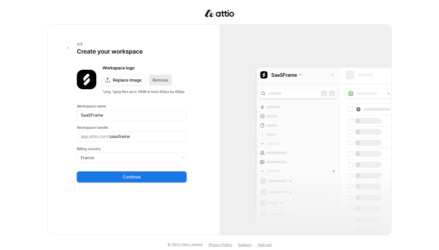
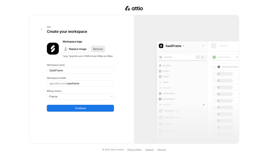
# Design from Reference: Attio Company Setup
Create an original, high-fidelity visual design inspired by the reference. Prioritize composition, typography, colors, spacing, and component styling over technical implementation.
## Reference
- **Product:** Attio
- **Category:** Account Setup
- **Screenshot:** https://cdn.prod.website-files.com/5e9dc792e1210c5325f7ebbc/6acbb9fbd37e66e942ffbbac_6acb70aeb226993977e1cb21_cms-751fc449574deb6aa6a06347.webp
Analyze the screenshot first. If inaccessible, request it rather than guessing.
## Content
{{content.instructions}}
{{content.data}}
Preserve essential messaging and factual accuracy. Adapt structure and copy length for visual balance; never invent product claims.
## Visual Design
### Overall aesthetic
- **Character:** Minimal workspace onboarding, pairing a compact form with a pale live-product preview.
### Page composition
- **Canvas:** 1440 × 821 screenshot px.
- **Structure:** Centered logo above large rounded split panel; left step 2/5 with workspace branding/name/handle/country; right gray preview shows a faded app sidebar and table. Small legal/support links sit beneath.
### Information hierarchy
- **Priority:** Create your workspace heading leads; uploaded logo controls precede named fields and full-width blue Continue.
### Typography
- **Family:** Neutral sans serif, exact font unverified.
- **Scale:** Estimated screenshot heading 20–22 px, body/inputs 14 px and helper/step 12 px.
### Colors & surfaces
- **Sampled palette:** White #FFFFFF, preview #EFEFEF/#FBFBFB, placeholders #F0F0F0, action blue #1977E6 and borders #E7E7E7.
### Components
- **Form:** Logo thumbnail with Replace image/Remove controls; three stacked outlined fields, handle prefix and country chevron.
- **Preview:** White rounded app window with tiny navigation icons and skeleton-like rows fading toward the bottom.
- **Geometry:** Estimated screenshot panel width 1130 px, corners 22 px, form width 360 px and button height 36 px.
### Visual rhythm
- **Spacing:** Approximately 24–30 screenshot px between field groups; broad panel padding and a generous empty lower region.
### Responsive
- **Observed:** Desktop only.
- **Adaptation:** Prioritize form on mobile; move preview below or omit it, preserve visible logo-file requirements and use fluid control widths.
### Adaptation guidance
- **Preserve:** Quiet split composition and immediate branding preview.
- **Replace:** Use actual workspace values, country options and current upload constraints.
Use this context to reproduce the reference's visual language: layout, typography, colors, spacing, borders, radii, and distinctive elements. The screenshot takes priority if descriptions conflict.
## Direction
{{preferences.fidelityInstructions}}
## Output
{{output.instructions}}
Deliver a polished, cohesive design with precise alignment, hierarchy, and spacing. Produce the requested visual artifact, not just a description. If unsupported, explain the limitation.