Design with AI
Generate a new design based on this screen using your own content.
# Design from Reference: Asana User Onboarding
Create an original, high-fidelity visual design inspired by the reference. Prioritize composition, typography, colors, spacing, and component styling over technical implementation.
## Reference
- **Product:** Asana
- **Category:** User Onboarding
- **Screenshot:** https://cdn.prod.website-files.com/5e9dc792e1210c5325f7ebbc/6acbc132b7ca13cf700959ba_6acbc025d6be908889c5e48d_cms-5b04d19ddb10ff1a888cb6db.webp
Analyze the screenshot first. If inaccessible, request it rather than guessing.
## Content
{{content.instructions}}
{{content.data}}
Preserve essential messaging and factual accuracy. Adapt structure and copy length for visual balance; never invent product claims.
## Visual Design
### Overall aesthetic
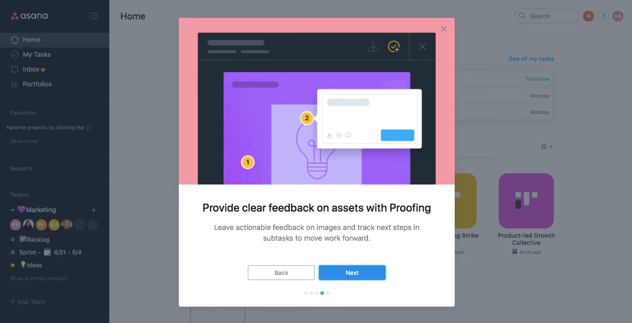
- **Character:** A product-tour modal uses a colorful instructional illustration over a dimmed dark-sidebar workspace.
- **Contrast:** A white copy/action region balances the pink and purple illustration above.
### Page composition
- **Capture:** The source is 1237 × 632 image pixels. Measurements approximate image pixels; CSS scale is unverified.
- **Backdrop:** A left navigation sidebar and Home workspace remain visible under a gray overlay.
- **Modal:** A centered approximately 540 × 565-pixel rectangle contains a large upper illustration and white lower explanation panel.
- **Actions:** Back and Next share a row below copy, with five progress dots beneath and a close X at the top-right.
### Information hierarchy
- **Illustration:** A proofing example with numbered markers and comment card establishes the feature visually.
- **Message:** A bold centered title explains feedback on assets; a short two-line paragraph follows.
- **Progression:** Blue Next is stronger than outlined Back, while the fourth progress dot is active.
### Typography
- **Family:** A compact sans serif is visible; exact identity is unverified.
- **Title:** Approximately 21 pixels, semibold.
- **Body:** Around 14 pixels with 21-pixel leading, centered and muted.
- **Buttons:** Approximately 12 pixels; the primary label is white and semibold.
### Colors & surfaces
- **Measured backdrop:** Gray #7D848C forms much of the dimmed workspace.
- **Measured dark:** #1F2936 and #222C37 appear in sidebar/illustration framing.
- **Measured illustration:** Pink #F29BA5 and purple #9C61F7 dominate the upper graphic.
- **Measured copy surface:** White #FFFFFF provides the lower panel; bright blue marks Next and active progress.
### Components
- **Tour shell:** Small corner radii define the white modal; the upper artwork has a full-width pink surround.
- **Proofing image:** A dark application frame encloses a purple asset, two yellow numbered markers and a white floating comment box.
- **Buttons:** Two approximately 132 × 30-pixel controls sit side by side; Next has blue fill and pale-blue outer emphasis.
- **Progress dots:** Five tiny circles show one blue active state and four pale states.
- **Dismissal:** A small gray X sits in the pink upper-right corner.
### Visual rhythm
- **Proportion:** Illustration occupies over half the modal height.
- **Alignment:** Heading, description, actions and dots share a central axis.
- **Spacing:** A broad gap separates explanation from buttons, with smaller spacing around progress dots.
### Responsive
- **Observed state:** Only desktop is supplied; compact behavior is unverified.
- **Recommended modal:** Bound to viewport width/height and allow scrolling.
- **Recommended imagery:** Scale artwork proportionally and retain usable button targets.
### Adaptation guidance
- **Preserve teaching order:** Keep illustration, title, explanation and navigation in sequence.
- **State fidelity:** Reproduce the fourth-dot tour state without inferring later steps.
- **Backdrop restraint:** Maintain enough dimming to focus the modal.
- **Accessibility:** Provide dialog semantics, keyboard dismissal and text progress information.
Use this context to reproduce the reference's visual language: layout, typography, colors, spacing, borders, radii, and distinctive elements. The screenshot takes priority if descriptions conflict.
## Direction
{{preferences.fidelityInstructions}}
## Output
{{output.instructions}}
Deliver a polished, cohesive design with precise alignment, hierarchy, and spacing. Produce the requested visual artifact, not just a description. If unsupported, explain the limitation.