Design with AI
Generate a new design based on this screen using your own content.
# Design from Reference: Asana Onboarding Email Flow
Create an original, high-fidelity visual design inspired by the reference. Prioritize composition, typography, colors, spacing, and component styling over technical implementation.
## Reference
- **Product:** Asana
- **Category:** Onboarding Email
- **Screenshot:** https://cdn.prod.website-files.com/5e9dc792e1210c5325f7ebbc/6acbc141b7ca13cf70095b8f_6acbc03c8fac5a61407022da_cms-cf11c9275d335e655e4419a0.webp
Analyze the screenshot first. If inaccessible, request it rather than guessing.
## Content
{{content.instructions}}
{{content.data}}
Preserve essential messaging and factual accuracy. Adapt structure and copy length for visual balance; never invent product claims.
## Visual Design
### Overall aesthetic
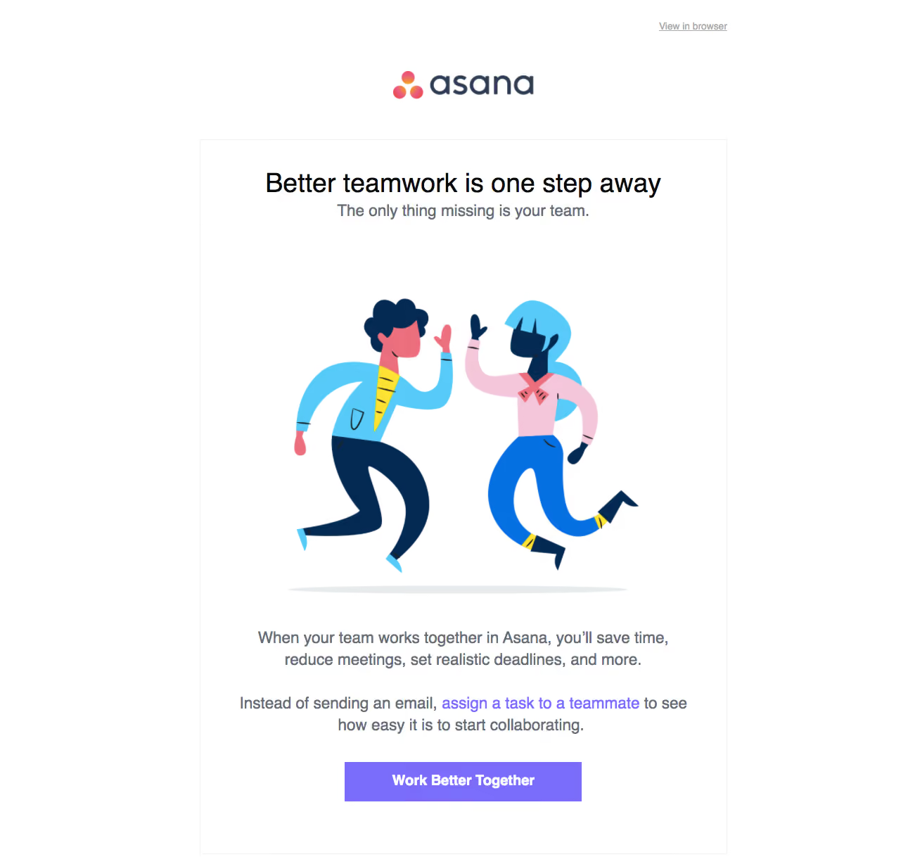
- **Style:** A white onboarding email pairs centered editorial copy with a large colorful teamwork illustration and purple action.
- **Character:** Friendly and celebratory, with broad whitespace and minimal framing.
### Page composition
- **Capture:** The source measures 1291 × 1218 pixels. Dimensions below use image pixels; email CSS scale is unverified.
- **Header:** A small browser-view link aligns right above a centered brand.
- **Panel:** A roughly 750-pixel-wide thin-bordered white region contains title, subtitle, large illustration, two supporting paragraphs and a centered action.
- **Artwork:** Two stylized people high-five above a faint ground shadow.
- **Closing:** The purple button ends the visible panel; no administrative footer is shown.
### Information hierarchy
- **Title:** A large black teamwork heading leads.
- **Subtitle:** A shorter gray line explains the missing team element.
- **Illustration:** The high-five artwork supplies the main visual focus.
- **Copy/action:** Two centered paragraphs lead to a purple collaboration button, with one inline purple link.
### Typography
- **Family:** Neutral sans serif; exact identity is unverified.
- **Heading:** Approximately 38 pixels, regular/medium.
- **Subtitle/body:** Around 23–24 pixels with 30-pixel leading.
- **Action:** Approximately 20 pixels, bold and white.
- **Utility:** Browser-view link around 14 pixels, gray and underlined.
### Colors & surfaces
- **Measured base:** White #FFFFFF dominates.
- **Artwork:** Navy #042A54, cyan #57CAFA, blue #0570E1 and pink #F4C6DA appear in the illustration.
- **Accent:** Purple #7A6DFC supplies the action/link system.
- **Text:** Black heading contrasts with gray body copy.
- **Depth:** Flat illustration and a faint ground shadow; the panel uses only a fine pale border.
### Components
- **Content panel:** Square-corner outlined rectangle with generous side padding.
- **Illustration:** Large flat vector-style figures use navy outlines/details and bright clothing.
- **CTA:** Approximately 337 × 56 pixels, purple fill, square or nearly square corners.
- **Inline link:** Purple text within the second paragraph provides a secondary route.
- **Brand:** Centered wordmark with three warm gradient dots.
### Visual rhythm
- **Spacing:** Large gaps surround the illustration; text blocks are separated by around 30–40 pixels.
- **Alignment:** Heading, artwork, paragraphs and button share one axis.
- **Density:** Short copy and one action keep the email visually simple.
### Responsive
- **Evidence:** One email layout is observed; mobile rendering is unverified.
- **Recommended column:** Use a fluid panel with reduced side padding and proportional illustration scaling.
- **Text:** Allow natural wrapping and retain comfortable line height.
- **Action:** Keep the main button a readable tap target.
### Adaptation guidance
- **Preserve:** Keep the high-five illustration, centered message and purple action.
- **Assets:** Use supplied brand/artwork rather than replacing it with unrelated imagery.
- **Content:** Use actual onboarding copy and destinations.
- **Behavior:** No team invitation or collaboration result is demonstrated.
Use this context to reproduce the reference's visual language: layout, typography, colors, spacing, borders, radii, and distinctive elements. The screenshot takes priority if descriptions conflict.
## Direction
{{preferences.fidelityInstructions}}
## Output
{{output.instructions}}
Deliver a polished, cohesive design with precise alignment, hierarchy, and spacing. Produce the requested visual artifact, not just a description. If unsupported, explain the limitation.