Overall Style and Aesthetic
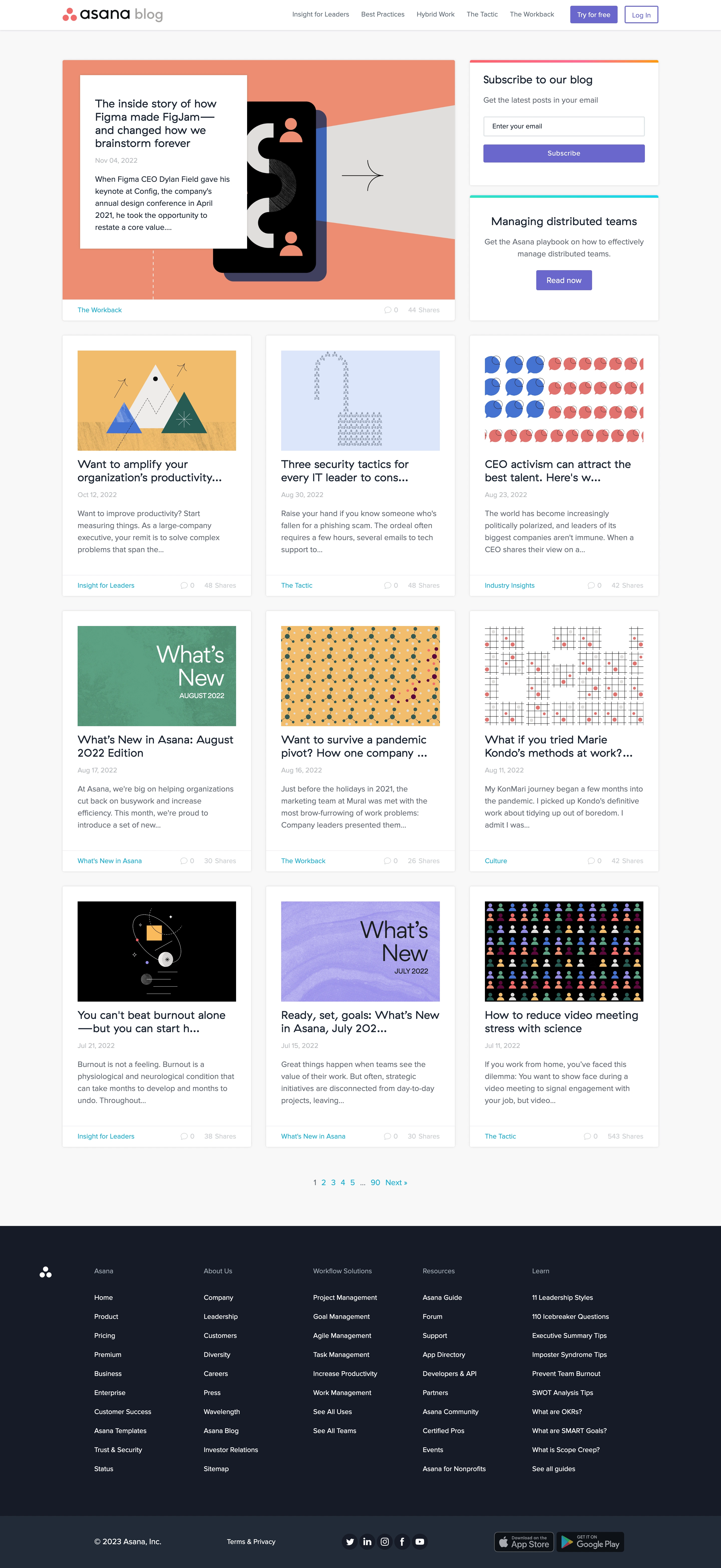
Asana’s blog page exudes a modern, approachable professionalism, blending clarity with a touch of playfulness. The design is unmistakably minimalist, relying on abundant white space to create a calm reading environment that draws focus to content. Pops of color—especially Asana’s recognizable pinks, blues, and oranges—inject subtle vibrancy without overpowering the page. Layout and Structure
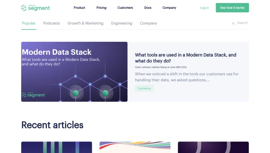
The structure unfolds with a simple, content-driven hero section featuring a concise introductory headline and featured posts. Articles are organized in a visually balanced grid, leveraging card layouts to neatly separate ideas. There are no intrusive elements; navigation remains clear and persistent at the top, while an understated footer provides resources and company information without distraction. Visual Elements
Clean vector illustrations and branded icons adorn each post preview, strengthening visual identity and maintaining consistency. Occasional soft gradient accents echo the SaaS brand, while photography, when present, feels editorial rather than stocky. Animations and hover effects are subtle—thoughtful highlights rather than attention grabs—signaling interactivity without overwhelming users. Color Palette and Typography
The color scheme leans on soft, harmonious gradients—Asana’s signature coral, turquoise, and navy—layered over a crisp white background. Typography features a modern, highly legible sans-serif paired with bold headings and generous line spacing. There’s a clear hierarchy, making content scannable and headlines easy to distinguish. User Experience Patterns
Sticky navigation, logical categorization, and intuitive search enhance discoverability. Calls to action (like “Read more”) are prominent yet tastefully integrated as playful buttons. Everything from scroll interactions to CTAs prioritizes minimal friction, making for a seamless user journey. Unique or Notable Design Choices
Notably, the consistency of visual branding—icon sets, accent colors, and illustration style—ensures every detail feels intentional and intuitive. The tone is smart yet welcoming, inspiring trust while motivating visitors to explore, engage, and, ultimately, convert.