Generate a new design based on this screen using your own content.
Thank you! Your submission has been received!
Oops! Something went wrong while submitting the form.
# Design from Reference: Anchor Blog Post
Create an original, high-fidelity visual design inspired by the reference. Prioritize composition, typography, colors, spacing, and component styling over technical implementation.
## Reference
- **Product:** Anchor
- **Category:** Blog Post
- **Screenshot:** https://cdn.prod.website-files.com/5e9dc792e1210c5325f7ebbc/6acad5295a5fdf4c30310fb6_6acad49591186b2d49d84fca_cms-5728f717126fd292245767ab.webp
Analyze the screenshot first. If inaccessible, request it rather than guessing.
## Content
{{content.instructions}}
{{content.data}}
Preserve essential messaging and factual accuracy. Adapt structure and copy length for visual balance; never invent product claims.
## Visual Design
Use this context to reproduce the reference's visual language: layout, typography, colors, spacing, borders, radii, and distinctive elements. The screenshot takes priority if descriptions conflict.
## Direction
{{preferences.fidelityInstructions}}
## Output
{{output.instructions}}
Deliver a polished, cohesive design with precise alignment, hierarchy, and spacing. Produce the requested visual artifact, not just a description. If unsupported, explain the limitation.
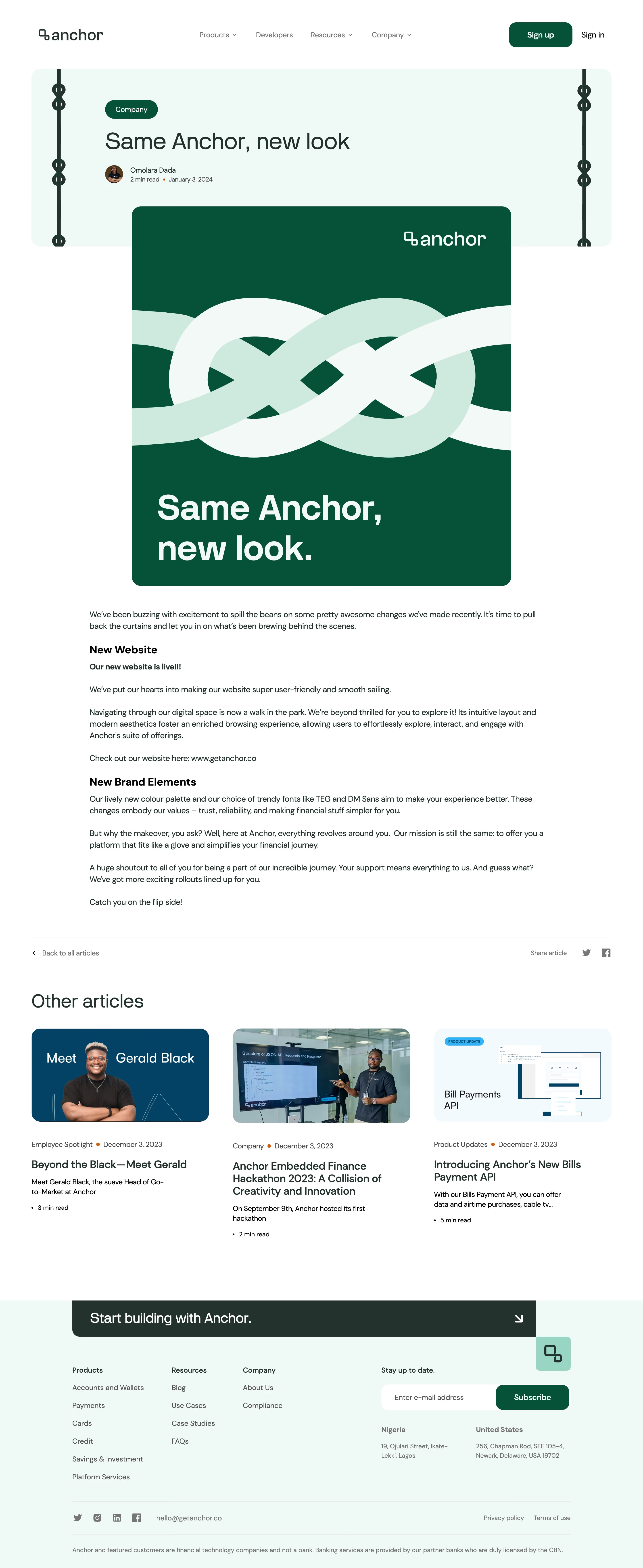
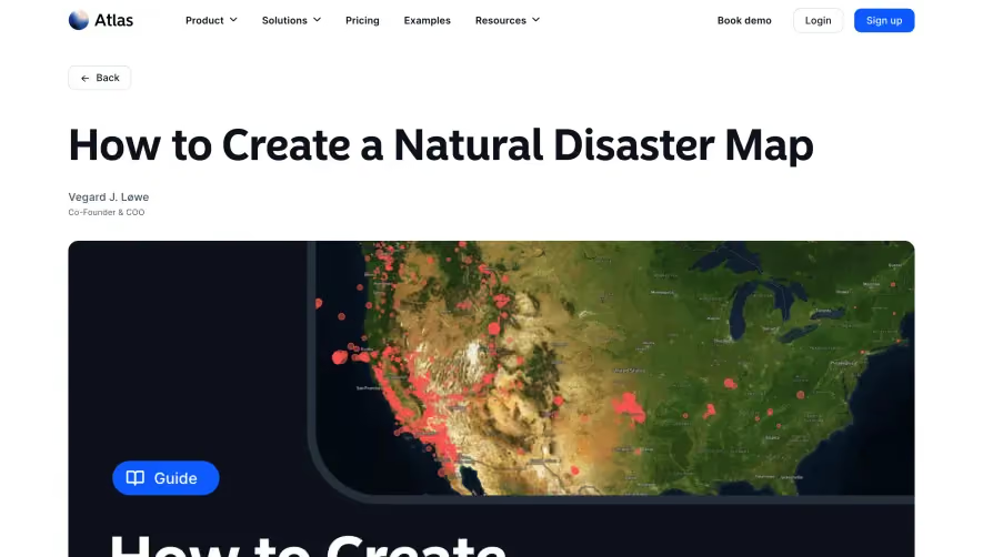
Anchor’s blog page exudes a clean, modern professionalism, rich in minimalism yet invitingly warm. The aesthetic balances ample white space with carefully chosen accent colors, creating a calm and organized feel. Subtle design touches—rounded corners, gentle shadows, and understated brand hues—convey a contemporary and trustworthy SaaS presence.
Layout and Structure
The page employs a focused, vertically stacked structure. It features a concise hero area with a bold headline, followed by the core blog content as the main visual anchor. No distracting sidebars or clutter; navigation sits unobtrusively atop the page, while a pared-down footer closes things out. This straightforward flow keeps the reader engaged without overwhelm.
Visual Elements
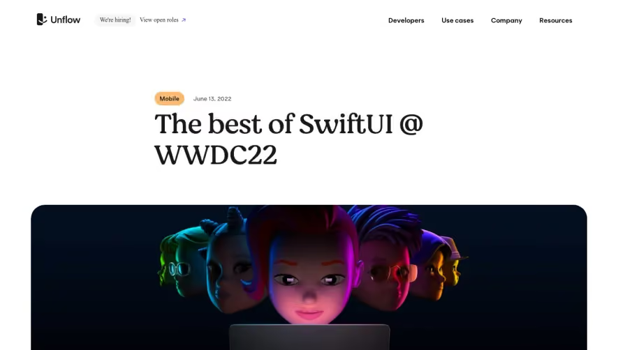
Illustrations take center stage over photography, with abstract, character-driven graphics adding reminders of brand personality while maintaining a sense of approachability. The visuals punctuate the content, guiding the reader’s eye and breaking up text without dominating the experience.
Color Palette and Typography
Anchor uses a cool, modern palette—soft blues and teals paired with muted grays. Vibrant accents highlight interactive elements and CTAs, ensuring they stand out. Typography is clear and legible, leveraging sharp sans-serif fonts with well-defined hierarchy: bold headings for emphasis, lighter body text for readability.
User Experience Patterns & Unique Choices
Smooth transitions and gentle animations (subtle fades, image reveals) add polish without distraction. Streamlined navigation and sparingly used calls-to-action foster effortless browsing. Notably, the sparse yet expressive use of branded illustration and color gives the page a memorable, cohesive identity. The overall tone is innovative and reassuring—ideal for inspiring SaaS designers seeking clarity and character.