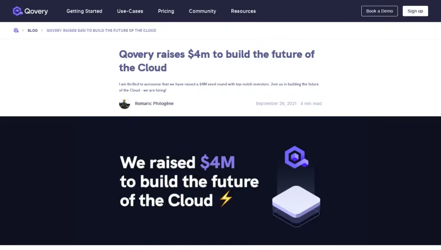
Generate a new design based on this screen using your own content.
Thank you! Your submission has been received!
Oops! Something went wrong while submitting the form.
# Design from Reference: Alloy Blog Post
Create an original, high-fidelity visual design inspired by the reference. Prioritize composition, typography, colors, spacing, and component styling over technical implementation.
## Reference
- **Product:** Alloy
- **Category:** Blog Post
- **Screenshot:** https://cdn.prod.website-files.com/5e9dc792e1210c5325f7ebbc/6acadbe7d05a3f53c0a862e6_6acadb341fe7916e41b14b72_cms-0ebed2c2a56a67e5e9df29cd.webp
Analyze the screenshot first. If inaccessible, request it rather than guessing.
## Content
{{content.instructions}}
{{content.data}}
Preserve essential messaging and factual accuracy. Adapt structure and copy length for visual balance; never invent product claims.
## Visual Design
Use this context to reproduce the reference's visual language: layout, typography, colors, spacing, borders, radii, and distinctive elements. The screenshot takes priority if descriptions conflict.
## Direction
{{preferences.fidelityInstructions}}
## Output
{{output.instructions}}
Deliver a polished, cohesive design with precise alignment, hierarchy, and spacing. Produce the requested visual artifact, not just a description. If unsupported, explain the limitation.
RunAlloy’s Unified API page presents a distinctly modern and minimalist aesthetic, exuding professionalism with subtle bursts of color. Clean white backgrounds, ample whitespace, and restrained design flourishes create an inviting atmosphere that feels both innovative and approachable, ideal for a SaaS platform aiming to build trust.
Layout and Structure
The structure follows a logical, high-conversion flow: a succinct hero section introduces the offering with concise messaging and a prominent call-to-action. Below, the features area is broken into digestible sections, with clear explainer copy and supportive visuals. There’s an emphasis on clarity—no clutter or distractions—while downstream testimonials and recognizable partner logos reinforce social proof. The sticky navigation promotes smooth access to the key sections, while a persistent footer provides additional paths for engagement.
Visual Elements
Custom vector illustrations animate the narrative, elevating the technical subject matter without overwhelming. Minimal iconography is used to guide the eye and clarify specific features. There’s tasteful motion—subtle hover effects and gentle transitions—that add polish and keep the user engaged as they scroll. Screenshots and product UI snippets ground the content in real utility.
Color Palette and Typography
A sophisticated palette of deep blues, crisp whites, and vibrant accent blues and purples ensures accessibility while adding technological energy. The sans-serif typography is modern and highly legible, using bold weights for headlines and lighter styles for supporting copy, establishing a strong informational hierarchy.
User Experience Patterns and Unique Choices
Call-to-action buttons are unambiguous, immediately recognizable, and always above the fold or near key value statements. The navigation is persistently available, making exploration effortless. Notably, the confident, uncluttered design, with repeating visual motifs and micro-animations, creates a lasting impression of both reliability and innovation.