
Thank you! Your submission has been received!
Oops! Something went wrong while submitting the form.
Get SaaSFrame Pro
Monthly
$18
Quarterly
$48
Yearly
$180
Upgrade to access this feature
Browse all screens & flows
Filter and search screens & flows
Access Figma files
Access mobile versions
Bookmark screens & flows
Join now
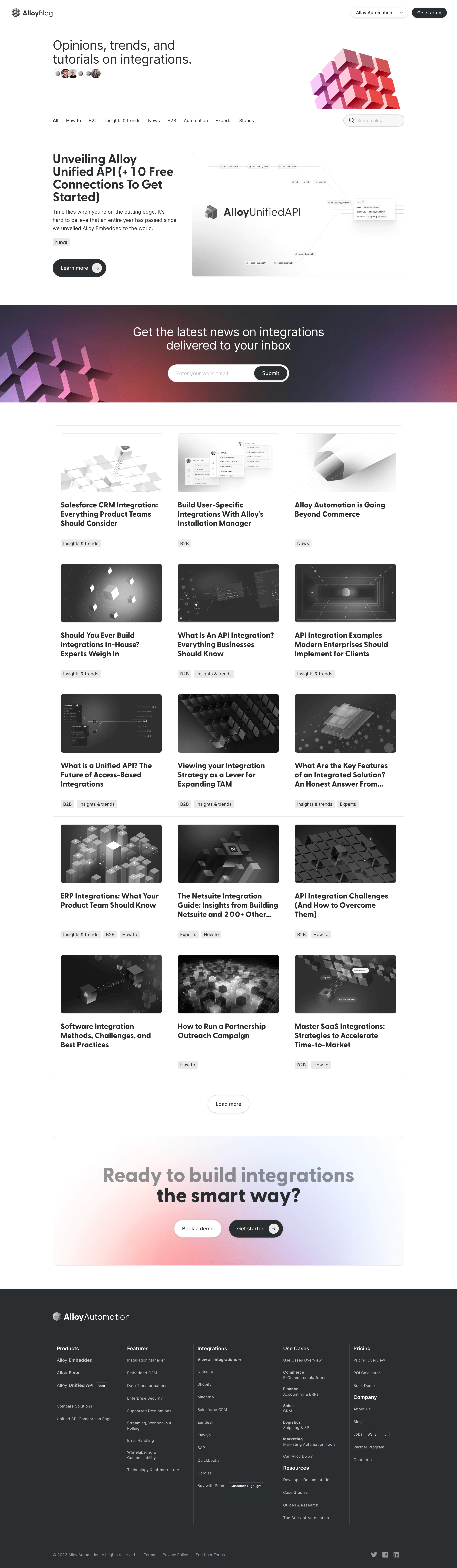

Alloy Blog Feed

Alloy
Build connected applications at the scale
Designed by
No items found.

Bookmark
Bookmark

Design with AI
Thank you! Your submission has been received!
Oops! Something went wrong while submitting the form.
# Design from Reference: Alloy Blog Feed
Create an original, high-fidelity visual design inspired by the reference. Prioritize composition, typography, colors, spacing, and component styling over technical implementation.
## Reference
- **Product:** Alloy
- **Category:** Blog Feed
- **Screenshot:** https://cdn.prod.website-files.com/5e9dc792e1210c5325f7ebbc/6acadbe9d05a3f53c0a8630e_6acadb3905865e2eb66b7060_cms-4f6117b1e7c725a42fe622f5.webp
Analyze the screenshot first. If inaccessible, request it rather than guessing.
## Content
{{content.instructions}}
{{content.data}}
Preserve essential messaging and factual accuracy. Adapt structure and copy length for visual balance; never invent product claims.
## Visual Design
### Overall aesthetic
- **Style:** Editorial integration blog with a monochrome article grid, charcoal actions, and colorful abstract cube artwork reserved for major banners.
- **Character:** White canvas, dark rounded sans-serif headings, fine shared grid lines, gray category chips, and spacious feature presentation.
- **Decoration:** Three-dimensional geometric cube clusters and soft pink/purple/red gradients connect hero, newsletter, and closing CTA.
### Page composition
- **Capture and scale:** 2880 × 9888 image px. CSS estimates assume a 2× capture, approximately 1440 × 4944 CSS px; scale is unverified. Full image inspected in readable portions.
- **Header:** Blog brand left, product dropdown and compact dark Get started pill right.
- **Hero:** Large two-line editorial statement left with small overlapping contributor avatars; cropped pink/red cube cluster right.
- **Filter bar:** Category links along a horizontal row and rounded search field at right.
- **Featured article:** Two columns: large title, short excerpt, category chip, and dark learn-more pill left; broad integration-diagram image right.
- **Newsletter band:** Full-width dark multicolor gradient with cube artwork left, centered white heading, and white email capsule with inset dark submit action.
- **Article grid:** Three columns and five visible rows within one rounded outlined grid, each cell containing image, bold title, and category chips.
- **Pagination:** Centered white outlined Load more pill.
- **Closing CTA:** Wide rounded pastel-gradient panel with large two-line heading and paired white/dark actions.
- **Footer:** Full-width charcoal section with brand, five tall link columns divided by vertical rules, and bottom legal/social row.
### Information hierarchy
- **Editorial identity:** Hero statement introduces the topic before categories and featured story.
- **Feature emphasis:** Featured title and large image precede the regular grid.
- **Grid anatomy:** Thumbnail first, bold multiline title second, small gray categories last.
- **Newsletter:** Large white message and isolated email field create an intervening conversion opportunity.
- **Closing action:** Large heading and dark Get started pill contrast with white Book a demo.
- **Footer hierarchy:** White group headings, muted links, small outlined badges, and quieter legal text.
### Typography
- **Family:** Rounded proportional sans serif; exact family is unverified.
- **Hero statement:** Approximately 40px regular with 44px line-height.
- **Featured title:** Approximately 40px bold with 40–44px line-height.
- **Featured excerpt:** Approximately 16px with 26px line-height.
- **Grid titles:** Approximately 24px bold with 29px line-height.
- **Newsletter heading:** Approximately 38px regular with 44px line-height.
- **Closing heading:** Approximately 60–64px bold with 64px line-height.
- **Navigation/chips:** Approximately 14px; actions around 16px.
- **Footer:** Approximately 12–14px with 20–26px line-height.
- **Precision:** CSS sizes, weights, and tracking are visual estimates.
### Colors & surfaces
- **Canvas:** Sampled #FFFFFF.
- **Charcoal footer/action:** Sampled #2A2E32.
- **Dark neutral imagery/text:** Sampled #2E2E2E, #303030, #434343, and #1D1D1D.
- **Category chips:** Sampled #E9EAEA.
- **Light background detail:** Sampled #F9F8F9.
- **Banner accents:** Pink, red, purple, and pale-blue gradients contrast with grayscale article imagery.
- **Boundaries:** Thin pale-gray rules separate grid cells and outline images; footer uses subtle lighter vertical dividers.
- **Sampling:** Listed colors are measured screenshot pixels after available profile handling; gradient artwork has many additional shades.
### Components
- **Product selector:** White compact pill with thin border, small shadow, text, separator, and downward chevron.
- **Primary pills:** Charcoal fill with white label; featured/closing versions include a small pale circular arrow at right.
- **Search:** Approximately 192 × 38px rounded field with magnifier, pale fill, thin gray outline, and muted placeholder.
- **Featured image:** Approximately 668 × 394px with thin outline and small radius, showing brand and connected schema labels.
- **Newsletter form:** Approximately 380 × 56px white capsule with muted email prompt and inset dark submit pill.
- **Article cells:** Approximately 370px wide, around 24px padding, shared thin borders, and equal row alignment.
- **Thumbnails:** Landscape crops around 320 × 184px with 6px radius; grayscale geometric/integration themes.
- **Category chips:** Small light-gray rounded rectangles, sometimes multiple per article.
- **Load more:** White outlined pill about 130 × 56px with subtle shadow.
- **Closing panel:** Approximately 1108 × 410px with 16px radius and soft pastel glow behind the content.
- **Footer badges:** Tiny outlined beta/hiring/customer-highlight labels embedded within link groups.
- **State limits:** Search/filter results, pagination loading, subscription confirmation, and menus are not demonstrated.
### Visual rhythm
- **Container:** Most body sections align to approximately 1108px centered width.
- **Feature spacing:** Broad gaps frame the hero, featured story, and closing panel.
- **Grid rhythm:** Shared row/column rules produce a consistent editorial matrix; category chips anchor the lower part of each cell.
- **Color cadence:** Mostly neutral content alternates with saturated newsletter and soft closing gradients.
- **Footer density:** Tall narrow link groups contrast with the more open body layout.
### Responsive
- **Observed state:** Desktop only; mobile and interactive behavior are unverified.
- **Hero recommendation:** Stack statement and artwork, reducing the decorative crop.
- **Filter recommendation:** Wrap categories or use a scrollable filter row with a full-width search.
- **Grid recommendation:** Reduce three columns to two then one.
- **Forms/actions recommendation:** Keep email and submit usable without crowding; stack paired CTA buttons when needed.
- **Footer recommendation:** Wrap link columns and retain clear group labels.
### Adaptation guidance
- **Preserve:** Strong featured story, clear categories, consistent monochrome grid, charcoal pills, and selective geometric gradients.
- **Starting geometry:** Approximately 1108px content width, 24px grid padding, 24px card titles, and 56px major pills under the unverified 2× assumption.
- **Content fidelity:** Use real supplied article titles, categories, excerpts, and images.
- **Artwork adaptation:** Maintain the cube/integration theme with approved assets rather than unrelated photography.
- **Implementation recommendation:** Provide accessible search/filter states, pagination feedback, and newsletter validation; no behavior is proven by the static capture.
Use this context to reproduce the reference's visual language: layout, typography, colors, spacing, borders, radii, and distinctive elements. The screenshot takes priority if descriptions conflict.
## Direction
{{preferences.fidelityInstructions}}
## Output
{{output.instructions}}
Deliver a polished, cohesive design with precise alignment, hierarchy, and spacing. Produce the requested visual artifact, not just a description. If unsupported, explain the limitation.


Category
Patterns
No items found.
Tech Stack

Added on
August 22, 2023
Similar screens



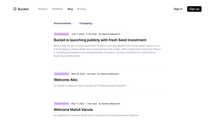



Upgrade to SaaSFrame Pro now to see similar examples.
Monthly
$18 /month
Billed $18 monthly
Browse all screens & flows
Filter and search screens & flows
Search text in screenshots
Access Figma files
Access mobile versions
Join now
Quarterly
$16 /month
Billed $48 quarterly
Browse all screens & flows
Filter and search screens & flows
Search text in screenshots
Access Figma files
Access mobile versions
Join now
Yearly
$15 /month
Billed $180 yearly
Browse all screens & flows
Filter and search screens & flows
Search text in screenshots
Access Figma files
Access mobile versions
Join now