
Thank you! Your submission has been received!
Oops! Something went wrong while submitting the form.
Get SaaSFrame Pro
Monthly
$18
Quarterly
$48
Yearly
$180
Upgrade to access this feature
Browse all screens & flows
Filter and search screens & flows
Access Figma files
Access mobile versions
Bookmark screens & flows
Join now


Alloy About Page

Alloy
Build connected applications at the scale
Designed by
No items found.

Bookmark
Bookmark

Design with AI
Thank you! Your submission has been received!
Oops! Something went wrong while submitting the form.
# Design from Reference: Alloy About Page
Create an original, high-fidelity visual design inspired by the reference. Prioritize composition, typography, colors, spacing, and component styling over technical implementation.
## Reference
- **Product:** Alloy
- **Category:** About Page
- **Screenshot:** https://cdn.prod.website-files.com/5e9dc792e1210c5325f7ebbc/6acc0c14128c0d0450eaabdb_6acc0b82d80161c035a1d1d2_cms-20c2812dc4b29db302b6d4f6-optimized-v3.webp
Analyze the screenshot first. If inaccessible, request it rather than guessing.
## Content
{{content.instructions}}
{{content.data}}
Preserve essential messaging and factual accuracy. Adapt structure and copy length for visual balance; never invent product claims.
## Visual Design
### Overall aesthetic
- **Character:** A spacious company/careers page using grayscale typography, rounded cards, team photography and occasional dark feature regions.
- **Personality:** Staggered travel/team photos, small geometric symbols and soft pill controls make the infrastructure company feel human.
### Page composition
- **Capture scale:** The source measures 2880 × 16440 pixels. A roughly 1440 × 8220 CSS-pixel page at 2× scale is plausible but unverified; all six readable portions were inspected.
- **Header and hero:** Brand sits left, a floating navigation capsule centers, and account/actions sit right. A large multilingual recruiting heading precedes a staggered horizontal photo strip.
- **Company context:** Centered mission copy and an openings action lead into three statistic cards and a horizontal milestone timeline.
- **Culture and jobs:** A full-width charcoal values region is followed by openings, a large pale benefits panel, press cards and FAQ rows.
- **Ending:** A full-width photo mosaic includes a centered testimonial, then a recruiting CTA, rating strip and large dark multi-column footer.
### Information hierarchy
- **Hero:** A large bold heading combines English text with a visible Hindi phrase and flag; the still does not establish animation or language rotation.
- **Context:** A bold team statement precedes a lighter large mission paragraph and dark All openings pill.
- **Values:** One active value is bright in a left list, paired with central abstract artwork and right-side explanation.
- **Openings/benefits:** Large headings lead into category pills, a job row and tab-like benefit choices.
- **Evidence:** Press cards, FAQ, team photography and a testimonial precede the final Get in touch action.
- **Footer:** Product/resource/company groups are organized in tall columns with fine vertical rules.
### Typography
- **Family:** A rounded sans serif is visible; exact identity is unverified.
- **Major headings:** Approximately 60–64 estimated CSS pixels, heavy, with compact line height. Some headings split gray and dark/white words for emphasis.
- **Introductions:** Large mission/benefit paragraphs are around 24–26 pixels with 34-pixel line height and lighter weight.
- **Card titles:** Roughly 24–26 pixels, bold; statistics use larger 38–40-pixel text.
- **Utility/body:** Navigation and buttons are around 14–16 pixels; footer links are smaller, around 12–14 pixels.
### Colors & surfaces
- **Measured palette:** ICC-aware sRGB sampling yields white #FFFFFF, charcoal #2B2E32, pale gray #F7F7F7, #F4F5F5, #F8F8F9 and #F9FAFA.
- **Foregrounds:** Dark #0B090A and mid-gray #4F5153 support the grayscale text system.
- **Accents:** Blue appears in press links and partner logos; photographs supply most other color.
- **Geometry:** Cards and photo tiles have generous rounded corners around 16–20 estimated CSS pixels. Pill navigation/actions use full rounding and subtle shadows.
### Components
- **Photo strip:** Tall rounded images alternate vertical positions and crop at viewport edges, interspersed with small heart/sun/cup symbols.
- **Statistic cards:** Three pale panels show team size, countries and funding, supported by tiny portraits, flag chips and investor badges. Values are captured historical claims.
- **Timeline:** A long pale rounded panel contains a line, milestone dots, pill labels, year markers and circular arrow controls.
- **Values module:** Seven textual choices accompany a stack of dark abstract cards and one explanatory paragraph.
- **Benefits panel:** A five-item icon list has a raised white selected row; the right area shows partner/tool logos and a large explanation.
- **Press/FAQ:** Rounded press cards use small circular logos and blue external links. Five FAQ rows use bold questions, fine rules and circled plus icons.
- **Mosaic/footer:** A three-column photographic collage surrounds a white quote panel. The footer has five broad columns, small badges, lower legal links and social icons.
### Visual rhythm
- **Whitespace:** Large 100–160-pixel estimated CSS gaps separate major sections.
- **Variation:** Staggered photos transition to symmetric statistics, a dark values block, compact jobs and a dense photo mosaic.
- **Consistency:** Rounded corners, pill controls and grayscale headings unify varied content.
- **Contrast pacing:** The dark values region and footer punctuate a predominantly white page.
### Responsive
- **Recommendation:** Stack statistic/benefit layouts, reduce oversized headings and convert photo strips into a readable static gallery or accessible carousel.
- **Recommendation:** Keep timelines and press cards operable on touch screens without relying on clipped content alone.
- **Recommendation:** Collapse navigation/footer groups and preserve FAQ/job-row tap targets. No mobile rendering is shown.
### Adaptation guidance
- **Preserve:** Retain the human photography, grayscale visual system, culture-to-openings sequence and generous rounded geometry.
- **Build:** Use reusable stats, timeline, tabbed-benefits, press and accordion components with clear selected/expanded states.
- **Content integrity:** Treat headcount, funding, ratings, positions and employment policies as captured historical content rather than current verified facts.
- **Accessibility:** Provide text alternatives for photo/culture artwork and keyboard-accessible tabs/carousels/accordions; actual interaction is unverified.
Use this context to reproduce the reference's visual language: layout, typography, colors, spacing, borders, radii, and distinctive elements. The screenshot takes priority if descriptions conflict.
## Direction
{{preferences.fidelityInstructions}}
## Output
{{output.instructions}}
Deliver a polished, cohesive design with precise alignment, hierarchy, and spacing. Produce the requested visual artifact, not just a description. If unsupported, explain the limitation.


Category
Patterns
No items found.
Tech Stack

Added on
August 22, 2023
Similar screens
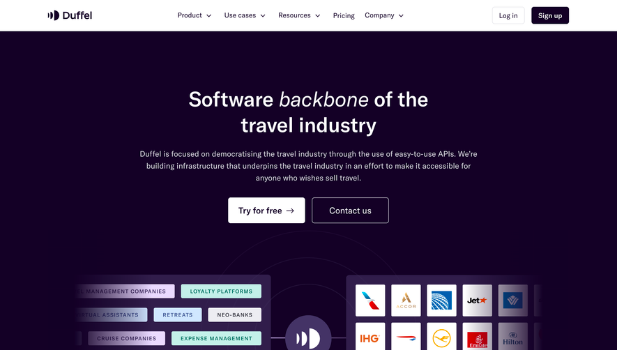


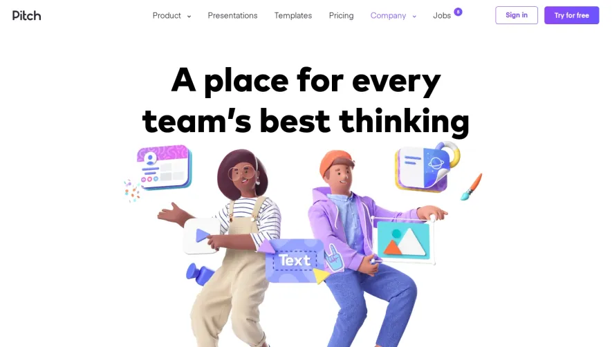

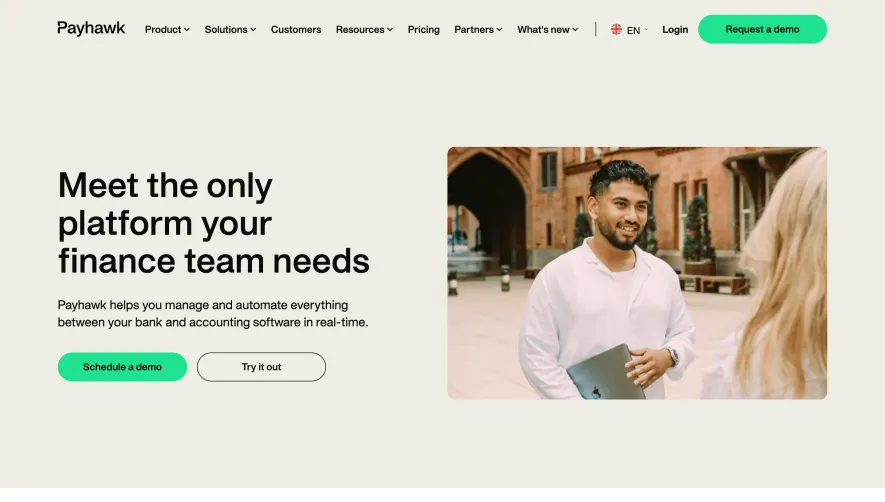

Upgrade to SaaSFrame Pro now to see similar examples.
Monthly
$18 /month
Billed $18 monthly
Browse all screens & flows
Filter and search screens & flows
Search text in screenshots
Access Figma files
Access mobile versions
Join now
Quarterly
$16 /month
Billed $48 quarterly
Browse all screens & flows
Filter and search screens & flows
Search text in screenshots
Access Figma files
Access mobile versions
Join now
Yearly
$15 /month
Billed $180 yearly
Browse all screens & flows
Filter and search screens & flows
Search text in screenshots
Access Figma files
Access mobile versions
Join now