
Thank you! Your submission has been received!
Oops! Something went wrong while submitting the form.
Get SaaSFrame Pro
Monthly
$18
Quarterly
$48
Yearly
$180
Upgrade to access this feature
Browse all screens & flows
Filter and search screens & flows
Access Figma files
Access mobile versions
Bookmark screens & flows
Join now
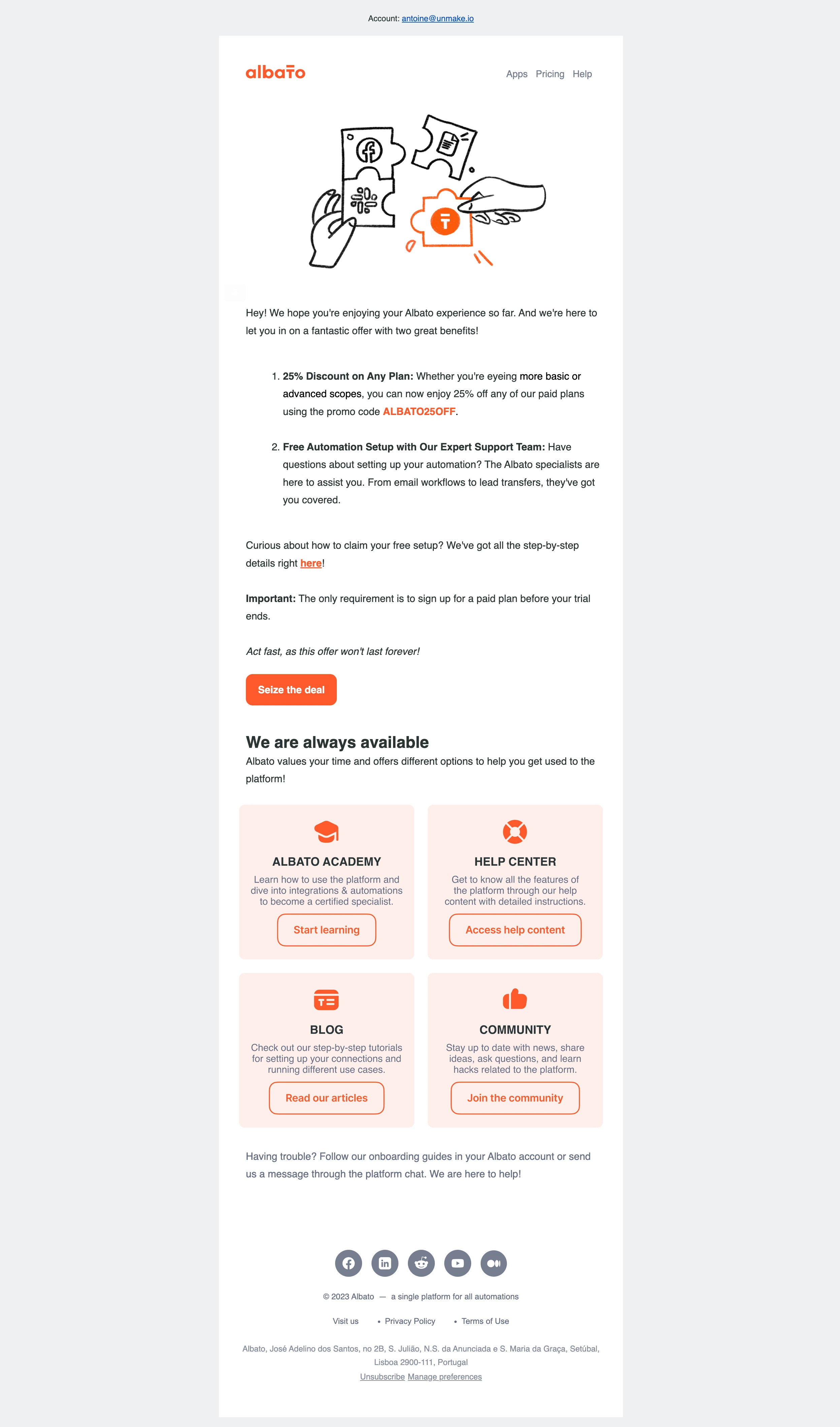
Albato Onboarding Email

Albato
No-code automation
Designed by
No items found.

Bookmark
Bookmark

Design with AI
Thank you! Your submission has been received!
Oops! Something went wrong while submitting the form.
# Design from Reference: Albato Onboarding Email
Create an original, high-fidelity visual design inspired by the reference. Prioritize composition, typography, colors, spacing, and component styling over technical implementation.
## Reference
- **Product:** Albato
- **Category:** Onboarding Email
- **Screenshot:** https://cdn.prod.website-files.com/5e9dc792e1210c5325f7ebbc/6acada15ca6d79c1e0c8a1aa_6acad9a043a3bb53b9db73a7_cms-9dab068302239b398aa298e1.webp
Analyze the screenshot first. If inaccessible, request it rather than guessing.
## Content
{{content.instructions}}
{{content.data}}
Preserve essential messaging and factual accuracy. Adapt structure and copy length for visual balance; never invent product claims.
## Visual Design
### Overall aesthetic
- **Style:** Branded promotional onboarding email combining a personal offer with a structured support-resource grid.
- **Character:** White email column on cool-gray canvas, charcoal copy, vivid orange actions and pale-peach resource cards.
- **Illustration:** Hand-drawn black puzzle pieces and hands, with one orange branded piece, introduce the automation theme.
### Page composition
- **Capture scale:** 2494 × 4236 image px. CSS estimates assume an unverified 2× capture, approximately 1247 × 2118 CSS px.
- **Email column:** Approximately 600 CSS px wide, centered on broad gray margins.
- **Account context:** Small centered account line sits above the white email.
- **Header:** Orange logo left and three small navigation links right.
- **Hero artwork:** Centered line illustration spans much of the column above the body.
- **Offer body:** Introductory paragraph, two-item numbered benefit list, explanatory text, bold requirement line, italic urgency line and orange CTA.
- **Support section:** Bold heading and short paragraph precede four pale-peach cards in two columns and two rows.
- **Closing help:** A muted paragraph offers additional onboarding/chat support.
- **Footer:** Five circular social icons, copyright/tagline, navigation/legal links, address and unsubscribe/preferences controls are centered below.
### Information hierarchy
- **Offer hierarchy:** Bold numbered benefit labels introduce regular-weight explanations; promo code is orange and bold.
- **Primary action:** Filled orange Seize the deal button stands apart from inline links.
- **Conditions:** Important label and italic closing sentence differentiate requirement and urgency from ordinary prose.
- **Support hierarchy:** Resource cards share icon, uppercase title, short description and outlined action.
- **Evidence limit:** Offer terms are captured source content, not verified current pricing or availability. No destination or post-click state is shown.
### Typography
- **Family:** Conventional neutral email sans serif; exact identity is unverified.
- **Body:** Approximately 15–16 CSS px with 26 px leading.
- **Support heading:** Approximately 24 px bold with 30 px leading.
- **Resource titles:** Approximately 18 px bold uppercase.
- **Card descriptions:** Approximately 14 px with 17–19 px leading, centered.
- **Actions:** Approximately 16 px; primary button is bold, outlined resource actions regular/medium.
- **Footer:** Approximately 12 px with 20 px leading.
- **Measurement limit:** Values are visual CSS estimates under the assumed 2× capture.
### Colors & surfaces
- **Outer canvas:** Sampled sRGB #ECF0F2 supplies the cool-gray background.
- **Email body:** Sampled #FFFFFF fills the central column.
- **Resource cards:** Sampled #FFEEEA supplies the pale-peach surface.
- **Primary orange:** Sampled #FF4600 supplies logo/action/icon emphasis.
- **Body ink:** Sampled #2A3534 provides the dark charcoal-green text reference.
- **Secondary text:** Sampled #747E91 and #646E85 provide muted blue-gray references.
- **Footer icons:** Gray-blue circles with white social symbols remain quieter than orange conversion actions.
### Components
- **Primary CTA:** Orange rounded rectangle, approximately 135 × 46 CSS px, white bold label and about 10 px radii.
- **Numbered list:** Indented two-item list with bold lead phrases and generous separation between benefits.
- **Inline links:** Orange underlined emphasis within body prose; account link above the email uses conventional blue.
- **Resource cards:** Approximately 260 px wide, around 230 px tall, pale peach, 10 px radii and centered contents.
- **Resource icons:** Simple orange academy, life-ring, article and thumbs-up symbols.
- **Resource actions:** Orange outlined rounded rectangles with white/peach-compatible fill and generous horizontal padding.
- **Social row:** Five equally sized circular icon links with consistent gaps.
- **Legal controls:** Small underlined unsubscribe/preferences links follow the postal address.
### Visual rhythm
- **Sequence:** Illustration, persuasive prose, primary action, support grid and subdued footer create distinct reading phases.
- **Alignment:** Main copy is left aligned; resource cards and footer switch to centered alignment.
- **Spacing:** Large paragraph/list gaps keep the promotional text readable; equal card dimensions establish a predictable resource grid.
- **Accent consistency:** Orange repeats across brand, offer emphasis, main CTA and support controls.
### Responsive
- **Evidence limit:** Only the captured email is visible; recommendations below are not observed behavior.
- **Container recommendation:** Use a fluid max-width column with safe mobile padding.
- **Grid recommendation:** Stack resource cards on narrow screens while preserving title/description/action grouping.
- **Type recommendation:** Maintain readable body size and let numbered items wrap naturally.
- **Email recommendation:** Validate buttons, card layout and image alternatives in target mail clients.
- **Accessibility recommendation:** Use descriptive links and adequate contrast, especially for muted card/footer text.
### Adaptation guidance
- **Use accurate offers:** Replace discount, promo code, trial requirements and urgency with verified target-product terms.
- **Preserve support value:** Pair the main offer with genuine learning/help/community destinations.
- **Keep hierarchy clear:** One filled primary CTA should remain stronger than resource actions.
- **Retain the palette roles:** Use brand accent for actions, pale tinted cards for resources and neutral reading surfaces.
- **Avoid fabricated outcomes:** Do not imply a redeemed offer or completed setup from this static email.
Use this context to reproduce the reference's visual language: layout, typography, colors, spacing, borders, radii, and distinctive elements. The screenshot takes priority if descriptions conflict.
## Direction
{{preferences.fidelityInstructions}}
## Output
{{output.instructions}}
Deliver a polished, cohesive design with precise alignment, hierarchy, and spacing. Produce the requested visual artifact, not just a description. If unsupported, explain the limitation.


Category
Patterns
No items found.
Tech Stack
No items found.
Added on
September 27, 2023
Found in 1 flow
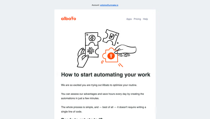
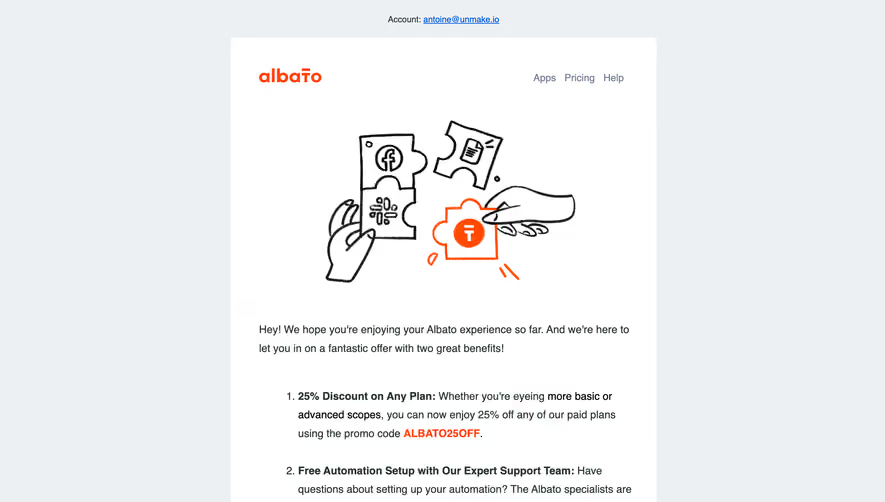
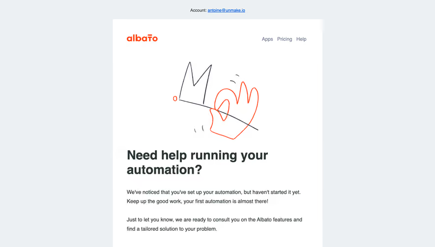
Similar screens





Upgrade to SaaSFrame Pro now to see similar examples.
Monthly
$18 /month
Billed $18 monthly
Browse all screens & flows
Filter and search screens & flows
Search text in screenshots
Access Figma files
Access mobile versions
Join now
Quarterly
$16 /month
Billed $48 quarterly
Browse all screens & flows
Filter and search screens & flows
Search text in screenshots
Access Figma files
Access mobile versions
Join now
Yearly
$15 /month
Billed $180 yearly
Browse all screens & flows
Filter and search screens & flows
Search text in screenshots
Access Figma files
Access mobile versions
Join now