Design with AI
Generate a new design based on this screen using your own content.
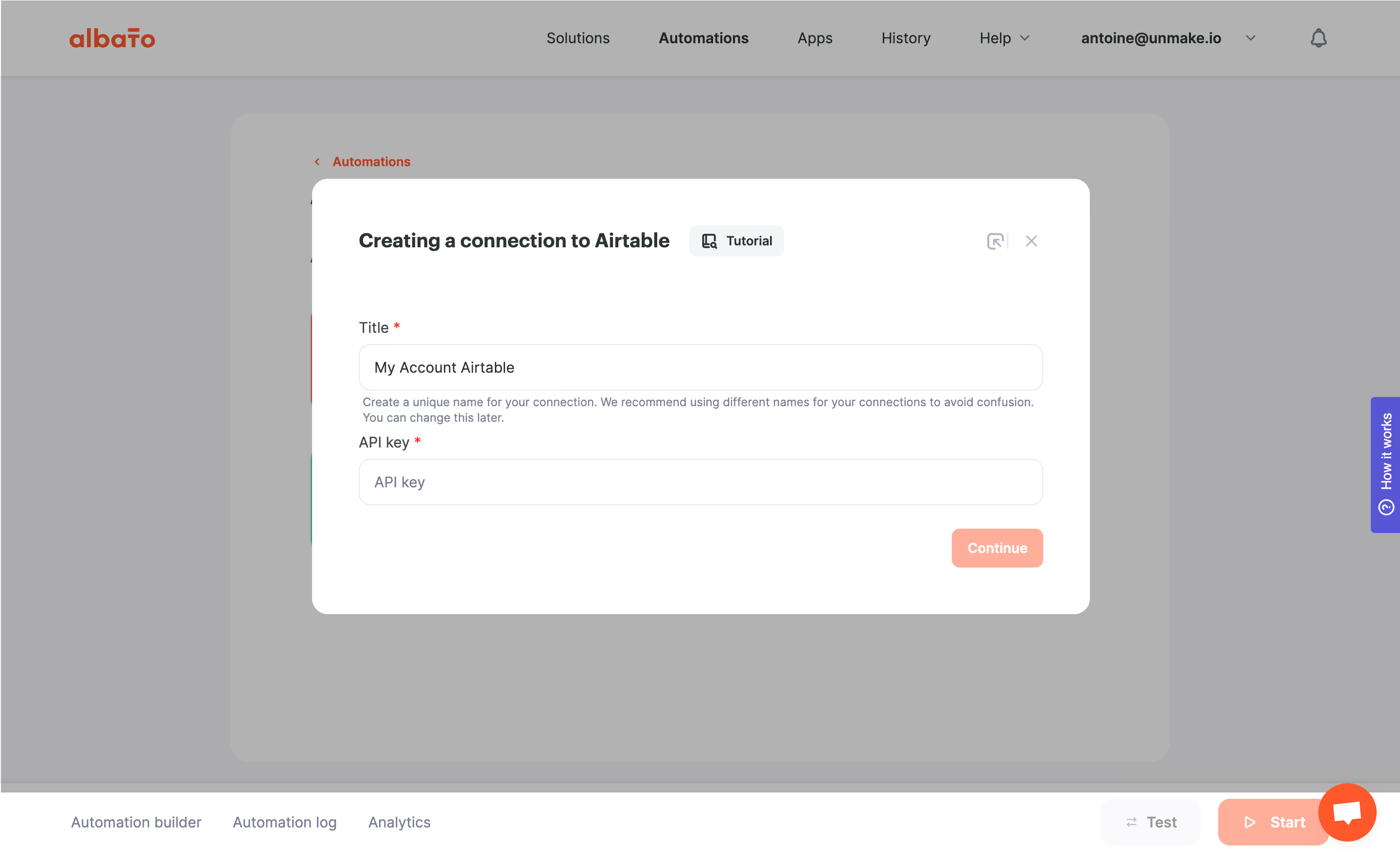
# Design from Reference: Albato Create a Connection to Airtable
Create an original, high-fidelity visual design inspired by the reference. Prioritize composition, typography, colors, spacing, and component styling over technical implementation.
## Reference
- **Product:** Albato
- **Category:** Add & Edit
- **Screenshot:** https://cdn.prod.website-files.com/5e9dc792e1210c5325f7ebbc/6acada60a43009b06fe6f23f_6acad9f4f10c45bfd5847bed_cms-1b900a5156d3d49c747a515b.webp
Analyze the screenshot first. If inaccessible, request it rather than guessing.
## Content
{{content.instructions}}
{{content.data}}
Preserve essential messaging and factual accuracy. Adapt structure and copy length for visual balance; never invent product claims.
## Visual Design
### Overall aesthetic
- **Character:** Simple integration-connection modal with a neutral form and warm coral progression action.
### Page composition
- **Canvas:** 2880 × 1772 screenshot px; CSS estimates assume 2× capture.
- **Structure:** Centered wide white dialog over a gray-dimmed automation builder. Header contains connection title, Tutorial chip and utility/close icons; body contains two stacked inputs and a right-aligned Continue action.
### Information hierarchy
- **Priority:** Connection title establishes destination; required Title and API key labels lead through the form. Helper copy sits directly below the title input.
### Typography
- **Family:** Neutral sans serif, exact family unverified.
- **Scale:** Estimated CSS dialog heading 20–22 px, labels/inputs 14–16 px, helper 12 px and button 14 px bold.
### Colors & surfaces
- **Sampled palette:** White #FFFFFF dialog, dimmed backdrop #B2B2B2 and #ACACAD, coral action #FFA995, pale fill #FAFAFB, outlines #E4E8EC and violet help tab #5856DD.
- **Required fields:** Small red asterisks; gray-blue supporting text.
### Components
- **Geometry:** Estimated CSS modal width 800 px, padding approximately 48 px and corners 16 px; full-width inputs approximately 48 px tall with 12 px corners.
- **Controls:** Small muted Tutorial chip, corner close icon and coral Continue button. Background includes bottom builder tabs and test/start actions.
- **Overlay:** Scrim suppresses builder detail while retaining context.
### Visual rhythm
- **Spacing:** Large gap below the header; approximately 20–28 CSS px between form groups and generous bottom padding.
### Responsive
- **Observed:** Desktop modal only.
- **Adaptation:** Use viewport-width dialog with 16–24 px gutters, stack header controls if needed and preserve full-width credential entry.
### Adaptation guidance
- **Preserve:** Short connection form, explicit required labels and warm primary action.
- **Replace:** Use current integration-specific authentication requirements and supplied account labels; never reproduce secrets from a reference.
Use this context to reproduce the reference's visual language: layout, typography, colors, spacing, borders, radii, and distinctive elements. The screenshot takes priority if descriptions conflict.
## Direction
{{preferences.fidelityInstructions}}
## Output
{{output.instructions}}
Deliver a polished, cohesive design with precise alignment, hierarchy, and spacing. Produce the requested visual artifact, not just a description. If unsupported, explain the limitation.