


```html

Thank you! Your submission has been received!
Oops! Something went wrong while submitting the form.
Get SaaSFrame Pro
Monthly
$18
Quarterly
$48
Yearly
$180
Upgrade to access this feature
Browse all screens & flows
Filter and search screens & flows
Access Figma files
Access mobile versions
Bookmark screens & flows
Join now
Aircall Product Update

Aircall
Cloud Phone System
Designed by
No items found.

Bookmark
Bookmark
Design with AI
Thank you! Your submission has been received!
Oops! Something went wrong while submitting the form.
# Design from Reference: Aircall Product Update
Create an original, high-fidelity visual design inspired by the reference. Prioritize composition, typography, colors, spacing, and component styling over technical implementation.
## Reference
- **Product:** Aircall
- **Category:** Product Update
- **Screenshot:** https://cdn.prod.website-files.com/5e9dc792e1210c5325f7ebbc/62ec9c5f08e2d83a7929717e_1659620507487-screenshot-device-79cebcff31f08b29bf6af3f6ab6a259a-1659598160292.webp
Analyze the screenshot first. If inaccessible, request it rather than guessing.
## Content
{{content.instructions}}
{{content.data}}
Preserve essential messaging and factual accuracy. Adapt structure and copy length for visual balance; never invent product claims.
## Visual Design
### Overall aesthetic
- **Style:** A bright editorial product-update article with a thin geometric headline, restrained green brand accents, and a long bordered reading panel.
- **Character:** Approachable and explanatory: a small team illustration introduces the article while product screenshots substantiate the workflow.
### Page composition
- **Capture and scale:** The screenshot is 1440 × 6212 pixels. Approximate dimensions below refer to screenshot pixels; CSS scale is unverified.
- **Header and hero:** A white navigation row contains the brand left, product links and phone badge across the middle, and login/trial right. A narrow centered hero pairs a peach category pill and two-line headline with a small illustration of three people.
- **Article:** An approximately 860 px-wide bordered panel contains an author/date/navigation strip, introductory paragraphs, What's New, Why We Built It, and How It Works sections, product screenshots, a support link, and sharing controls.
- **Footer:** A brand-tagline strip precedes a pale-gray five-column link footer and lower legal/contact/social row. A large blank white tail remains below the rendered page content.
- **Sharing:** A small vertical sharing rail appears near the viewport's left edge; another horizontal set closes the article. Fixed positioning cannot be proven from the still image.
### Information hierarchy
- **Article hierarchy:** The thin large headline introduces the update, while bold black subsection headings divide practical explanation and instructions.
- **Evidence:** Product screenshots are centered within the text column and separated by generous white space.
- **Supporting metadata:** Author, date, back link, and related-content link occupy a compact top strip, remaining subordinate to the article.
### Typography
- **Family:** A geometric sans serif with very light display lettering and rounded body forms is visible; exact family identity is unverified.
- **Display:** The hero headline is approximately 42–44 px, very light weight, with 1.2 line-height. Its final emphasized word uses a heavier weight.
- **Article:** Body copy is roughly 18 px with 29 px line-height. Subsection headings are approximately 29–30 px bold.
- **Utility text:** Navigation is around 16 px; author/date labels, category badge, sharing label, and footer copy are approximately 12–14 px.
### Colors & surfaces
- **Foundation:** Sampled sRGB #FFFFFF dominates the page, while #F7F7F7 and #F6F6F6 support the footer and subtle neutral regions.
- **Ink:** Sampled #4E4E4E is a reference for medium-gray article copy, contrasted with near-black headings.
- **Brand and links:** Green/teal accents the logo, phone badge, and trial action. Blue marks article links; peach marks the category pill. Exact accent hex values are unverified.
- **Boundaries:** Fine light-gray borders separate the article shell, metadata strip, headings, and social controls without heavy shadows.
### Components
- **Article shell:** A white rectangle with a thin gray border and approximately 10 px radius uses roughly 50 px horizontal body padding.
- **Section headings:** Bold headings have thin full-width rules below, creating clear editorial checkpoints.
- **Product images:** Two visible call-distribution interface screenshots show a sidebar and ordered teammate/team lists. They are approximately 510–520 px wide and sit centered.
- **Hero and actions:** The category pill is peach with small white bold text. The trial control is a compact green rectangle with modest rounding; social icons use small outlined rounded squares.
- **Footer:** Five unboxed columns use uppercase group labels and quiet gray links. A thin bottom divider precedes copyright, sitemap, phone badge, and social icons.
### Visual rhythm
- **Paragraph rhythm:** Use approximately 24–32 px between paragraphs and 32–44 px around subsection headings.
- **Image spacing:** Allow roughly 60–90 px around product screenshots, keeping their edges inside the article's text frame.
- **Page pacing:** The broad header and footer contrast with the narrow article. The blank capture tail should not be treated as an intentional content section.
### Responsive
- **Observed state:** Only desktop is visible.
- **Recommended reflow:** Stack hero illustration beneath the headline, make the article fluid with 20–24 px inner padding, and move sharing controls into the normal flow on narrow screens.
- **Readability:** Scale screenshots proportionally or offer enlarged views, and stack footer columns without shrinking article type excessively.
### Adaptation guidance
- **Preserve:** Retain the category-led hero, thin display title, bordered editorial panel, strong subsection headings, and centered product evidence.
- **Adapt:** Use the new update's actual rationale, benefits, and instructions. Match screenshots to the relevant paragraphs rather than inserting generic imagery.
- **Avoid:** Do not reproduce the blank screenshot tail or copy the reference's author, dates, phone details, and product claims.
Use this context to reproduce the reference's visual language: layout, typography, colors, spacing, borders, radii, and distinctive elements. The screenshot takes priority if descriptions conflict.
## Direction
{{preferences.fidelityInstructions}}
## Output
{{output.instructions}}
Deliver a polished, cohesive design with precise alignment, hierarchy, and spacing. Produce the requested visual artifact, not just a description. If unsupported, explain the limitation.
Category
Patterns
No items found.
Added on
April 21, 2020
Similar screens
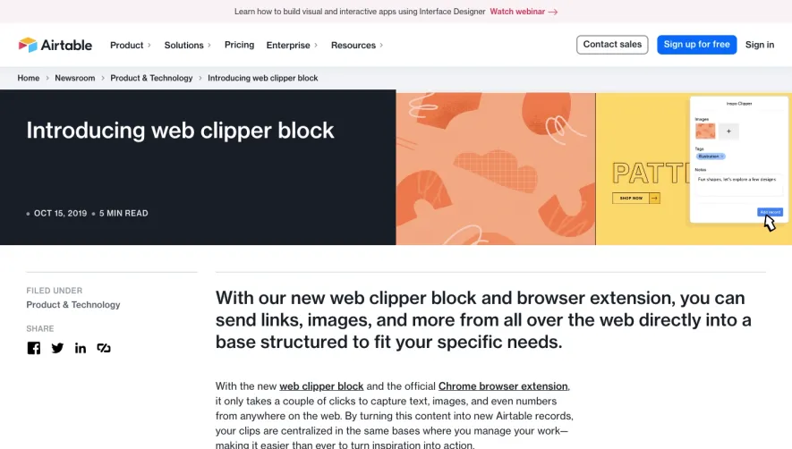


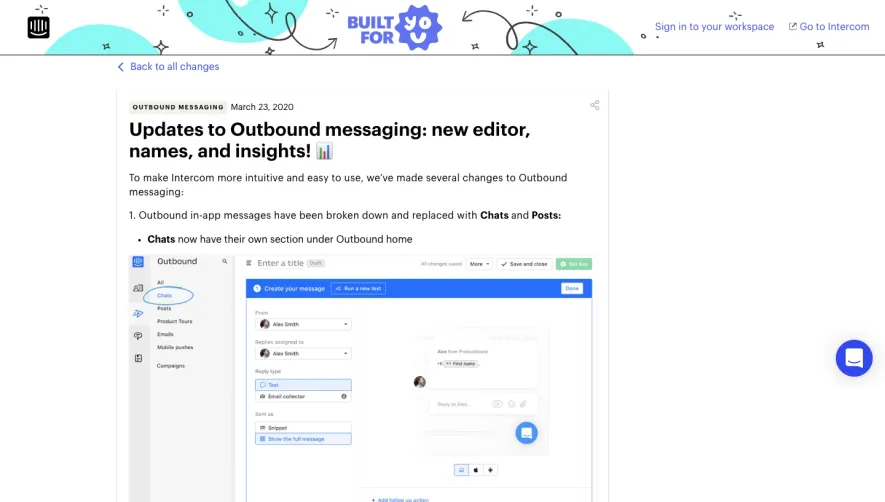

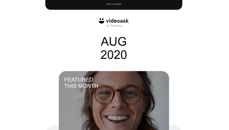

Upgrade to SaaSFrame Pro now to see similar examples.
Monthly
$18 /month
Billed $18 monthly
Browse all screens & flows
Filter and search screens & flows
Search text in screenshots
Access Figma files
Access mobile versions
Join now
Quarterly
$16 /month
Billed $48 quarterly
Browse all screens & flows
Filter and search screens & flows
Search text in screenshots
Access Figma files
Access mobile versions
Join now
Yearly
$15 /month
Billed $180 yearly
Browse all screens & flows
Filter and search screens & flows
Search text in screenshots
Access Figma files
Access mobile versions
Join now