Overall Style and Aesthetic
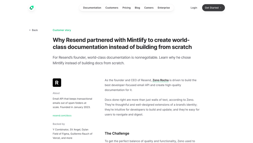
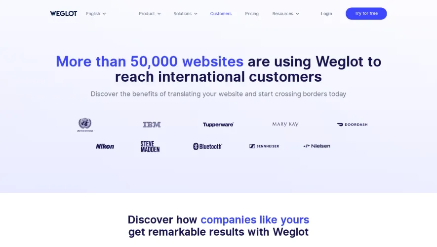
Aircall’s Sendinblue customer story page embraces a crisp, modern aesthetic that reflects SaaS professionalism while remaining visually approachable. Clean, white space dominates, accentuated by signature brand accents—Aircall’s vibrant greens and Sendinblue’s bright blues—that signal freshness and digital innovation without overwhelming the visitor. Layout and Structure
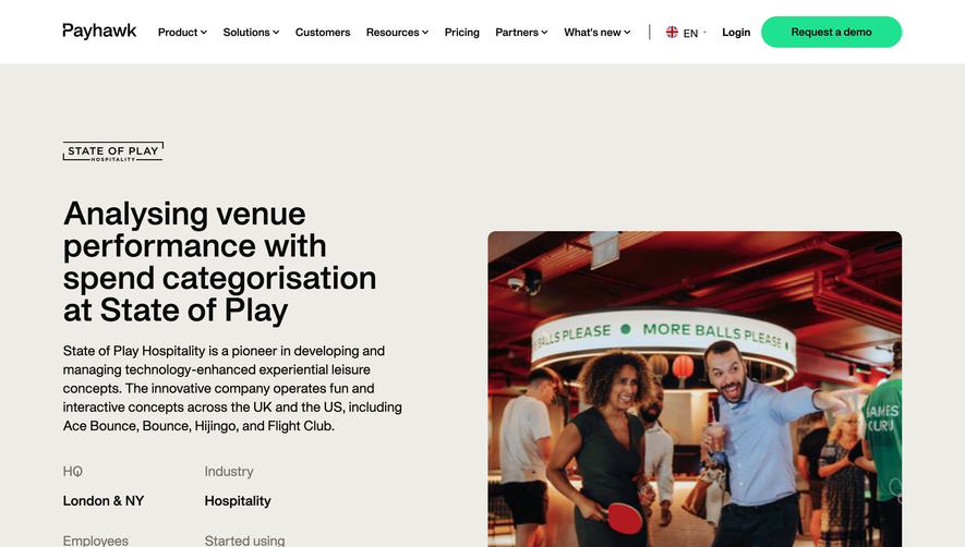
The page follows a focused, single-column layout with purposeful sectioning. It opens with a bold hero area featuring a prominent customer logo, succinct headline, and an engaging photo—instantly conveying credibility and context. Beneath, the narrative unfolds as a case study interwoven with pull quotes, product highlights, and callouts. Call-to-action modules (like “See More Stories”) and a sticky navigation header keep pathways clear throughout the scroll. Visual Elements
Photography plays a starring role—real, personable images of Sendinblue’s team anchor the story. Company logos, product UI screenshots, and crisp iconography provide supportive visuals while subtle gradients and background shapes add depth. The rich media approach forgoes unnecessary animation, relying instead on high-quality imagery to establish trust. Color Palette and Typography
The color palette is carefully curated: classic white and neutral grays for readability, with confident teal greens and digital blues for impact. Typography is friendly yet authoritative, using a sans-serif font family with precise weight hierarchy: bold headlines, clear subheads, and generously spaced paragraphs. Quotes and highlights use larger, colored text blocks to guide the eye. User Experience Patterns
The site’s navigation is streamlined—anchored top nav, visible CTAs, and logical scroll behavior foster seamless exploration. Strategic CTAs like “Try Aircall Free” and related story links encourage engagement without cluttering the page. Form elements and overlays are minimal and context-aware. Unique or Notable Design Choices
This page stands out by immersing visitors in a narrative with editorial depth, supported by authentic employer photography and energetic brand accents. Prominent use of customer voice builds credibility, while judicious use of brand colors ties the story back to Aircall. The tone feels inviting and confident—a balance of professional clarity and human warmth—perfectly suited for inspiration in SaaS storytelling.