
Thank you! Your submission has been received!
Oops! Something went wrong while submitting the form.
Get SaaSFrame Pro
Monthly
$18
Quarterly
$48
Yearly
$180
Upgrade to access this feature
Browse all screens & flows
Filter and search screens & flows
Access Figma files
Access mobile versions
Bookmark screens & flows
Join now
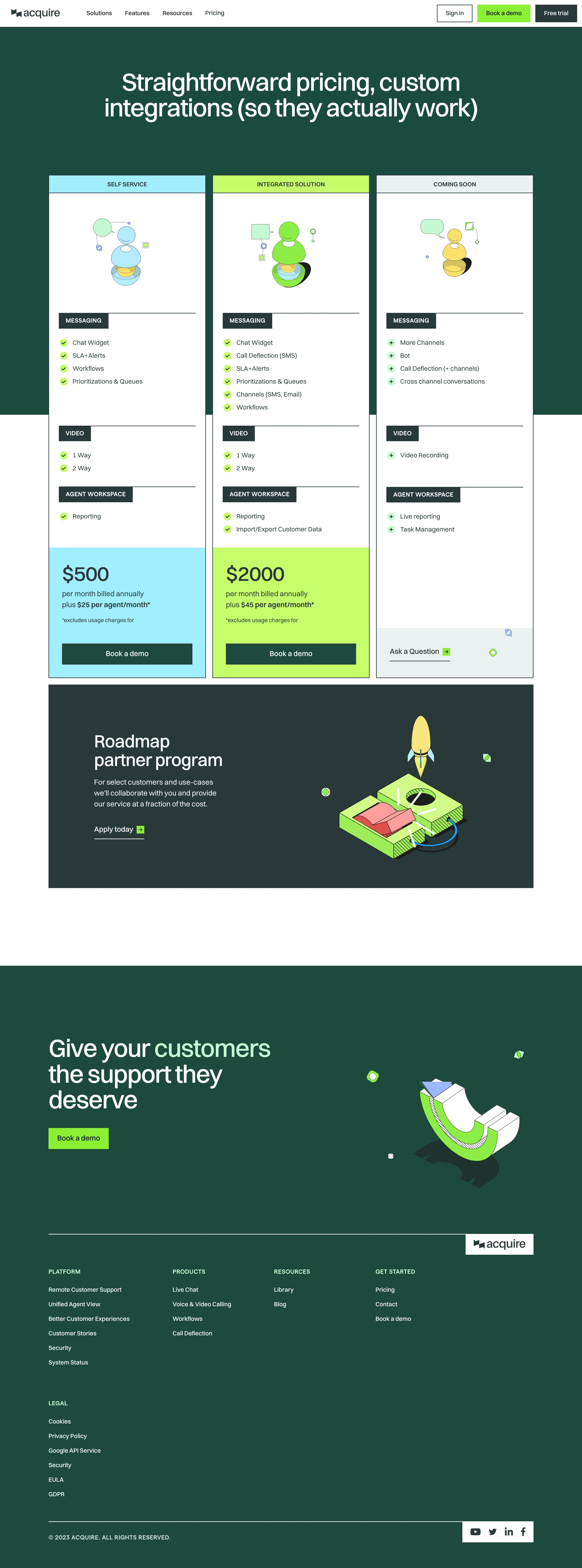

Acquire Pricing Page

Acquire
All your sales and support in one widget
Designed by
No items found.

Bookmark
Bookmark

Design with AI
Thank you! Your submission has been received!
Oops! Something went wrong while submitting the form.
# Design from Reference: Acquire Pricing Page
Create an original, high-fidelity visual design inspired by the reference. Prioritize composition, typography, colors, spacing, and component styling over technical implementation.
## Reference
- **Product:** Acquire
- **Category:** Pricing Page
- **Screenshot:** https://cdn.prod.website-files.com/5e9dc792e1210c5325f7ebbc/6acb6805c08cd859ff8694d1_6acb671ab79140e81e497bb4_cms-e31760c72df59a68fab296a3.webp
Analyze the screenshot first. If inaccessible, request it rather than guessing.
## Content
{{content.instructions}}
{{content.data}}
Preserve essential messaging and factual accuracy. Adapt structure and copy length for visual balance; never invent product claims.
## Visual Design
### Overall aesthetic
- **Character:** A bold pricing page with deep green backgrounds, sharp rectangular cards and vivid cyan/lime accents. Flat outlined illustrations and strong section labels give it a graphic, technical identity.
- **Image basis:** The 2880 × 7758 source was inspected throughout at approximately 1400 px wide in three crops. Dimensions below are inspection pixels; CSS scale and pixel ratio are unverified.
### Page composition
- **Header:** A white navigation bar contains brand and product links left, with three rectangular account/demo/trial controls right.
- **Hero:** A large centered white two-line statement sits on deep green.
- **Comparison:** Three approximately 378 px wide tall columns span x117–1283 and overlap the green-to-white section transition. Self-service, integrated and coming-soon columns share structured feature groups.
- **Partner program:** A broad charcoal-green panel pairs heading/copy/action left with a large rocket/platform illustration right.
- **Closing:** A full-width deep-green conversion area pairs a large left heading and lime demo action with geometric artwork.
- **Footer:** On the same green surface, four link columns and a separate legal group precede copyright and a white social-icon block. A white-backed brand tab aligns to the upper rule's right edge.
### Information hierarchy
- **Statement:** Approximately 60 px white display text introduces the pricing proposition.
- **Columns:** Uppercase colored header strips identify offerings. Illustration, grouped features and colored price/action areas establish the comparison sequence.
- **Features:** Dark rectangular labels and horizontal rules divide Messaging, Video and Agent Workspace categories.
- **Future offering:** The third column uses plus markers and an Ask a Question action, rather than the price/demo structure of the first two.
- **State:** No checkout, hover or selected plan state is visible.
### Typography
- **Hero:** Approximately 60 px medium sans-serif with tight tracking and around 62 px line-height.
- **Section headings:** Partner heading is around 42 px; closing display is around 58 px.
- **Plans:** Prices are around 46 px medium; feature rows around 16 px, with 31 px cadence.
- **Utility:** Uppercase group labels and footer headings are around 14 px semibold; body/footer links around 15–18 px. Exact family identity and CSS metrics are unverified.
### Colors & surfaces
- **Measured foundations:** Deep green #004B3D and nearby #004B3F anchor hero/footer; dark slate-green #263A3A forms partner panel and labels.
- **Measured accents:** Lime #B6FF4C, cyan #87F1FF and bright green #64F200 define plan bands and actions.
- **Measured light:** White #FFFFFF forms card bodies; pale #E7F1F0 supports the coming-soon treatment.
- **Illustration:** Mint, yellow, coral and blue appear in outlined geometric people/platform artwork. Shadows are drawn shapes rather than soft card elevation.
### Components
- **Pricing columns:** Roughly 378 px wide, sharp corners and thin dark outlines. Colored approximately 43 px header strips cap white bodies.
- **Feature sections:** Dark label tabs sit on horizontal rules. Small filled circular checks or plus signs lead left-aligned feature text.
- **Price areas:** Cyan/lime lower blocks contain large prices, billing notes and broad dark-green rectangular demo buttons.
- **Coming-soon action:** A pale lower area contains an underlined question link and small lime arrow tile.
- **Partner panel:** Approximately 1167 × 488 px with sharp corners and generous padding; artwork occupies the right half.
- **Closing/footer:** Bright rectangular demo button, thin pale rules and white social/brand blocks maintain the geometric language.
- **States:** No focus or expanded navigation is shown.
### Visual rhythm
- **Grid:** Three equal columns and aligned category groups support comparison despite different feature counts.
- **Spacing:** Large gaps separate hero, partner program and closing CTA; pricing columns remain densely structured.
- **Contrast:** Dark green, white and saturated bands create strong horizontal/vertical blocks.
- **Geometry:** Sharp rectangles, thin outlines and flat illustration shapes are repeated throughout.
### Responsive
- **Evidence limit:** Only desktop is observed.
- **Recommended columns:** Stack complete offerings with their labels, features and billing notes intact.
- **Recommended comparison:** Preserve group headings and explicit included/future markers when layout changes.
- **Recommended illustration:** Scale partner/closing artwork independently so text remains readable.
- **Recommended footer:** Wrap columns and rectangular header actions without shrinking hit targets.
### Adaptation guidance
- **Preserve:** Keep the deep-green/cyan/lime palette, sharp card geometry and categorized feature comparison.
- **Build:** Reuse offering-column, feature-group, price-block and geometric-action components.
- **Content integrity:** Verify real pricing and future availability before reuse; screenshot commercial content is historical.
- **Validate:** Confirm fonts, lime/dark contrast, billing-note readability and mobile column order.
Use this context to reproduce the reference's visual language: layout, typography, colors, spacing, borders, radii, and distinctive elements. The screenshot takes priority if descriptions conflict.
## Direction
{{preferences.fidelityInstructions}}
## Output
{{output.instructions}}
Deliver a polished, cohesive design with precise alignment, hierarchy, and spacing. Produce the requested visual artifact, not just a description. If unsupported, explain the limitation.


Category
Patterns
No items found.
Tech Stack



Added on
May 27, 2023
Similar screens
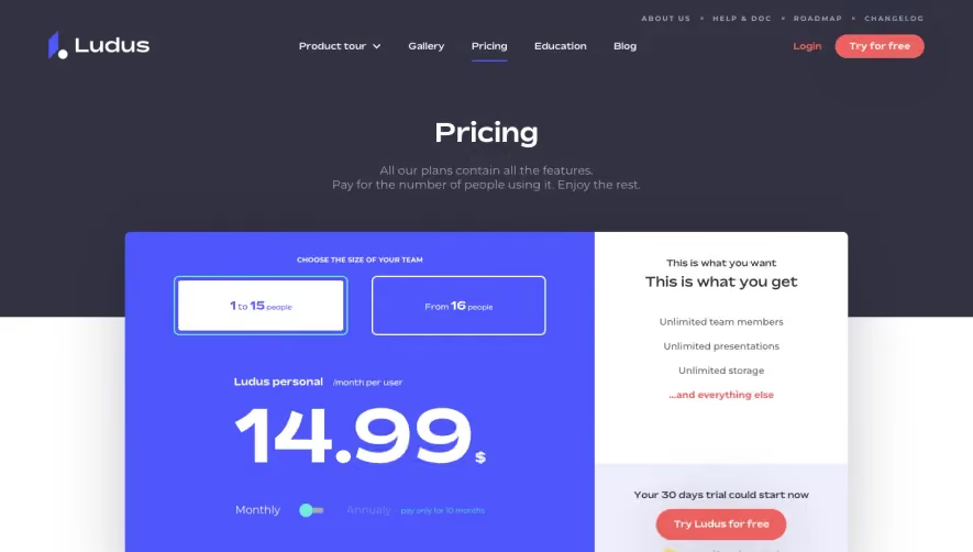






Upgrade to SaaSFrame Pro now to see similar examples.
Monthly
$18 /month
Billed $18 monthly
Browse all screens & flows
Filter and search screens & flows
Search text in screenshots
Access Figma files
Access mobile versions
Join now
Quarterly
$16 /month
Billed $48 quarterly
Browse all screens & flows
Filter and search screens & flows
Search text in screenshots
Access Figma files
Access mobile versions
Join now
Yearly
$15 /month
Billed $180 yearly
Browse all screens & flows
Filter and search screens & flows
Search text in screenshots
Access Figma files
Access mobile versions
Join now