Maintain user engagement during wait times with polished SaaS Loading Screens and Skeleton States. Explore progress bars, animated logos, and ghost loaders that improve perceived performance and keep the UI feeling responsive.
Browse 34 real SaaS Loading Screen with modern UI patterns and conversion strategies.
We sell SaaSFrame licenses on Gumroad, a secured online selling platform for creators.
What about future updates and versions?
SaaSFrame gets updated all the time! Every new update and version will immediately be made available to all SaaSFrame users.
I didn't receive my licence key, what should I do?
The licence key required to create your SaaSFrame account is send by Gumroad once you made your purchase. If this email is blocked by your email client, send me an email at antoine[at]unmake[dot]io so I can resend the licence key.
Can you send me an invoice?
You can generate an invoice on Gumroad once you purchased SaaSFrame. You will find the link in the order confirmation email.
Can I get a refund?
If you're not satisfied, you can ask for a refund within 7 days. Just send me an email at antoine[at]unmake[dot]io
Loading Screen Design Guide
A SaaS loading screen explains that the product is waiting for work to finish or information to arrive. Its design should identify the operation, preserve useful context, and help users understand whether they should wait, continue elsewhere, or recover from a problem. A spinner alone cannot answer all of those questions.
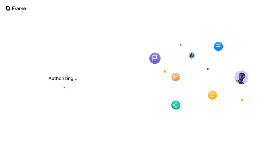
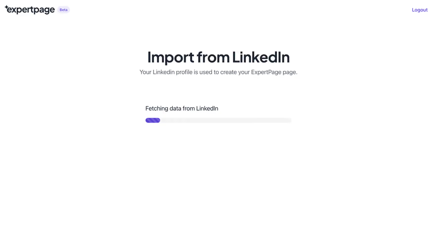
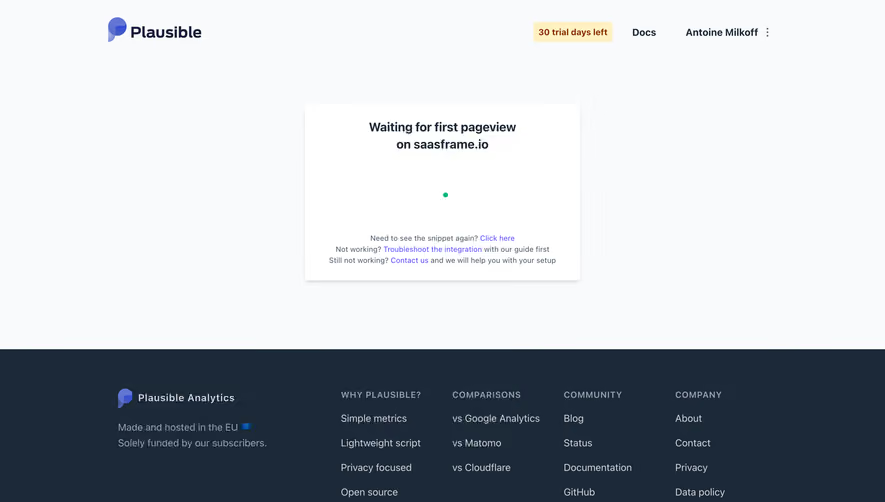
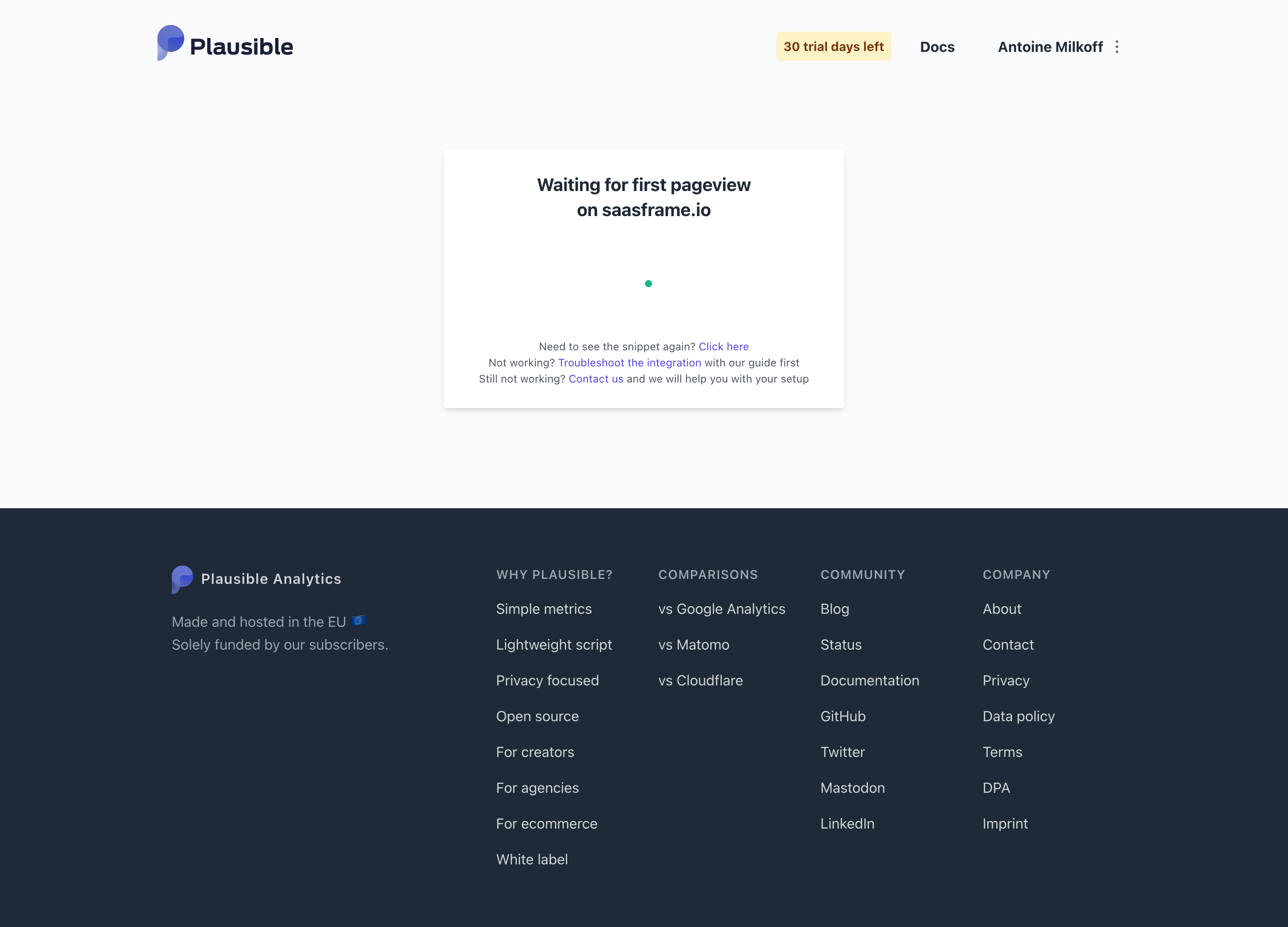
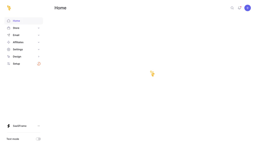
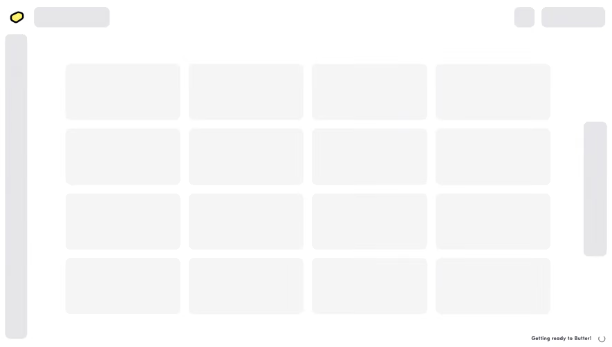
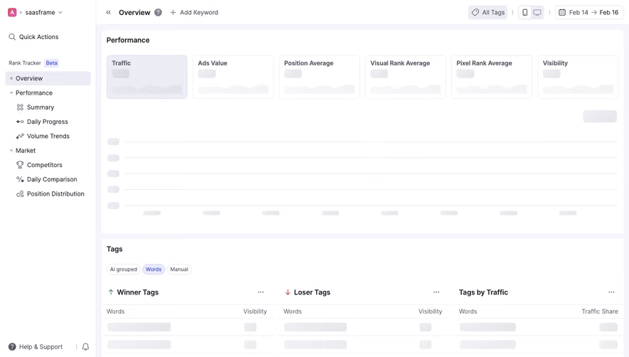
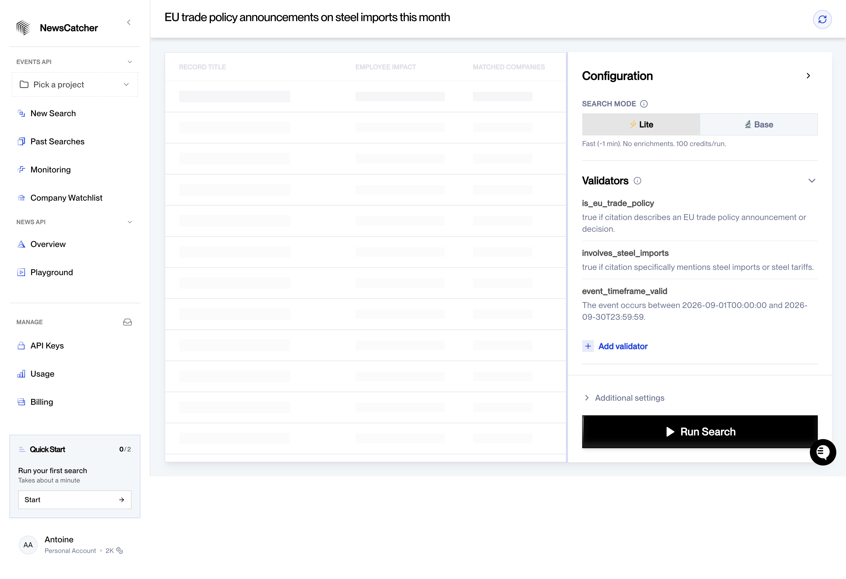
The SaaSFrame references include a full-screen startup state, a room-creation overlay, and a search surface with placeholder results. They show different loading scopes. A static capture can demonstrate the presentation, but it cannot establish actual duration or animation behavior.
Identify what is loading
Opening an interface, fetching records, creating an object, and running a search are different operations. Use wording that describes the relevant work. A generic loading label may be enough for a very short transition but becomes less useful as the wait grows.
Distinguish information retrieval from a state-changing operation. A user can often navigate away from a list refresh, while creating a room may have a pending result they need to find later.
Keep the target or account context visible where it matters. Waiting for the wrong workspace or object is a different problem from waiting too long.
Match the indicator to the affected scope
A full-screen state can fit initial startup when no useful interface is ready. A card-level placeholder can fit one updating source while the rest of the screen remains usable. Do not block the whole product for an unrelated small fetch.
Choose the scope according to dependencies. If every action relies on completed initialization, a larger waiting state may be appropriate. If users can continue elsewhere, communicate that option.
Keep existing trustworthy content where useful, but identify it as refreshing when relevant. Old values should not silently appear to be the newest result.
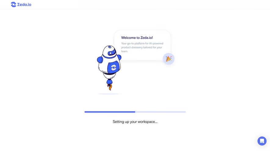
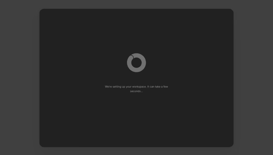
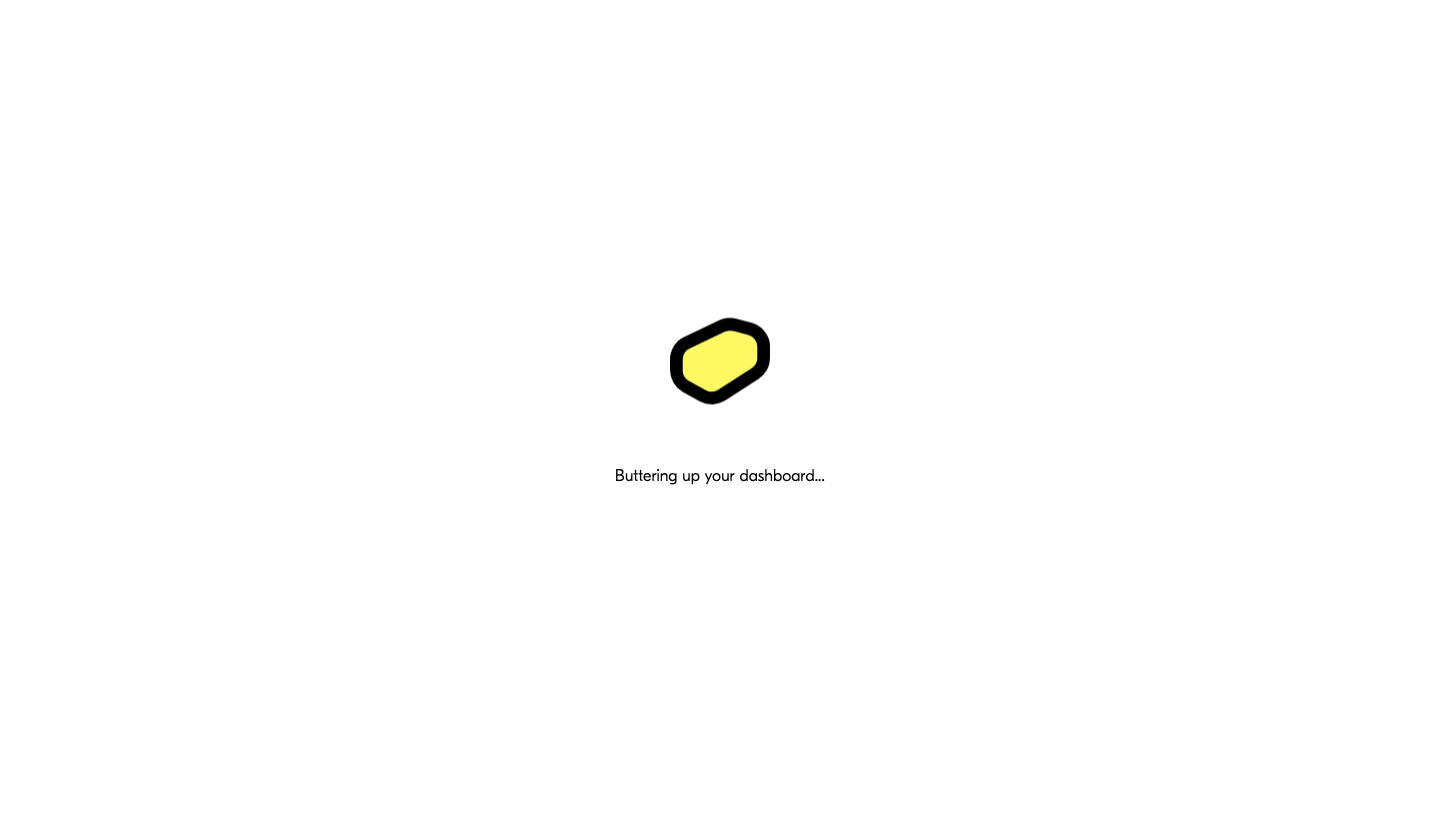
The Butter startup capture uses a centered brand mark and a short dashboard-loading message against an otherwise minimal screen.
This concentrates attention on the waiting state while the application has not yet exposed its working surface. The message adds context beyond an unlabeled spinner.
When adapting the approach, account for longer waits and failure. A branded phrase can suit a brief startup transition, but it should not remain the only explanation indefinitely. Users need a useful next step if initialization cannot complete.
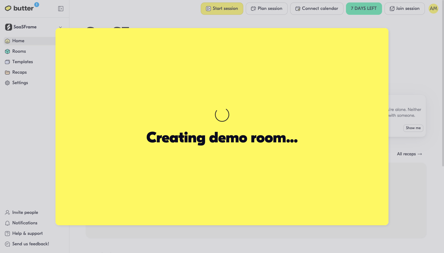
The Butter room-creation capture shows a large overlay saying that a demo room is being created, while the product interface remains visible behind it.
This identifies a specific pending operation. The surrounding workspace provides orientation, while the overlay concentrates attention on the dependency before continuation.
The result should follow confirmed creation. A loading message is not evidence that the room exists yet. If the operation fails or continues after dismissal, explain how users can find its actual state.
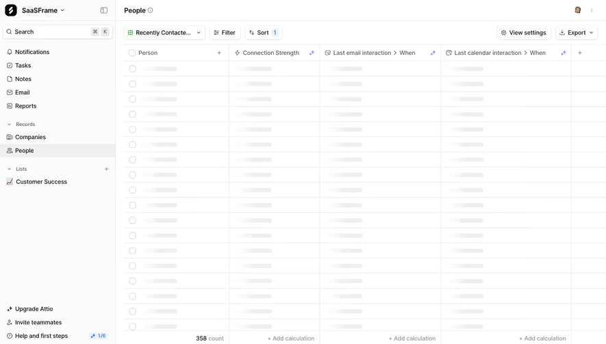
The NewsCatcher capture shows a search configuration panel beside a results area with placeholder rows. Search-mode choices, validators, and a run action remain visible.
This demonstrates a layout where the expected result structure can be communicated without filling it with fabricated records. The static image does not prove whether a request is currently running, so it should be studied as a placeholder presentation.
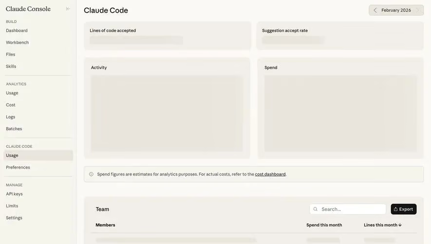
When using skeletons, keep them structurally related to the content that will appear. Avoid detailed fake values that users could interpret as real output. Once data arrives, the transition should preserve orientation rather than completely rearrange the screen.
Make progress honest
Use determinate progress only when the system can measure it meaningfully. An invented percentage may feel reassuring while misleading users about the remaining work. If the duration is uncertain, an indeterminate state can be more truthful.
For multi-stage work, explain the current stage. Uploading, validating, processing, and generating an artifact may have different completion criteria. A single bar reaching the end too early can make the subsequent wait confusing.
Do not use estimated timing as a promise. If an estimate is shown, identify it appropriately and update it according to the system's actual knowledge.
Distinguish queued, active, and completed work
A request can be accepted but still queued. It can be running, waiting on another service, or ready for review. These states deserve different labels when the wait is material.
A queued operation should not look like active execution if the distinction affects the user. A completed operation should transition to a usable result or clear success state, not remain behind a spinner.
If users can leave, identify where status can be found later. A notification or history entry should point to the relevant operation and describe its actual result.
Prevent accidental duplicate actions
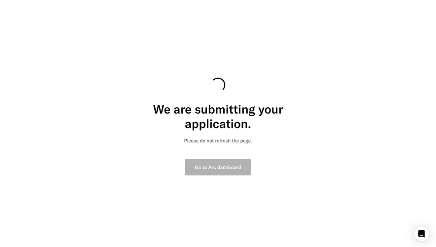
While a submission is processing, make the pending commitment clear and avoid repeated activation of the same action where duplication is harmful. A disabled button needs enough context to explain why it is unavailable.
After a timeout, do not assume the operation failed. The system may have accepted it before the response was lost. Check the confirmed state before encouraging another submission where possible.
Preserve the user's inputs and selection through recovery. A failed wait should not reset an unrelated form or lose work that was already valid.
Explain cancellation according to real behavior
Canceling can stop an operation, request that it stop, or simply close the interface. The label and feedback should reflect the actual consequence. Users should not believe work was undone if it continues in the background.
For operations that cannot be canceled, explain the relevant state without trapping users unnecessarily. If navigation is safe, provide that route. If a dependency blocks the next step, make the reason clear.
Keep cancellation distinct from deletion of a completed result. These are different lifecycle actions even when they share a close or remove icon.
Handle slow and failed states deliberately
Define the point at which a longer explanation or recovery option becomes useful. A short indicator can transition into more context rather than leaving users with the same uninformative animation.
Distinguish service failure from an empty result. A failed search has not established that no records match. A failed account load has not established that the workspace is empty.
Provide a relevant retry or support route and preserve useful information. Generic refresh advice can discard pending work or repeat a transaction if used without state awareness.
Keep motion and status accessible
Important status should be available as text, with appropriate announcements for meaningful changes. Do not communicate progress solely through animation, opacity, or color.
Respect reduced-motion preferences and avoid repetitive effects that make it harder to read nearby content. A skeleton can preserve layout without becoming a distracting animated surface.
Keyboard focus should remain predictable during loading and after results appear. If a blocked region becomes available, users need a usable path into it without an unexpected focus jump.
Test real delays and interruptions
Test fast responses, slow responses, queued work, partial updates, failure, canceled operations, and navigation away. Include account switching and duplicate submission attempts.
Ask users what the system is doing and what they expect to happen next. If they cannot distinguish retrieval from creation or pending from completed work, improve the state description.
Measure recovery and successful continuation alongside perceived speed. An animation may make a wait feel smoother without making the operation's state understandable.
Frequently asked questions about loading screens
Should loading always use a spinner?
No. Use an indicator that fits the scope and available progress information. Placeholders, stage labels, or determinate progress may be more useful.
Can a loading screen show a percentage without exact measurement?
Avoid presenting invented precision. Communicate uncertain progress or an explicitly qualified estimate instead.
Is closing a loading modal the same as canceling the operation?
Not necessarily. Explain whether work stops, continues, or is only hidden from view.