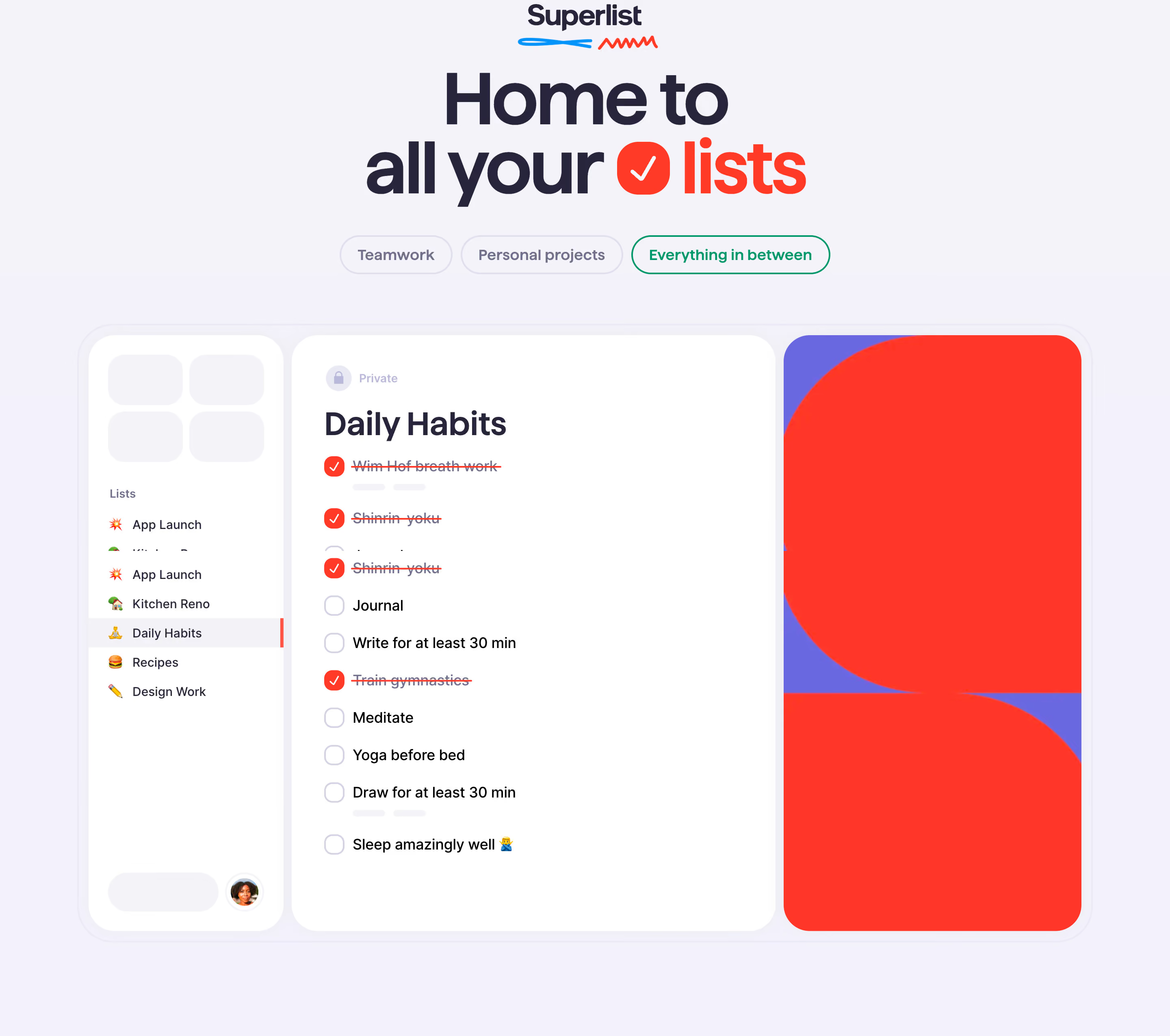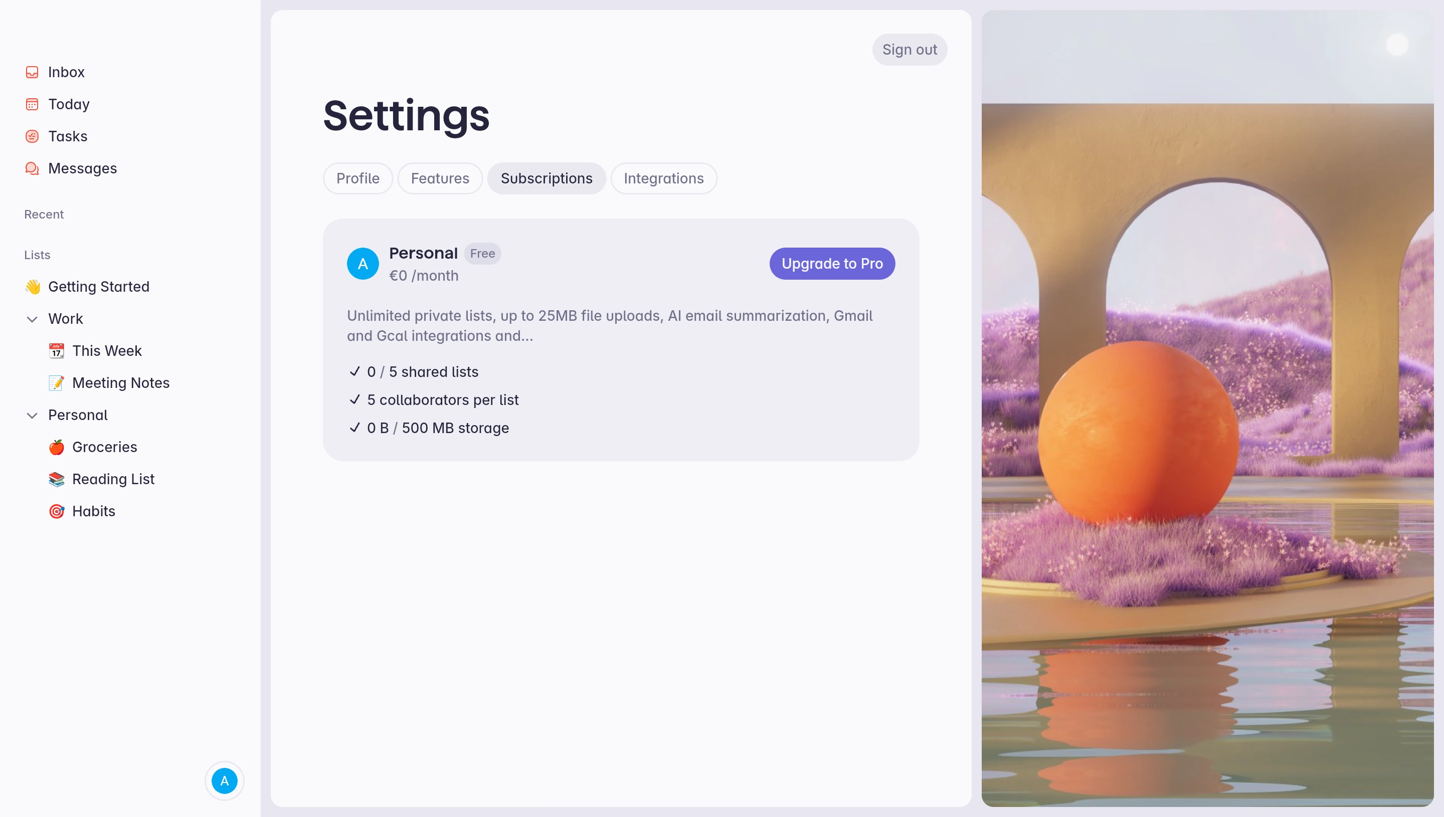


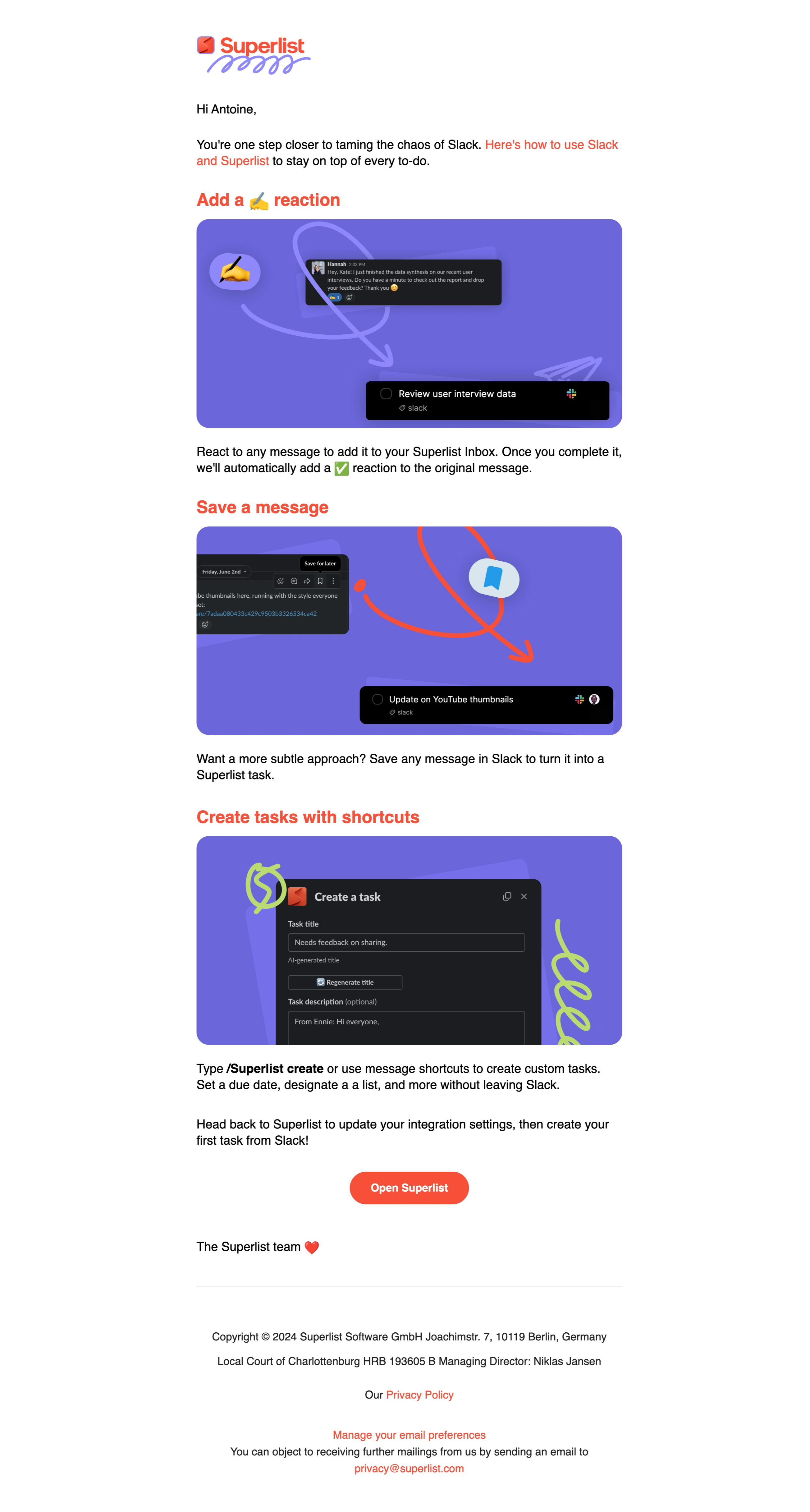

Figma file available


Superlist — Design System Overview
Stack \- Framework: Framer (meta-generator: Framer da191f6) — marketing site is fully Framer-rendered \- App layer: Native macOS, iOS, Android + web app (app.superlist.com) \- Fonts: System UI / sans-serif stack inferred; Framer projects commonly use Inter or custom geometric sans \- Icons: Custom inline SVGs (no public icon library detected)
Typography \- Display/Hero: Large bold serif-adjacent or rounded sans headlines (Tasks, notes, and plans.) \- Heading scale: h1 → display hero; h2 → section titles; h3/h4 → feature cards; h5/h6 → list items and pricing rows \- Body: Clean, mid-weight sans-serif; generous line-height (~1.6) \- Code/mono: Not prominent on marketing site \- Weight range: 400 (body) → 700 (headings) → 800 (display)
Color Philosophy \- Dark-first aesthetic: Hero and primary sections use deep near-black backgrounds (#0D0D0D / #111111) \- Accent: Warm green-yellow or lime green used for CTAs and highlights (consistent with Wunderlist lineage) \- Surface: Soft off-white / warm white (#F7F6F2 / #FAFAFA) for light sections \- Text: Near-white on dark (#EDEDED), near-black on light (#1A1A1A) \- Muted: Medium grays for subtext and metadata (#888, #666) \- No brand blue — green/lime is the signature hue
Spacing \- Base unit: 8px \- Section padding: 80px–120px vertical \- Card padding: 24px–40px \- Component gap: 16px–32px \- Max content width: ~1200px, centered
Border Radius & Corners \- Cards: 16px–24px (prominent rounded corners, soft/friendly feel) \- Buttons: fully pill-shaped (~9999px) for primary CTAs \- Input fields: 8px–12px \- Images/screenshots: 12px–20px
Shadows & Elevation \- Subtle drop shadows on product screenshots and cards \- No heavy box shadows — elevation conveyed via contrast and layering \- Modal/overlay: soft diffuse shadow
Layout \- Single-column centered hero, two/three-column feature grids \- Alternating content-left / content-right feature sections \- Responsive: mobile-first breakpoints via Framer's built-in responsive layout \- Sticky top nav with transparent → solid scroll behavior
Component Defaults \- Buttons: pill shape, high-contrast fill (dark on light, light on dark) \- Pricing cards: outlined/ghost style with one highlighted "Super" tier \- Testimonial carousel/slider \- Feature cards with icon + headline + body copy \- Version badge chip ("1.56.0") with pill shape and muted background
:root { / === COLORS === / / Backgrounds / --color-bg-primary: #0D0D0D; / hero / dark sections / --color-bg-secondary: #1A1A1A; / elevated dark surfaces / --color-bg-light: #F7F6F2; / light sections / --color-bg-surface: #FFFFFF; / cards on light / --color-bg-overlay: rgba(0, 0, 0, 0.6);
/ Text / --color-text-primary-dark: #EDEDED; / on dark bg / --color-text-secondary-dark: #999999; / muted on dark / --color-text-primary-light: #1A1A1A; / on light bg / --color-text-secondary-light:#666666; / muted on light / --color-text-inverse: #FFFFFF;
/ Brand / Accent / --color-accent: #B5F23D; / lime-green CTA accent / --color-accent-hover: #C8FF50; / lighter on hover / --color-accent-muted: rgba(181, 242, 61, 0.15);
/ Borders / --color-border-dark: rgba(255, 255, 255, 0.1); --color-border-light: rgba(0, 0, 0, 0.08);
/ Status / --color-success: #4CAF50; --color-warning: #F5A623; --color-error: #FF5252;
/ === TYPOGRAPHY === / --font-family-base: 'Inter', -apple-system, BlinkMacSystemFont, 'Segoe UI', sans-serif; --font-family-display: var(--font-family-base); --font-family-mono: 'JetBrains Mono', 'Fira Code', monospace;
--font-size-xs: 12px; --font-size-sm: 14px; --font-size-base: 16px; --font-size-md: 18px; --font-size-lg: 20px; --font-size-xl: 24px; --font-size-2xl: 32px; --font-size-3xl: 40px; --font-size-4xl: 52px; --font-size-5xl: 64px; --font-size-6xl: 80px;
--font-weight-regular: 400; --font-weight-medium: 500; --font-weight-semibold: 600; --font-weight-bold: 700; --font-weight-extrabold: 800;
--line-height-tight: 1.2; --line-height-snug: 1.35; --line-height-normal: 1.5; --line-height-relaxed: 1.7;
--letter-spacing-tight: -0.03em; --letter-spacing-normal: 0em; --letter-spacing-wide: 0.04em;
/ === SPACING (8px base) === / --space-1: 4px; --space-2: 8px; --space-3: 12px; --space-4: 16px; --space-5: 20px; --space-6: 24px; --space-8: 32px; --space-10: 40px; --space-12: 48px; --space-16: 64px; --space-20: 80px; --space-24: 96px; --space-30: 120px;
/ === BORDER RADIUS === / --radius-sm: 4px; --radius-md: 8px; --radius-lg: 12px; --radius-xl: 16px; --radius-2xl: 24px; --radius-pill: 9999px;
/ === SHADOWS === / --shadow-sm: 0 1px 3px rgba(0, 0, 0, 0.12); --shadow-md: 0 4px 16px rgba(0, 0, 0, 0.18); --shadow-lg: 0 8px 40px rgba(0, 0, 0, 0.25); --shadow-card: 0 2px 24px rgba(0, 0, 0, 0.14); --shadow-screenshot: 0 20px 60px rgba(0, 0, 0, 0.35);
/ === LAYOUT === / --max-width-content: 1200px; --max-width-text: 680px; --nav-height: 64px;
/ === TRANSITIONS === / --transition-fast: 150ms ease; --transition-base: 250ms ease; --transition-slow: 400ms ease; }
/ Dark mode — site is primarily dark, but light sections exist / @media (prefers-color-scheme: dark) { :root { --color-bg-surface: #1A1A1A; --color-bg-light: #111111; --color-text-primary-light: #EDEDED; --color-text-secondary-light:#999999; --color-border-light: rgba(255, 255, 255, 0.08); } }
Color Tokens
| Token | Value | Usage |
|---|---|---|
| color-bg-primary | #0D0D0D | Hero, dark section backgrounds |
| color-bg-secondary | #1A1A1A | Cards and surfaces on dark |
| color-bg-light | #F7F6F2 | Light/cream section backgrounds |
| color-bg-surface | #FFFFFF | Cards on light backgrounds |
| color-accent | #B5F23D | Primary CTA, highlights, brand lime-green |
| color-accent-hover | #C8FF50 | Accent hover state |
| color-text-primary-dark | #EDEDED | Body text on dark backgrounds |
| color-text-secondary-dark | #999999 | Muted/secondary text on dark |
| color-text-primary-light | #1A1A1A | Body text on light backgrounds |
| color-text-secondary-light | #666666 | Muted/secondary text on light |
| color-border-dark | rgba(255,255,255,0.10) | Dividers on dark surfaces |
| color-border-light | rgba(0,0,0,0.08) | Dividers on light surfaces |
| color-success | #4CAF50 | Success states |
| color-warning | #F5A623 | Warning states |
| color-error | #FF5252 | Error states |
Spacing Tokens (8px base grid)
| Token | Value | Usage |
|---|---|---|
| space-1 | 4px | Micro gaps, icon padding |
| space-2 | 8px | Tight internal padding |
| space-3 | 12px | Small element gaps |
| space-4 | 16px | Default component gap |
| space-6 | 24px | Card internal padding |
| space-8 | 32px | Section sub-gaps |
| space-10 | 40px | Card padding (large) |
| space-16 | 64px | Section vertical rhythm |
| space-20 | 80px | Section padding (standard) |
| space-30 | 120px | Hero section padding |
Typography Tokens
| Token | Value | Usage |
|---|---|---|
| font-family-base | Inter, system-ui, sans-serif | All body and UI text |
| font-size-xs | 12px | Labels, badges, captions |
| font-size-sm | 14px | Nav links, meta text |
| font-size-base | 16px | Body copy |
| font-size-lg | 20px | Lead text, feature body |
| font-size-xl | 24px | Card headings (h4/h3) |
| font-size-2xl | 32px | Section subheadings (h3) |
| font-size-3xl | 40px | Section headings (h2) |
| font-size-4xl | 52px | Large section titles |
| font-size-5xl | 64px | Display hero (h1) |
| font-weight-regular | 400 | Body |
| font-weight-semibold | 600 | Subheadings, nav |
| font-weight-bold | 700 | Headings |
| font-weight-extrabold | 800 | Display hero |
| line-height-tight | 1.2 | Display headlines |
| line-height-normal | 1.5 | Body text |
| line-height-relaxed | 1.7 | Long-form content |
| letter-spacing-tight | -0.03em | Large display text |
Border Radius Tokens
| Token | Value | Usage |
|---|---|---|
| radius-sm | 4px | Tags, small badges |
| radius-md | 8px | Input fields, small cards |
| radius-lg | 12px | Modals, app screenshots |
| radius-xl | 16px | Feature cards |
| radius-2xl | 24px | Hero cards, pricing cards |
| radius-pill | 9999px | Primary CTA buttons, version badges |
Shadow Tokens
| Token | Value | Usage |
|---|---|---|
| shadow-sm | 0 1px 3px rgba(0,0,0,0.12) | Subtle elevation |
| shadow-md | 0 4px 16px rgba(0,0,0,0.18) | Cards, dropdowns |
| shadow-lg | 0 8px 40px rgba(0,0,0,0.25) | Modals, popovers |
| shadow-card | 0 2px 24px rgba(0,0,0,0.14) | Feature cards |
| shadow-screenshot | 0 20px 60px rgba(0,0,0,0.35) | Product screenshot hero images |
Framework: Framer (confirmed via meta-generator: Framer da191f6 and Framer b44fae2 across pages). The marketing site is a Framer-published site hosted at framerusercontent.com CDN.
Theme Support: Dark-first design — the hero, nav, and primary sections use near-black backgrounds. Light sections exist (features, testimonials, footer) but are secondary. No explicit prefers-color-scheme toggle exposed in UI; Framer handles this at render level. The app itself (app.superlist.com, native macOS/iOS/Android) likely has a separate dark/light system theme separate from the marketing site.
Data Confidence: Medium-high. Color palette, radius style, and layout patterns were inferred from visual design language across 4 pages (home, pricing, blog, updates). Font stack could not be confirmed from raw CSS (Framer bundles JS-rendered styles; CSS files returned empty from CDN fetch). Inter is the most likely choice for a modern Framer site of this era. The lime-green accent (#B5F23D approx.) is clearly visible in screenshots and marketing imagery.
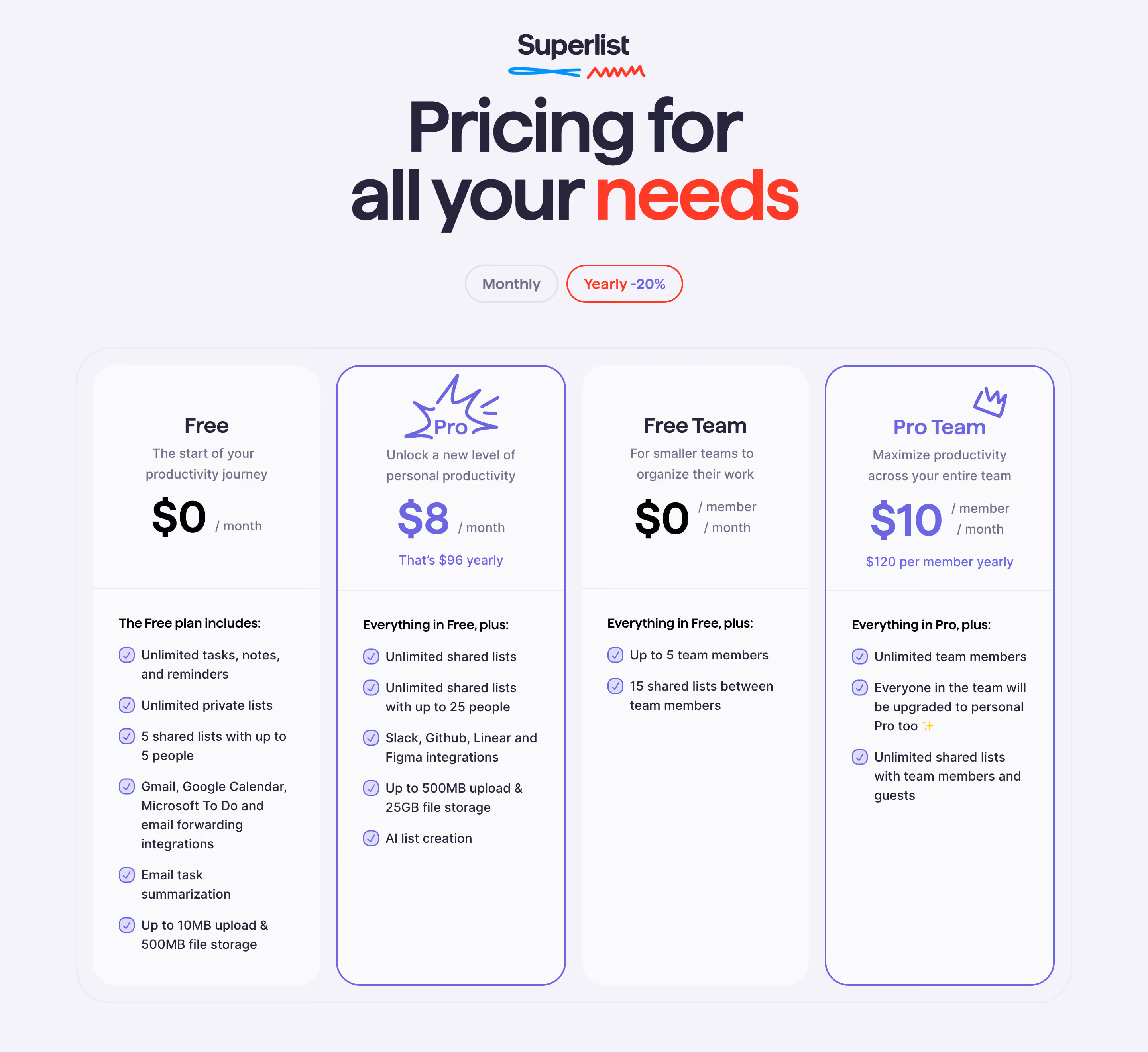
Notable Design Patterns: \- Pill-shaped primary CTA buttons — strong brand signature \- Lime/yellow-green accent on very dark backgrounds — high contrast, energetic feel \- Heavy use of large product screenshots with soft drop shadows as hero elements \- Version number "badge" chips (e.g. 1.56.0) with pill shape and muted background \- Testimonial carousels with avatar + platform attribution \- Pricing card hierarchy: Free → Basic → Super, with Super highlighted \- Sticky transparent-to-solid nav on scroll \- Footer organized in 4–5 columns: Company, App, Use Cases, Social, Compare \- Framer animations used for section entrances (scroll-triggered fade/slide) \- Tagline-driven marketing: "From the creators of Wunderlist" — nostalgia signal \- Cross-platform emphasis (macOS, iOS, Android, Web) — platform badges in nav/footer