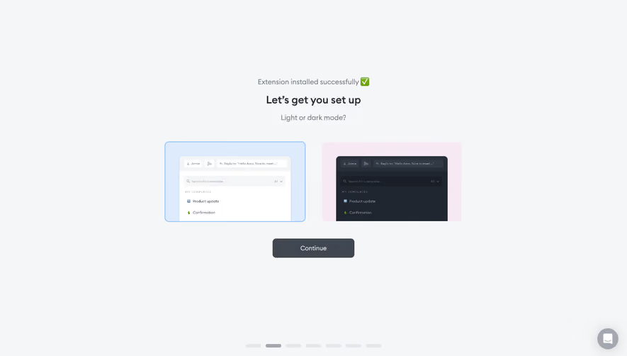
Theme Mode
24
Personalize the workspace with SaaS Theme Mode patterns. Discover how to implement 'System Default,' 'Light,' and 'Dark' mode toggles with a single click.

Theme mode lets users choose how a product's interface appears, commonly through light, dark, or system-following options. It is a preference about the surrounding UI, not necessarily a change to the content users create. In SaaS products, a clear theme setting can make a workspace feel more adaptable without changing its underlying information or behavior.
The design challenge extends beyond switching background colors. Users need to understand the available choices, see which one is active, and trust that the preference will persist in the intended scope. The product also needs a coherent treatment for every component, state, chart, and asset that appears in each mode.
A theme mode usually changes the product's chrome and surfaces. A brand-color setting changes an accent or identity value. A document theme may change an exported or published asset. Those choices can coexist, but they should not be presented as if they have identical scope.
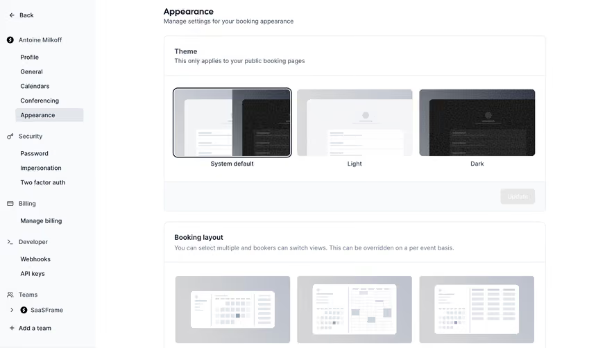
Explain the surface affected by the choice. A user selecting dark mode should know whether it applies to their own workspace, the whole team, or a customer-facing widget. Personal preferences are especially easy to confuse with shared appearance settings when both live under a general Appearance heading.
Consider whether the product needs a binary switch or a named choice group. Light and Dark can fit a simple control. Adding System creates a different decision: users can explicitly choose a mode or delegate that choice to their device preference. The interface should describe that option rather than merely adding an unexplained third icon.
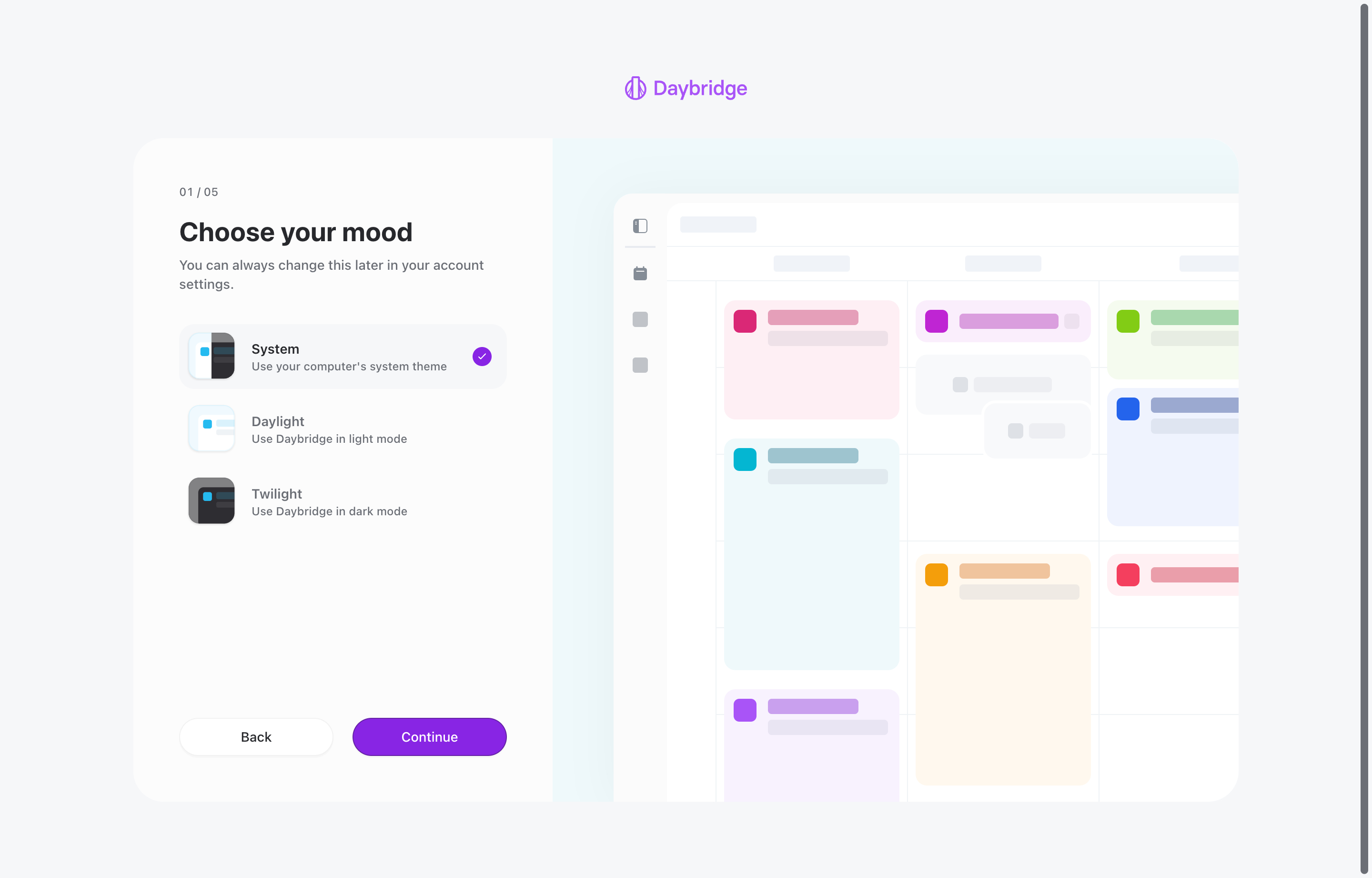
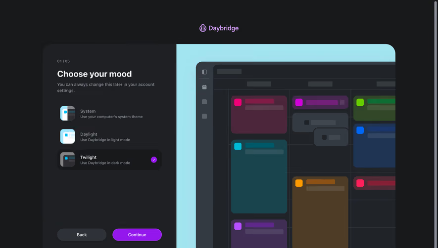
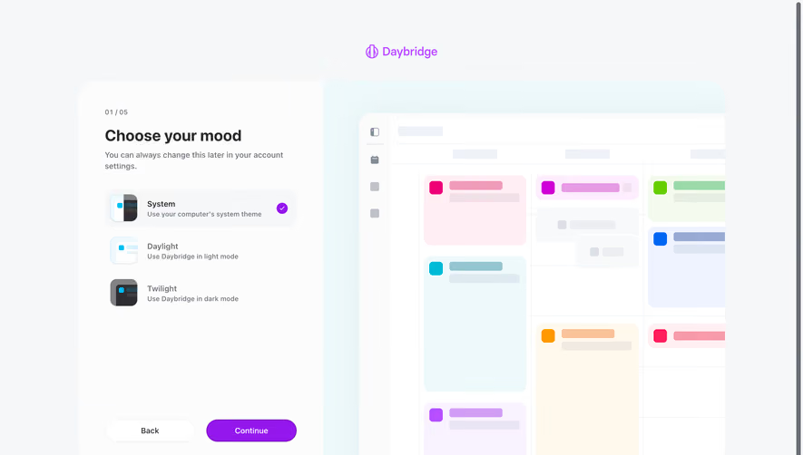
The Daybridge screenshot shows an onboarding step titled Choose your mood. Three choices appear: System, Daylight, and Twilight. Their descriptions explain following the computer's system theme, using light mode, and using dark mode. System has a visible selected marker.
The descriptions do important work. Daylight and Twilight are expressive names, but the supporting text translates them into familiar interface behavior. A user does not need to learn the product's terminology before making an ordinary appearance decision.
The page also says the choice can be changed later in account settings. That makes the onboarding step feel less consequential and identifies a future route back to the preference. Your product should make that promised route easy to find and use.
The right side contains a stylized calendar preview. The screenshot shows one selected state, not a recording of mode changes. It demonstrates explanation, selection, and preview placement, but it does not establish how the interface responds when the computer's theme changes.
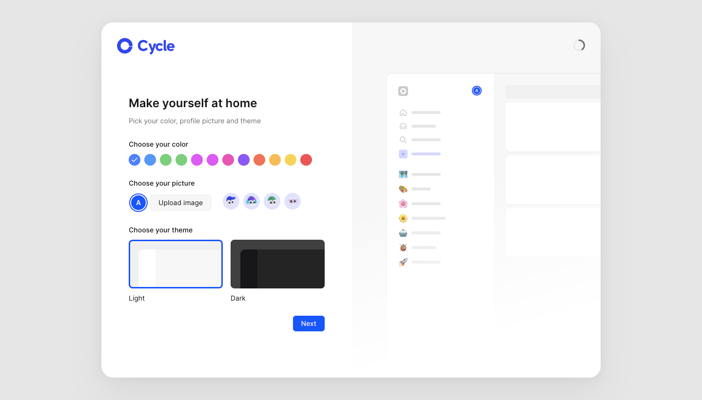
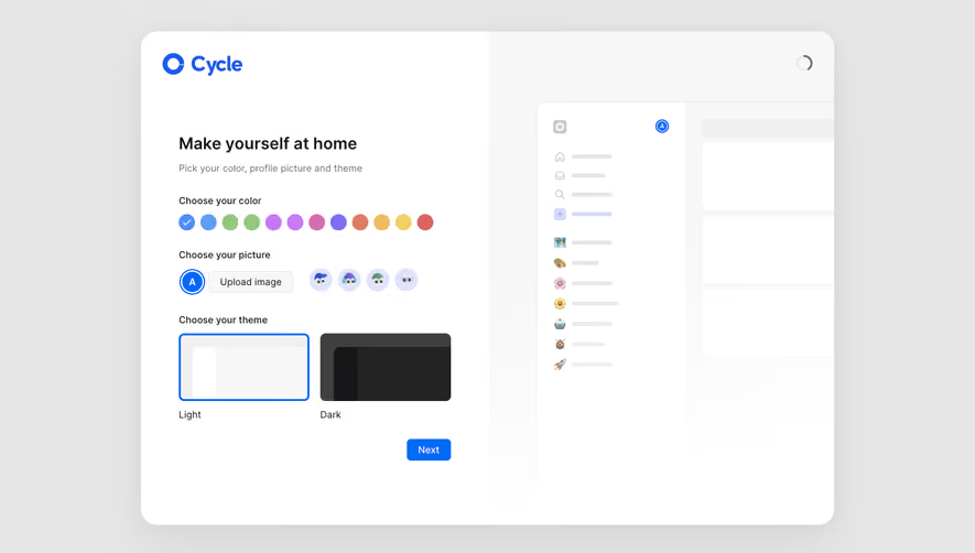
The light Cycle screenshot places three groups on an account-setup screen: color, picture, and theme. The theme group contains Light and Dark preview cards, with Light outlined as selected. A larger workspace illustration appears beside the controls.
This separation helps distinguish personal identity from interface mode. Changing a profile picture is not the same task as choosing a dark surface, even when both contribute to feeling at home in a product. Separate group labels reduce ambiguity about which preference each control changes.
The mode cards use miniature interface previews rather than only sun and moon icons. That gives users a direct visual comparison. In your own settings, ensure that the preview represents the product's actual surfaces closely enough to support the choice.
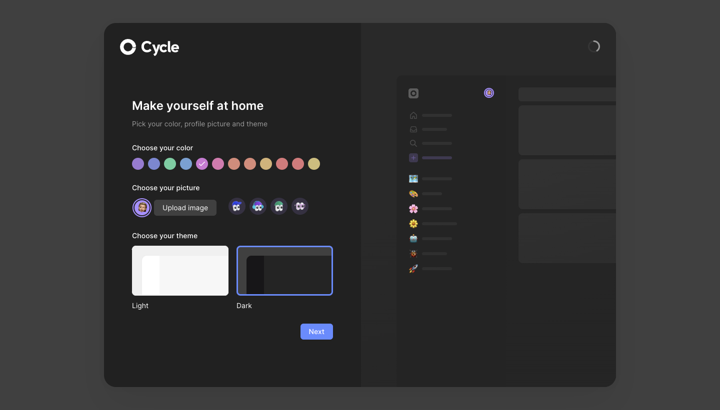
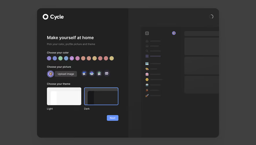
The second Cycle capture shows Dark selected and a dark treatment across the setup page and preview. The two captures make it possible to compare the visual treatment of surfaces, text, and accent colors. They do not prove which actions persisted the preference or whether a system option exists elsewhere.
They also show why a theme is a system of relationships. The accent palette, profile choices, borders, and secondary text all sit on different backgrounds in the two modes. Designing a dark page requires evaluating those relationships rather than inverting one background value.
The selected state should represent the stored preference, not just the current rendered appearance. A user who chooses System may currently see a light interface, but their preference is still System. Showing Light as selected would obscure the delegation they intentionally chose.
Use a recognizable selection marker beyond a subtle hue difference. An outline, check, or explicit label can help people understand the active option. Focus and selection should remain distinct so that keyboard movement does not look like an already committed preference change.
Decide whether the choice applies immediately or requires saving. Immediate feedback can help users compare modes, but a separate save action needs clear communication. Do not let a visually updated page imply that the preference is permanently stored when it is only a preview.
A theme preference can be stored for the current browser, device, user account, or workspace. Each policy creates different expectations. Someone who signs in on another device may expect their account preference to follow them, while a device-specific choice may be useful in other contexts.
Make the scope understandable where it matters. If a setting is personal, avoid presenting it beside shared workspace controls without distinction. If administrators configure a customer-facing theme, explain who sees the result and when it takes effect.
Handle signed-out and signed-in states coherently. A visitor's local preference and an account's saved preference can conflict when they sign in. Choose a rule deliberately and avoid surprising switches that make the interface appear to ignore the user's recent choice.
Test the first render after navigation and reload. An interface that briefly displays a different mode before applying the preference can feel inconsistent. Verify the actual behavior across supported entry points instead of only testing a switch on an already loaded page.
Define the roles that colors serve: page surface, elevated surface, primary text, secondary text, border, accent, selected state, and feedback. Each mode should map those roles to an intentional treatment. This makes the design easier to maintain than a collection of unrelated screen-level overrides.
Preserve hierarchy in both modes. An elevated panel should remain distinguishable from its surroundings; secondary text should remain readable; disabled controls should remain identifiable. A treatment that works on a white surface may need a different relationship on a dark one.
Include interaction states in the system. Hover, focus, selection, loading, success, warning, and error states need review in each mode. A polished default screen can conceal missing state treatments that users encounter as soon as they begin working.
Some content does not automatically adapt to interface mode. A chart may use category colors, a document canvas may stay white, and a brand logo may need a different asset. Decide which surfaces follow the interface theme and which retain their own appearance.
Charts need legible labels, grid lines, legends, and meaningful distinctions among series in both modes. Do not assume that an accent-color change solves the entire visualization. The color relationships must support the chart's actual reading task.
Editors and previews deserve explicit boundaries. A light document inside a dark application can be appropriate because it represents the output. Users should understand why that surface differs rather than interpreting it as a broken theme implementation.
Embedded tools or third-party content may have independent limitations. Test them in context and decide how the surrounding frame communicates the difference. Avoid claiming that the preference changes every surface if the product cannot deliver that behavior.
Light and dark modes offer different appearances, and users may prefer different modes in different environments. Do not frame dark mode as universally more comfortable or accessible. Evaluate the actual interface and give users meaningful control where the product supports it.
Readability depends on the relationships between text, backgrounds, boundaries, and states. Check the combinations the product actually renders. A theme can look attractive in a large mockup while making small labels, chart annotations, or field borders difficult to perceive.
Use more than color to communicate state. Error text, selected markers, and icon meaning should remain understandable across modes. A theme preference should not change the information a user can obtain from the interface.
Onboarding can introduce the choice, as Daybridge and Cycle do, but users need a later route to adjust it. A personal settings area or a clearly named appearance menu can provide that route. Keep labels consistent with the onboarding explanation.
A quick-access toggle can be useful when switching is frequent. If the product also supports System, the quick control should not accidentally erase that preference without making the change clear. A binary icon and a three-way setting need a coherent relationship.
Avoid forcing personalization before users can begin the core task unless it serves the onboarding purpose. A sensible default can let people proceed and adjust later. Theme selection should contribute to setup rather than become an unnecessary obstacle to activation.
Test Light, Dark, and System where offered; reload; navigate; sign in; sign out; and revisit settings. For System, test the supported environment's preference changes and confirm that an explicit user choice follows the documented rule.
Review representative screens and less common states. Include empty tables, open menus, validation errors, tooltips, charts, disabled actions, and external content. A mode is complete only when it supports real work across the product.
It can be useful when users want the interface to follow their device preference. Explain that relationship and ensure that the product implements it consistently across the supported environment.
No. Surfaces, text, borders, accents, and feedback states need intentional relationships. Review actual components and content in both modes rather than relying on a single color transformation.
A personal interface preference usually belongs to the individual. A customer-facing or workspace appearance setting may have shared scope. Name and separate those purposes so users understand who sees the change.
Explore theme mode examples on SaaSFrame to compare mode explanations, preview treatments, and personalization flows in real SaaS interfaces.