Overall Style and Aesthetic
The Vercel Customers page embraces a minimalist and ultra-modern aesthetic, blending generous white space with sharp, professional cues. The design ethos is understated yet confident, relying on simplicity to highlight content rather than overwhelm it. Subtle gradients and restrained animation deliver a sense of high-end sophistication, appealing to enterprise audiences and startups alike. Layout and Structure
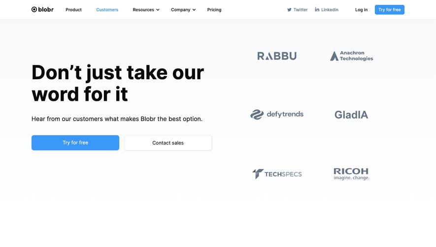
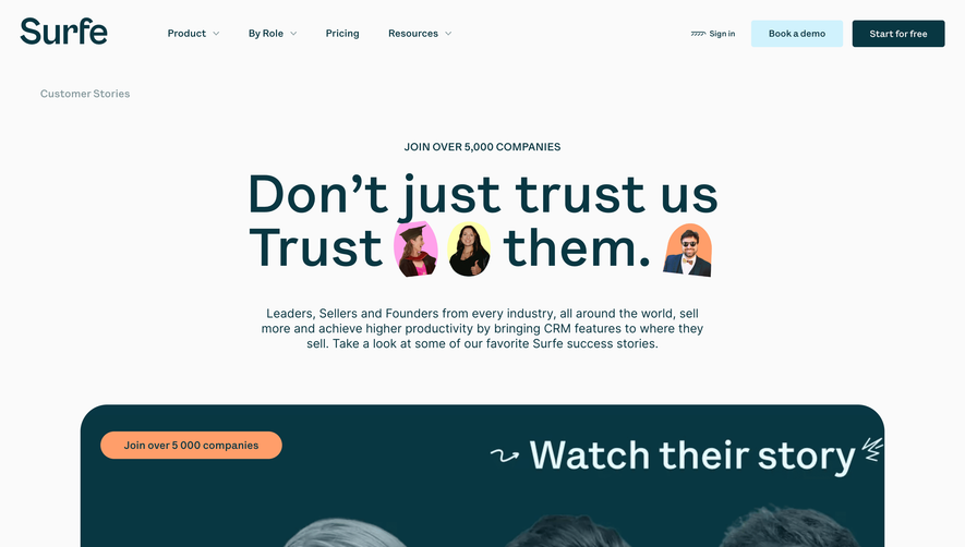
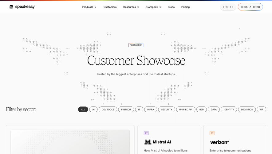
This page utilizes a focused, modular structure. The hero section instantly showcases credibility with a large, prominent headline and succinct subcopy, framed by logos of well-known brands. Below, customers are organized in a dynamic, grid-like gallery that effortlessly scrolls, each entry displaying company names, logos, and succinct visual stories. Navigation is sticky and minimal, ensuring users can explore without distraction. There are no overt pricing tables or forms on this page—its purpose is validation through customer proof. Visual Elements
Logo walls, clean vector graphics, and high-quality photographic case study banners distinguish each featured company. Micro-interactions—like gentle hover effects and animated card transitions—add polish without flashiness. Overall, visuals are sleek and functional, accentuating rather than crowding the content with embellishments. Color Palette and Typography
Monochrome grays, cool whites, and inky blacks form the backbone of the palette, occasionally punctuated by understated accent hues from customer logos or subtle highlights. Typography is crisp and highly legible, using sharp sans-serif fonts with clear headline hierarchies that guide users naturally from section to section. User Experience Patterns
Navigation is lean—anchored up top and persistent—inviting seamless exploration. Strong, understated CTAs (“Read Case Study”) are tucked into cards or overlays, channeling curiosity without intruding. The user journey is fluid, with well-calibrated scrolling and content chunking to avoid cognitive overload. Unique or Notable Design Choices
What truly sets this page apart is its refined restraint: the confident use of white space, emphasis on social proof via real brands, and the interactive, almost editorial way customer stories are presented. The tone strikes a balance between trustworthy and innovative, underscoring Vercel’s role as an enabler for world-class digital experiences.