Overall Style and Aesthetic
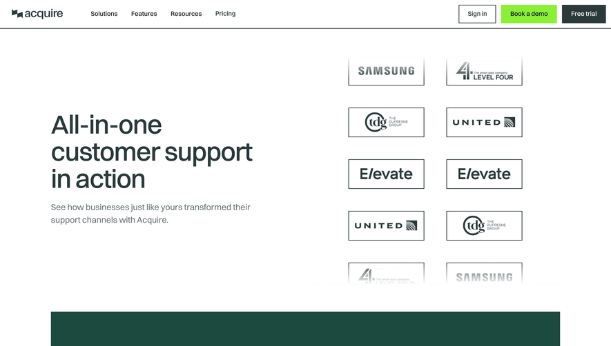
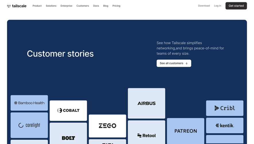
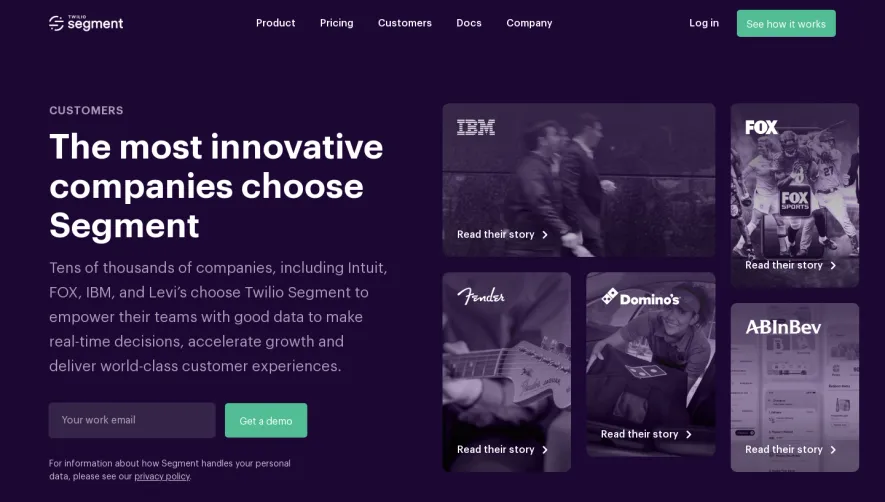
Speakeasy's "Customers" page exemplifies a refined, modern SaaS design ethos. The aesthetic leans heavily on a minimalist approach—ample white space, restrained color accents, and clean, geometric layouts. A professional yet approachable vibe is achieved by blending subtle sophistication with splashes of customer logos and human-centric visuals, projecting trust and industry authority. Layout and Structure
The page unfolds with a prominent hero section, centering a headline that speaks to real customer value, immediately grounding the story in authentic outcomes. Scrolling reveals a tightly organized grid of customer logos, glimpses of featured stories, and elegantly interspersed testimonial quotes. There’s a clear narrative path—first showcasing breadth, then depth—culminating in direct CTAs and prompts to learn more. Visual Elements
Photography and real-life brand assets are prioritized over illustrations, reinforcing credibility. The use of monochromatic logo treatments harmonizes disparate client brands into the site's visual language, while occasional highlight videos or quote overlays add dynamic touches without overwhelming the user. Color Palette and Typography
A primary palette of crisp whites and deep indigos sets a calm, enterprise-ready backdrop, offset by a warm, optimistic accent color for calls to action. Typography is crisp and functional, with a strong sans-serif for headers and generous sizing for testimonials, establishing clear hierarchy and effortless readability. User Experience Patterns and Unique Choices
Navigation is sticky yet discreet, surfacing only what’s required. Subtle interaction cues—hover effects on logos, animated transitions on testimonial cards—invite exploration without distraction. The confident restraint, seamless logo grid, and hero section that balances messaging with whitespace are especially striking, conveying a narrative of stability, innovation, and client focus.