Overall Style and Aesthetic
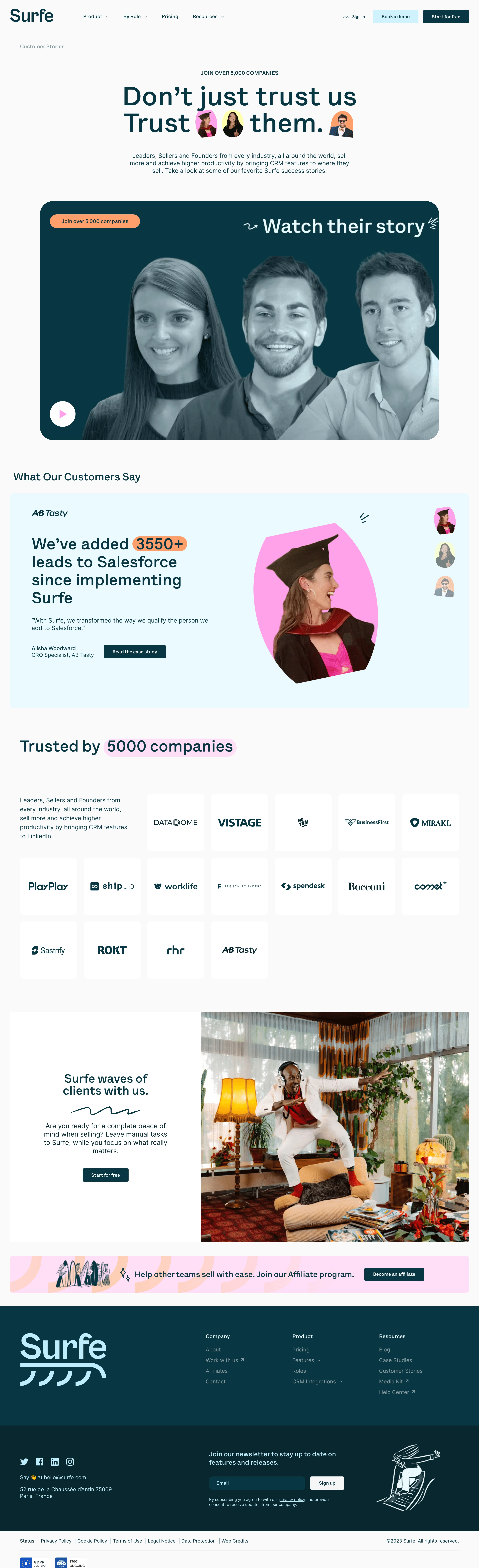
Surfe’s customer stories page embraces a modern and sleek aesthetic, seamlessly blending minimalist sensibilities with vibrant accents to exude professionalism while maintaining a friendly, approachable vibe. The visual balance between whitespace and color injects energy without overwhelming, giving the page a fresh, inviting spirit. Layout and Structure
The structure is crisp and intuitive, opening with a bold hero section that establishes credibility through recognizable customer logos and a concise, compelling headline. Featured success stories follow in a card-based grid, each card elegantly spotlighting a customer with clear, clickable CTAs for deeper engagement. The layout strategically alternates content blocks and testimonials, maintaining visual rhythm and interest down the scroll. Visual Elements
Photography of real customers adds authenticity, punctuated by distinctive brand-colored accents and geometric background shapes. Custom icons and subtle hover effects energize interactivity. The story spotlight cards are visually distinguished with company logos and brief overviews, inviting click-throughs while avoiding clutter. Color Palette and Typography
The palette centers on crisp white and soft gray backgrounds, elevated by Surfe’s signature blue and vibrant green hues. These pops direct attention to CTAs and highlights. Typography is clean and legible—likely sans-serif—establishing clear hierarchy through bold headlines, ample spacing, and concise copy, ensuring effortless readability. User Experience Patterns
Navigation is streamlined via a sticky header, making movement across the site intuitive. Call-to-actions are prominent yet unobtrusive, guiding the viewer toward customer stories or contact points. Thoughtful scroll interactions keep users engaged, while card hovers provide tactile feedback, enhancing the sense of usability. Unique or Notable Design Choices
Standout choices include the blend of customer photography with real quotes, reinforcing user trust, and the modular grid design that ensures scalability and consistency. The overall tone feels reliable and innovative—communicating a customer-focused, energetic SaaS brand that’s easy to trust and even easier to explore.