
Thank you! Your submission has been received!
Oops! Something went wrong while submitting the form.
Get SaaSFrame Pro
Monthly
$18
Quarterly
$48
Yearly
$180
Upgrade to access this feature
Browse all screens & flows
Filter and search screens & flows
Access Figma files
Access mobile versions
Bookmark screens & flows
Join now


Speakeasy Customers Page

Speakeasy
Craft exceptional API experiences
Designed by


Bookmark
Bookmark

Design with AI
Thank you! Your submission has been received!
Oops! Something went wrong while submitting the form.
# Design from Reference: Speakeasy Customers Page
Create an original, high-fidelity visual design inspired by the reference. Prioritize composition, typography, colors, spacing, and component styling over technical implementation.
## Reference
- **Product:** Speakeasy
- **Category:** Customers Page
- **Screenshot:** https://cdn.prod.website-files.com/5e9dc792e1210c5325f7ebbc/6acad417c910b3adf9e48e8d_6acad1b3fc7b168033f526bc_cms-ca776f6fd626d2122388fb4c.webp
Analyze the screenshot first. If inaccessible, request it rather than guessing.
## Content
{{content.instructions}}
{{content.data}}
Preserve essential messaging and factual accuracy. Adapt structure and copy length for visual balance; never invent product claims.
## Visual Design
### Overall aesthetic
- **Style:** A restrained customer showcase combines near-white surfaces, thin gray card outlines, elegant high-contrast serif display text and technical monospaced labels.
- **Character:** ASCII-like particle motifs and monochrome customer logos create a developer-oriented identity, with color reserved for sector tags and fine spectrum borders.
### Page composition
- **Capture:** The source measures 2880 × 19590 pixels. Estimated CSS dimensions below assume an unverified 2× capture. All portions of the long page were inspected.
- **Header:** A thin multicolor top rule precedes a white navigation row with brand left, six navigation items center and login/demo controls right.
- **Hero:** A small Customers badge, large centered serif title and short subtitle sit among symmetrical gray character patterns.
- **Filters:** A serif Filter by sector label aligns left of thirteen compact capsules, with All selected dark.
- **Showcase grid:** A four-column modular grid spans nearly the viewport width. Standard cards occupy one column; broad cards span two, and large image-led feature cards span two columns and two rows.
- **Content groups:** Many customer entries repeat the same sector/logo/description/artifact structure. Large feature cards and broad patterned cards alternate across the grid.
- **Metrics:** Two spacious bands repeat four large service statistics between grid groups.
- **Closing CTA:** A large character-built ring sits between split serif phrases and an outlined action.
- **Footer:** A spectrum divider precedes brand/social/theme/status controls left and four link columns right, with copyright and oversized pale serif lettering below.
### Information hierarchy
- **Hero title:** Thin, large serif display text establishes the page topic.
- **Customer identity:** Black logos lead each card, preceded by small colored sector badges.
- **Descriptions:** Standard cards use compact gray copy; large feature cards use much larger lightweight descriptions beneath image/logo artwork.
- **Artifacts:** A small uppercase label introduces rows of muted language/tool glyphs.
- **Case-study actions:** Some cards include rounded Read Case Study controls; others show artifacts without a visible action.
- **Statistics:** Oversized serif figures dominate their bands, with small explanatory captions.
### Typography
- **Families:** A fine editorial serif handles display headings and metrics; neutral sans serif handles descriptions/navigation; monospaced text handles badges and actions. Identities are unverified.
- **Hero:** Approximately 64 pixels, light serif, tight tracking.
- **Metrics:** Roughly 90 pixels, light serif.
- **Card descriptions:** Around 16 pixels with 24-pixel leading; feature descriptions around 32 pixels with 44-pixel leading.
- **Technical labels:** About 12 pixels, uppercase monospaced.
- **Buttons:** Around 14 pixels monospaced; footer links around 16 pixels sans serif.
### Colors & surfaces
- **Measured base:** Near-white #FAFAFA dominates; white #FFFFFF and subtle #FBFBFB, #F9F9F9 and #F8F8F8 variations appear in surfaces.
- **Borders:** Sampled gray #DBDBDB contributes fine outlines.
- **Ink:** Black logos and display text contrast with medium-gray descriptions and artifact icons.
- **Sector accents:** Small pastel outlined labels use violet, blue, teal, green, orange, pink and neutral gray according to category.
- **Spectrum treatment:** Fine multicolor rules and selected button borders introduce restrained rainbow color.
- **Depth:** Minimal shadows; surfaces rely primarily on outlines and pale tonal variation.
### Components
- **Filter chips:** Small outlined capsules with dark text; the selected All chip has a charcoal fill and white label.
- **Standard cards:** Approximately 330 × 370 CSS pixels, around 8-pixel corners, thin gray border and roughly 32-pixel padding.
- **Broad cards:** Roughly double width, with gray character-pattern artwork extending across the right half.
- **Feature cards:** Large two-column/two-row panels contain an inset landscape image with centered logo over a pale character ring, then sector tag, description and artifacts.
- **Artifact rows:** Small gray language/tool symbols wrap naturally where numerous.
- **Case-study buttons:** Pale rounded capsules with monospaced labels and subtle lower-edge shadows.
- **Metric units:** Four equal columns have thin multicolor vertical separators.
- **Footer controls:** A three-option theme capsule, small compliance mark and green system-status indicator sit under social links.
### Visual rhythm
- **Grid cadence:** Roughly 16-pixel gutters connect a large number of cards while mixed spans prevent monotony.
- **Card spacing:** Sector, logo, description, artifact label and icons follow a repeated vertical order.
- **Breathing space:** Large metric and closing bands interrupt the dense customer collection.
- **Motif repetition:** Character rings and scattered marks recur in hero, broad cards, metrics and closing CTA.
### Responsive
- **Evidence:** Only desktop is observed; filtering, theme changes and mobile layout are unverified.
- **Recommended grid:** Reduce four columns to two, then one, resetting feature-card spans while preserving reading order.
- **Filters:** Allow wrapping or horizontal scrolling without shrinking labels.
- **Metrics:** Reflow four figures into two-by-two or one-column groups.
- **Footer:** Stack navigation groups and keep theme/status controls accessible.
### Adaptation guidance
- **Preserve:** Keep the near-white outlined modular grid, mixed serif/monospace hierarchy and restrained sector color.
- **Build:** Use reusable standard, broad and feature card variants driven by supplied customer data.
- **Artwork:** Reuse the character-pattern language consistently rather than introducing unrelated illustration.
- **Content fidelity:** Customer claims, artifact availability and service statistics are visible page content, not independently verified facts.
- **Interaction:** Define filters, card links, theme and CTA behavior explicitly; only visual states are established.
Use this context to reproduce the reference's visual language: layout, typography, colors, spacing, borders, radii, and distinctive elements. The screenshot takes priority if descriptions conflict.
## Direction
{{preferences.fidelityInstructions}}
## Output
{{output.instructions}}
Deliver a polished, cohesive design with precise alignment, hierarchy, and spacing. Produce the requested visual artifact, not just a description. If unsupported, explain the limitation.


Category
Patterns
No items found.


Added on
August 14, 2025
Similar screens
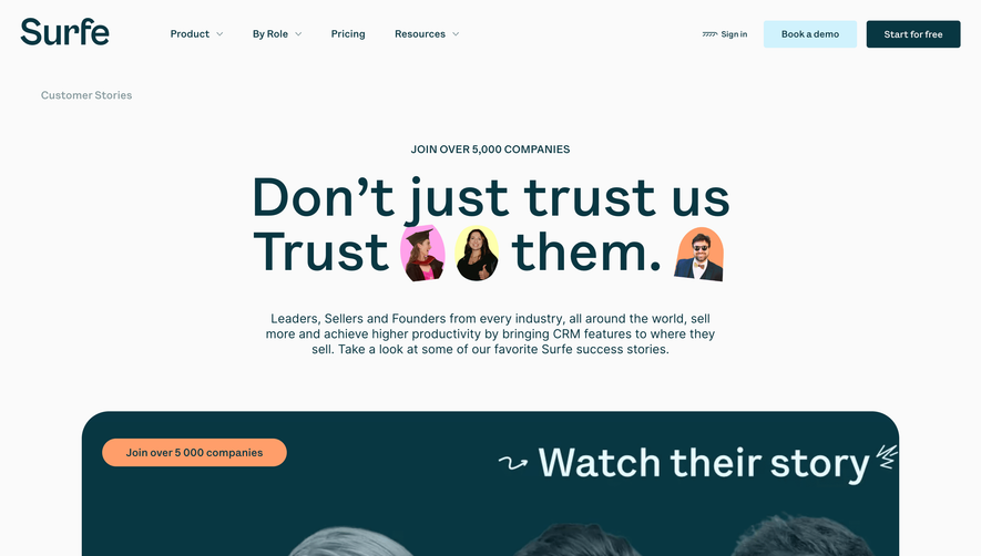


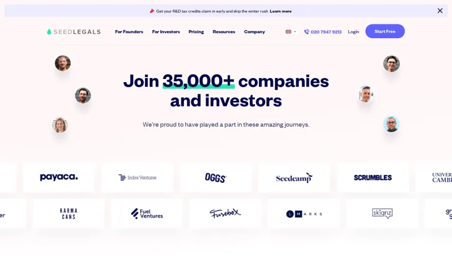



Upgrade to SaaSFrame Pro now to see similar examples.
Monthly
$18 /month
Billed $18 monthly
Browse all screens & flows
Filter and search screens & flows
Search text in screenshots
Access Figma files
Access mobile versions
Join now
Quarterly
$16 /month
Billed $48 quarterly
Browse all screens & flows
Filter and search screens & flows
Search text in screenshots
Access Figma files
Access mobile versions
Join now
Yearly
$15 /month
Billed $180 yearly
Browse all screens & flows
Filter and search screens & flows
Search text in screenshots
Access Figma files
Access mobile versions
Join now