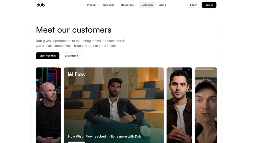
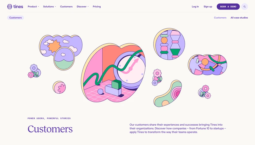
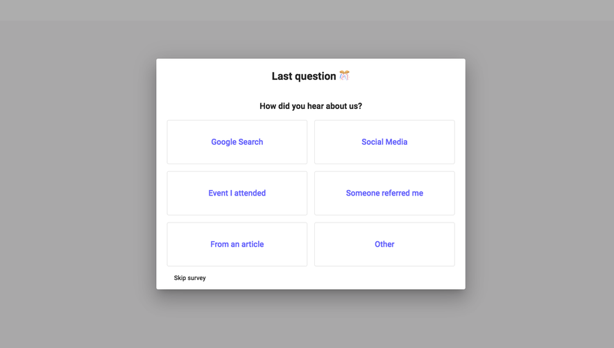
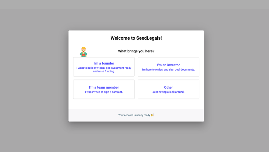
SeedLegals’ customers page delivers a polished, modern SaaS vibe that balances professionalism with warmth. The aesthetic is clean and purposeful—leveraging ample white space, crisp lines, and subtle shadows to create a light, accessible atmosphere. Brand colors pop selectively, providing energetic focal points without overwhelming the viewer.
Layout and Structure
The page opens with a full-bleed hero section featuring a confident headline and customer-centric tagline, supported by real founder photos. Scrolling reveals a dynamic grid of case studies: each customer spotlight is housed in a modular card, with clear headings, company branding, and tailored call-to-action buttons. Testimonial quotes and logos boost credibility, and essential CTAs are woven throughout. The well-defined footer reinforces navigation, social proof, and further resources.
Visual Elements
Photography of authentic founders is central—eschewing stock images for relatability. Each case study is visually differentiated through branded company logos and founder portraits, while soft gradients, micro animations, and playful vector accents subtly guide attention and add vibrancy. Carefully chosen iconography communicates processes and values.
Color Palette and Typography
A mostly neutral background lets SeedLegals’ signature green and supporting teals take the stage, used sparingly for highlights and CTAs. Headings employ a bold, modern sans-serif, creating strong visual hierarchy, while body text remains highly legible and approachable.
User Experience Patterns and Unique Design Choices
Navigation is intuitive, with sticky menus and clear page anchors. Case study cards feature hover states for discoverability, and carousels condense content without crowding. Embedded video testimonials and playful founder spotlights build trust through authenticity—a fresh twist in SaaS storytelling. The overall feel is reliable yet forward-thinking, encouraging user exploration while cementing expert credibility.
 SaaSFrame