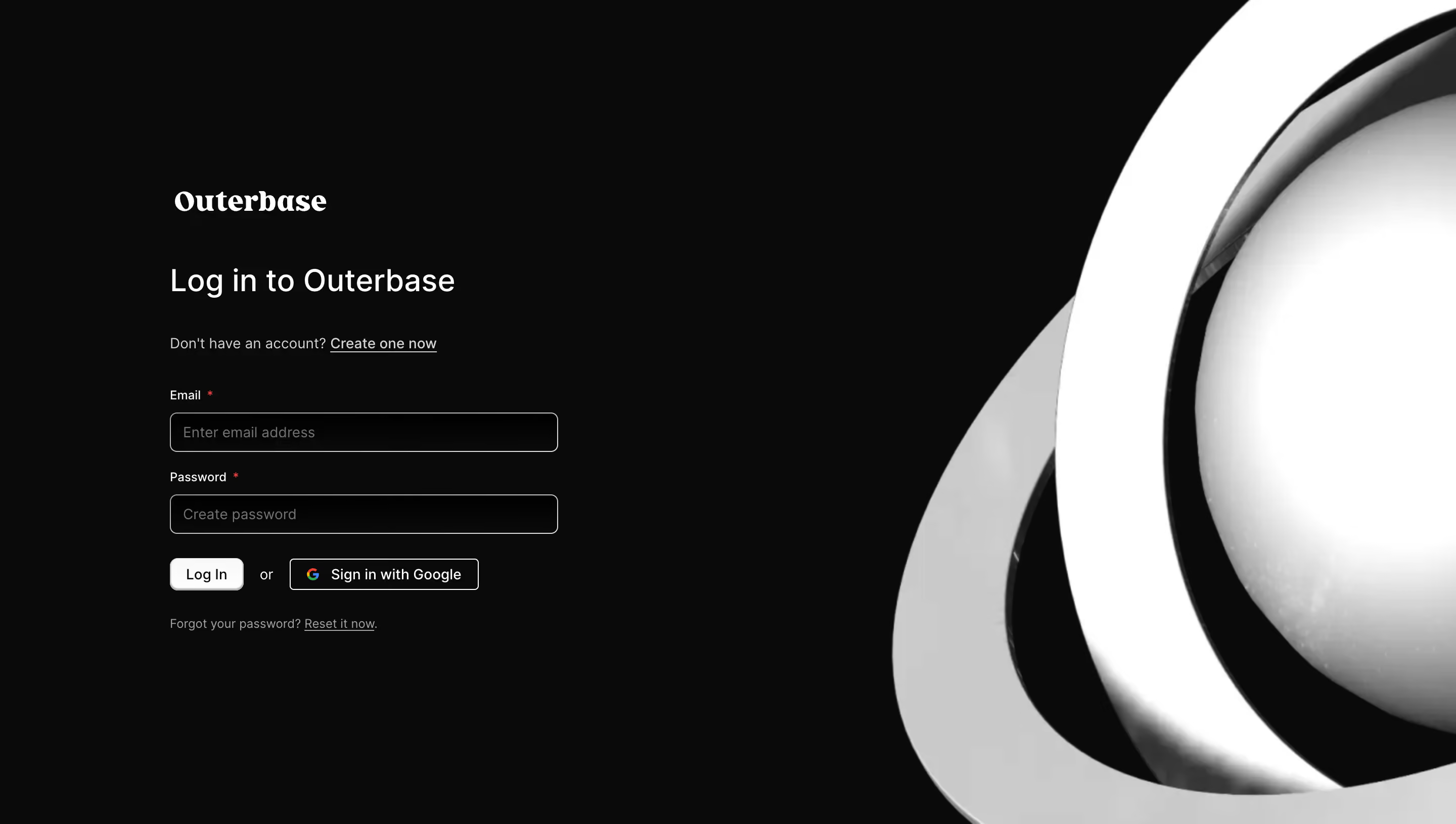
Generate a new design based on this screen using your own content.
Thank you! Your submission has been received!
Oops! Something went wrong while submitting the form.
# Design from Reference: Outerbase Login Page
Create an original, high-fidelity visual design inspired by the reference. Prioritize composition, typography, colors, spacing, and component styling over technical implementation.
## Reference
- **Product:** Outerbase
- **Category:** Login
- **Screenshot:** https://cdn.prod.website-files.com/5e9dc792e1210c5325f7ebbc/6acad83fb3daa04f542761b6_6acad7c03ce5f4104ebeed29_cms-8da4d9e101561b8332bbb424.webp
Analyze the screenshot first. If inaccessible, request it rather than guessing.
## Content
{{content.instructions}}
{{content.data}}
Preserve essential messaging and factual accuracy. Adapt structure and copy length for visual balance; never invent product claims.
## Visual Design
Use this context to reproduce the reference's visual language: layout, typography, colors, spacing, borders, radii, and distinctive elements. The screenshot takes priority if descriptions conflict.
## Direction
{{preferences.fidelityInstructions}}
## Output
{{output.instructions}}
Deliver a polished, cohesive design with precise alignment, hierarchy, and spacing. Produce the requested visual artifact, not just a description. If unsupported, explain the limitation.
Outerbase’s login page embodies a sleek, modern minimalism that feels both professional and approachable. The abundance of white space amplifies focus on the central login form, allowing the user to move through the process without distractions. Subtle gradients and muted background tones ensure the interface feels current and digital—ideal for a SaaS audience seeking innovation and clarity.
Layout and Structure
Half the page is devoted to an inviting welcome section, while the other half features the login form. This split-screen layout creates a visual balance—functional yet elegant. No overcrowded elements or unnecessary distractions: you’re welcomed, given a concise headline, and prompted to sign in, all in one sweep, reflecting a streamlined and user-centric approach.
Visual Elements
Visuals are striking but restrained, with bold yet non-intrusive illustrations that hint at data and connectivity themes. The brand’s geometric icon stands out at the top, establishing identity from the first glance. Soft shadows, smooth transitions on hover states, and clear icons for alternative sign-in options (like Google) contribute to a polished, cohesive look.
Color Palette and Typography
A cool, professional palette of navy blues, purples, and gradients creates a high-tech yet calming atmosphere. Typography is crisp and sans-serif, with a pronounced hierarchy—headline large and confident, supporting copy concise and understated, and form labels clear and accessible.
User Experience Patterns
Central placement of the form enhances usability. CTAs are clear and visually distinct, while alternative login options simplify access. Responsive design ensures the site works seamlessly across devices, and concise error handling reassures users at every interaction.
Unique Design Choices & Tone
The split layout and purposeful empty space relay confidence and transparency, while the understated use of color and illustration positions Outerbase as innovative and trustworthy—a case study in SaaS UX elegance.