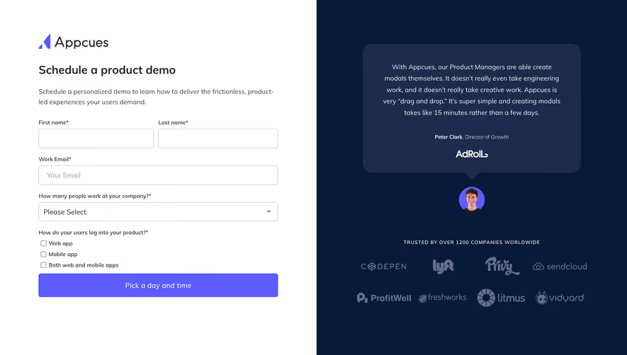
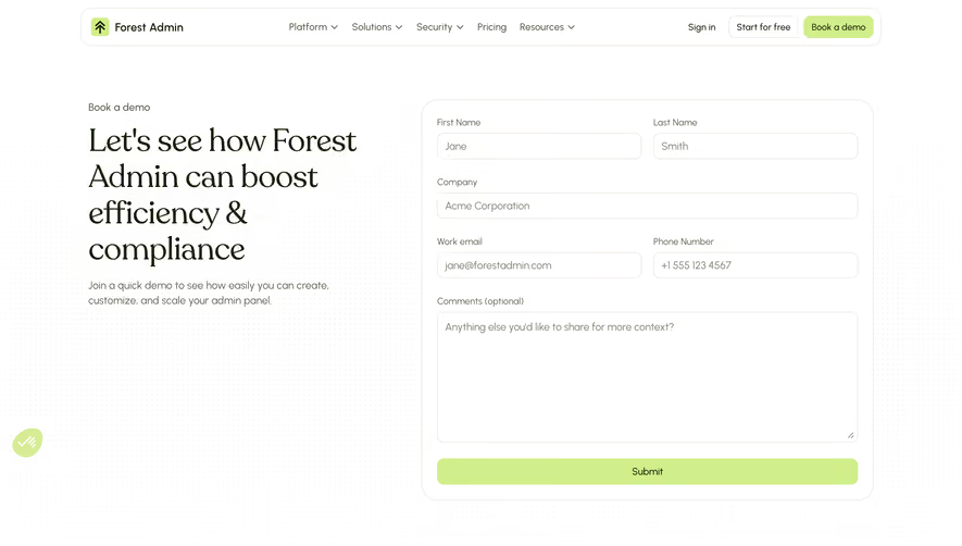
Generate a new design based on this screen using your own content.
Thank you! Your submission has been received!
Oops! Something went wrong while submitting the form.
# Design from Reference: Mixpanel Demo Request
Create an original, high-fidelity visual design inspired by the reference. Prioritize composition, typography, colors, spacing, and component styling over technical implementation.
## Reference
- **Product:** Mixpanel
- **Category:** Demo Request
- **Screenshot:** https://cdn.prod.website-files.com/5e9dc792e1210c5325f7ebbc/62ecad9e0e99ef5ebed92213_1659676969215-5ebe7251225bce5a988b2515_screencapture-mixpanel-contact-us-demo-2020-05-15-12_42_53.webp
Analyze the screenshot first. If inaccessible, request it rather than guessing.
## Content
{{content.instructions}}
{{content.data}}
Preserve essential messaging and factual accuracy. Adapt structure and copy length for visual balance; never invent product claims.
## Visual Design
Use this context to reproduce the reference's visual language: layout, typography, colors, spacing, borders, radii, and distinctive elements. The screenshot takes priority if descriptions conflict.
## Direction
{{preferences.fidelityInstructions}}
## Output
{{output.instructions}}
Deliver a polished, cohesive design with precise alignment, hierarchy, and spacing. Produce the requested visual artifact, not just a description. If unsupported, explain the limitation.
The two-column structure here is doing all the heavy lifting. Left side sells, right side converts. Simple. The form floats on a white card against that soft gray background, making it feel approachable rather than intimidating despite having quite a few fields.
Trust Signals Done Right
Skyscanner, Uber, DocuSign, Expedia. The logo grid below the headline is stacked two rows deep, and it hits hard without being overkill. Then they layer in G2 Crowd, Forbes, and Gartner badges underneath. That's three levels of social proof before you even glance at the form. Smart.
Typography and Color Keep It Tight
The type hierarchy is solid. "Get Demo" in bold black, subtext in a lighter gray, and that tiny "DEMO" label up top in Mixpanel's signature blue. Speaking of blue, the CTA button is the only real color pop on the right side. It pulls your eye exactly where it needs to go. The form fields use placeholder text instead of labels, keeping everything minimal. One thing that stands out: the country code selector with the French flag. Little localization details like that show thoughtfulness.